


Mohawk Blog
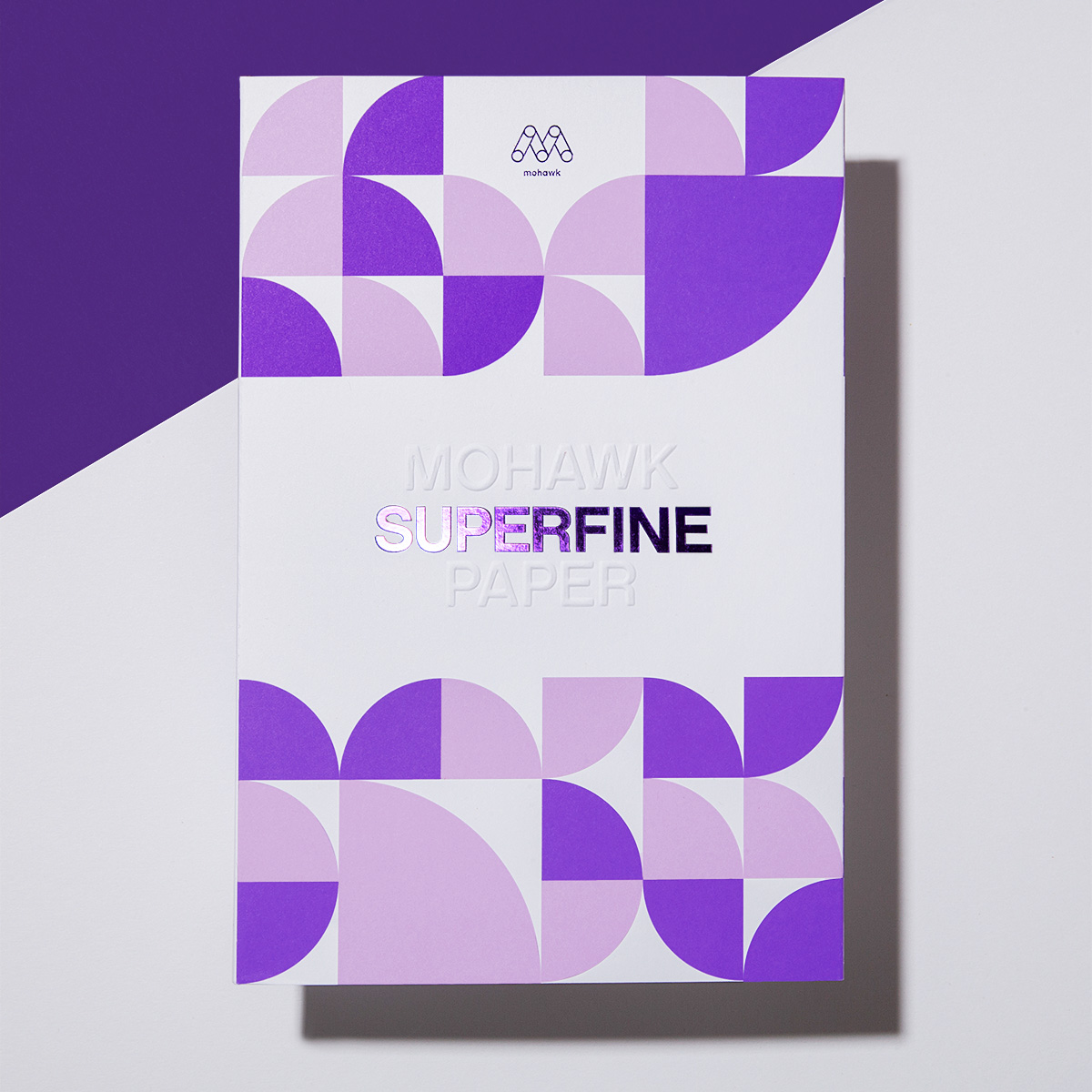
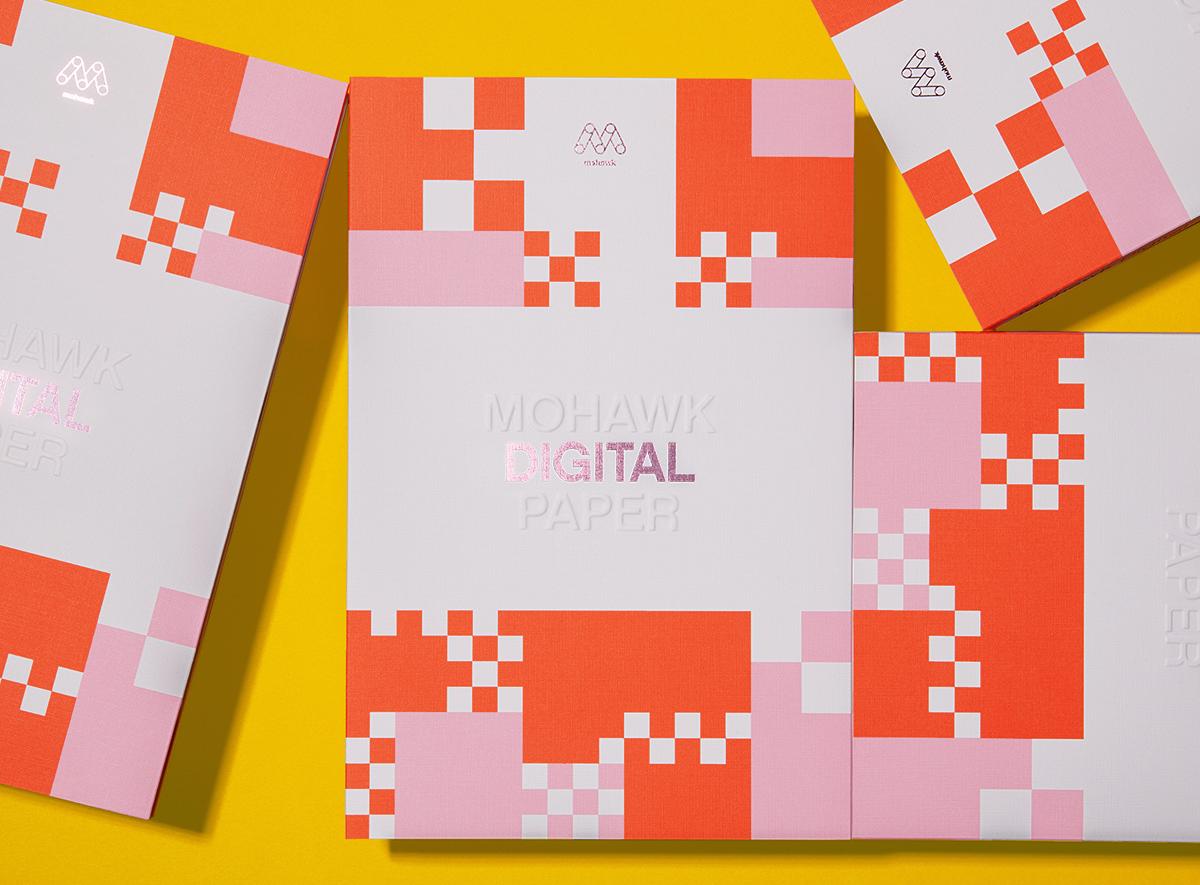
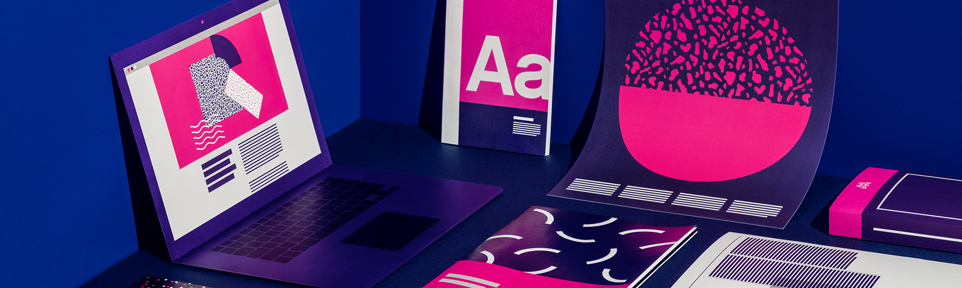
Today’s print projects demand speed, flexibility, and standout results. That’s where the Mohawk Digital Collection comes in.
If you are having trouble logging in please clear your browser cookies.
Don't have an account?
Register
Today’s print projects demand speed, flexibility, and standout results. That’s where the Mohawk Digital Collection comes in.

Field Notes have become one of the most popular notebooks people use for daily musings, doodles and to-do lists. For the Spring 2017 edition, Field Notes introduced “Utility,” a notebook format perfect for any hard worker who may spend a bit of their time in a local hardware store…or for anyone that aspires to do so.

Upon reading this article’s title, if you’re thinking: ‘Fire a customer? That’s crazy! Any business is good business!’ – please do yourself a favor and read part one of this series.

Firing a customer. It sounds like an oxymoron, doesn’t it? But contrary to popular belief, the customer is not always right and not all customers are good.
Today, guest blogger, Sarah Schwartz, editor of Stationery Trends and The Paper Chronicles, chats with one of Stationery Trends’ Top Ten 2017 Designers to Watch about her career, inspiration and thoughts about paper.
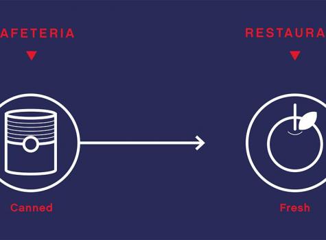
Imagine two lunch spots: a cafeteria and a restaurant. Each serve their own purpose, but which one would you bring a client or first date to?

Last week, we began our discussion on how to design for spot colors used in digital print technologies. This included how to determine which spot colors may reproduce accurately as CMYK builds and what information you can gather from the various Pantone guides.

Recently, we delved into the basics of spot colors. If you’re curious how they differ from process colors or when they should be used – we recommend you pause here and check out our introductory article.

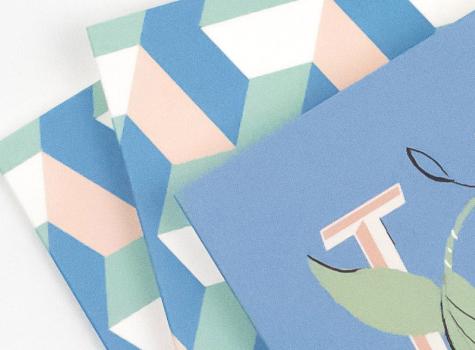
We can’t think of any better way to wrap up another year but to give all of our customers, colleagues and friends a warm, heartfelt holiday greeting. Our 2016 Mohawk holiday card does just that, by celebrating the artful craftsmanship of design, illustration and printing…and of course paper!
Mohawkconnects.com will be performing scheduled maintenance on Saturday, January 20th, 2024 between the hours of 9am and 12pm EST.
We apologize for any inconvenience or interruption to stock check, Xpress Check, product pages and the add to cart feature during this time. If any issues persist beyond this window, please contact [email protected] or 800-THE-MILL during normal business hours resuming Monday, January 22nd at 8am EST. Thank you.
