
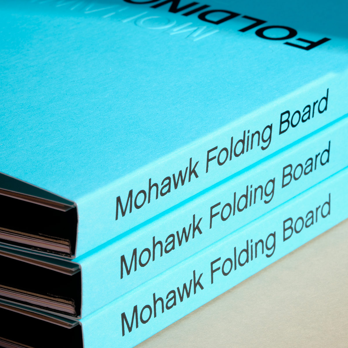

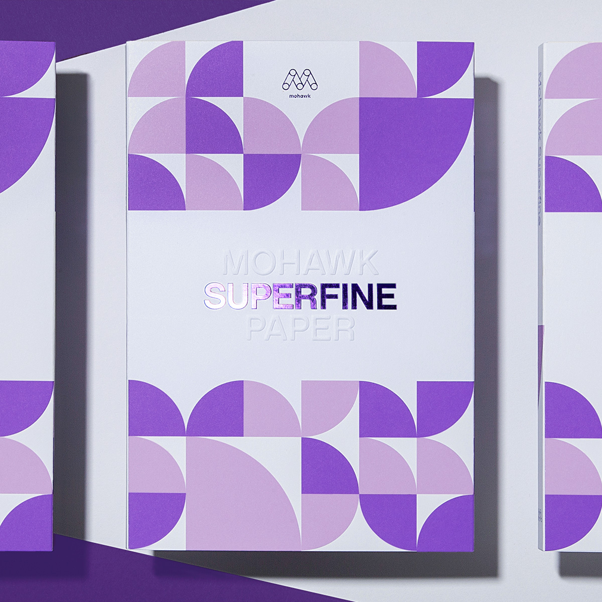

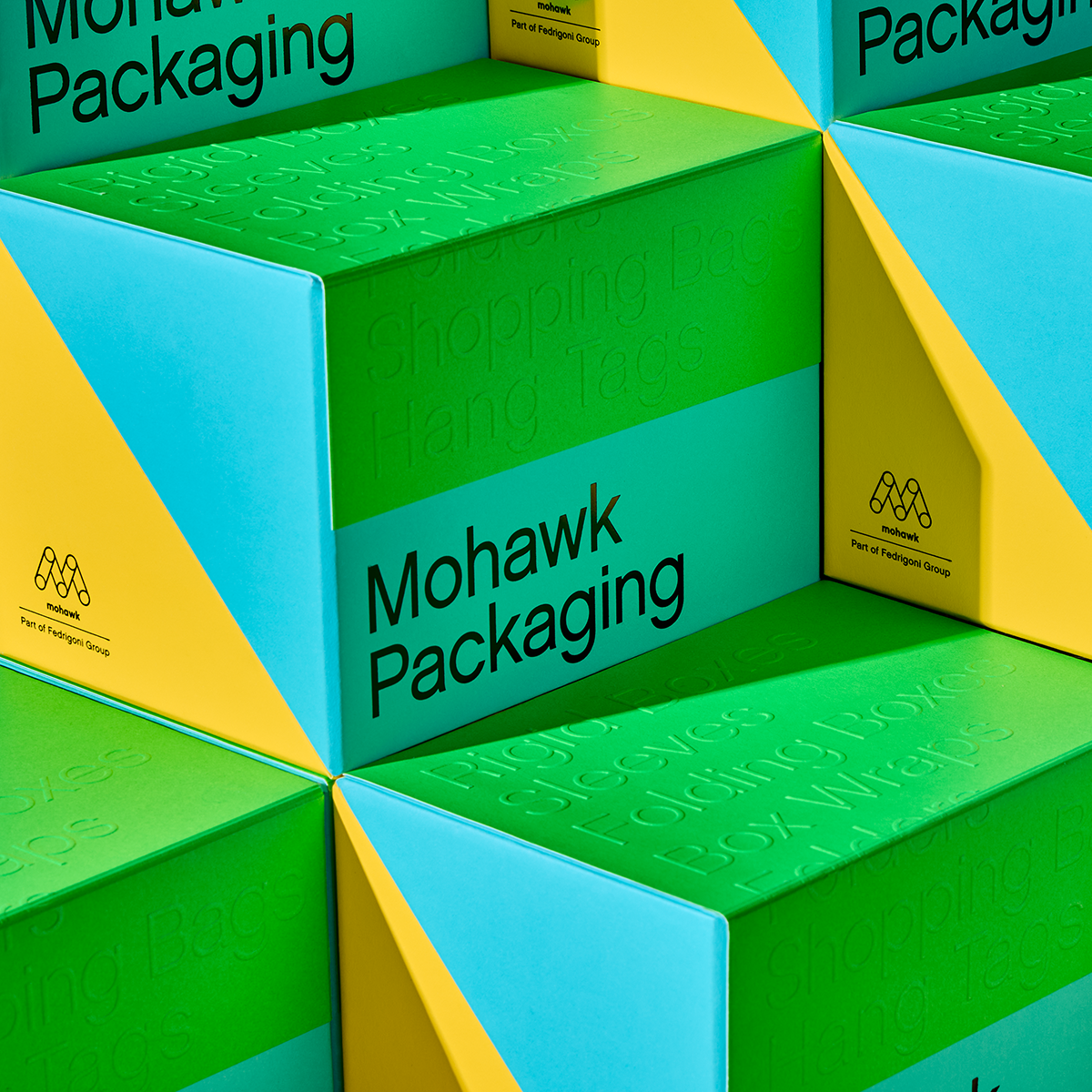


Mohawk Blog
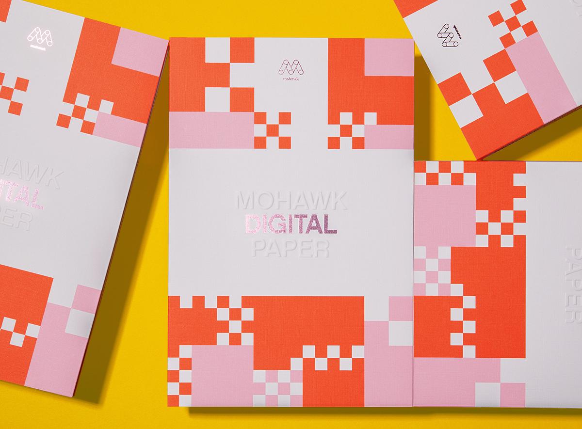
Today’s print projects demand speed, flexibility, and standout results. That’s where the Mohawk Digital Collection comes in.
If you are having trouble logging in please clear your browser cookies.
Don't have an account?
Register
Today’s print projects demand speed, flexibility, and standout results. That’s where the Mohawk Digital Collection comes in.
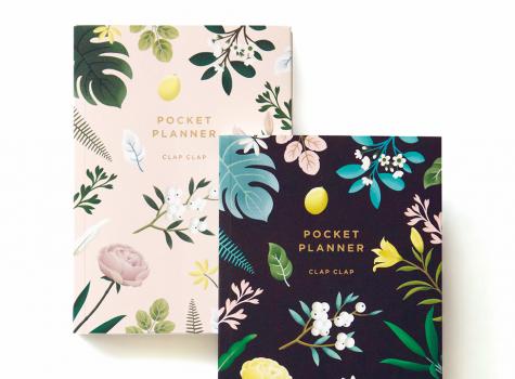
Today, guest blogger, Sarah Schwartz, editor of Stationery Trends and The Paper Chronicles, chats with one of Stationery Trends’ Top Ten 2016 Designers to Watch about her career, inspiration and thoughts about paper. Today, Sarah introduces us to Mimi Kim of Clap Clap.

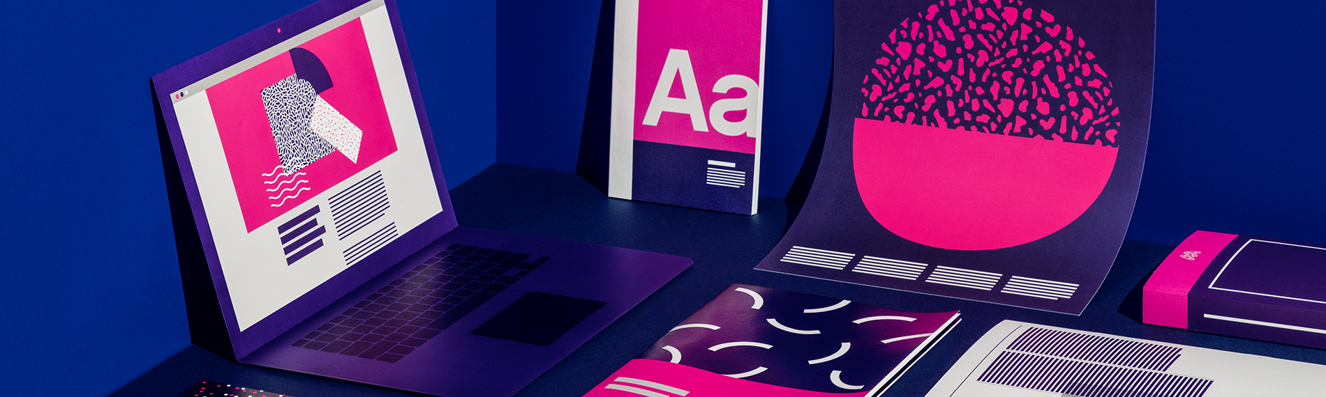
In a previous post we dived deep into the nuances of color, including the differences between RGB and CMYK color spaces, when to use each and how to design for them. What about spot colors?

As we move about our day, we’re bombarded with thousands of branded images. Most of them are white noise, but others manage to cut through the clutter and intrigue us.

For those accustomed to selling traditional lithographic print, making the transition to selling digital print can be challenging.

In 2014, Mohawk stumbled upon a paper holy grail: a collection of samples, swatchbooks and sales guides boxed up in a warehouse, all but forgotten.

For the past two years, Chris Fritton has been on the road, traveling to letterpress print shops across the United States and producing unique, regional prints at each stop.
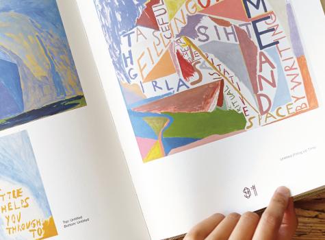
When artists create every facet of a book, from cover to page numbers to index, it becomes a work of art.

Whether it’s a bright snowy mountain or a dark moody forest, photographer Kennett Mohrman captures expansive natural landscapes with both wonder and clarity.

Here at Mohawk, environmental commitment, social responsibility and corporate stewardship are woven into the fabric of our culture and business practices, and we believe the origin of exceptional craft lies in exceptional materials.
Mohawkconnects.com will be performing scheduled maintenance on Saturday, January 20th, 2024 between the hours of 9am and 12pm EST.
We apologize for any inconvenience or interruption to stock check, Xpress Check, product pages and the add to cart feature during this time. If any issues persist beyond this window, please contact [email protected] or 800-THE-MILL during normal business hours resuming Monday, January 22nd at 8am EST. Thank you.