Spot Colors and Digital Printing: Design Tips and Best Practices Part II

Last week, we began our discussion on how to design for spot colors used in digital print technologies. This included how to determine which spot colors may reproduce accurately as CMYK builds and what information you can gather from the various Pantone guides.
Do Not Leave Color Conversions up to the Printer or RIP
As is often the case in printing, output is directly linked to input. Whether using actual spot colors or attempting to accurately recreate them using CMYK, it’s critical that your colors are formatted correctly in the design stage and not during the printing process, UNLESS you and your printer have discussed an alternative approach.
Colors set up as Pantone swatches in a design program cannot simply be printed using a process printer. If you leave the conversion up to the printer or digital front end, it will attempt to translate your spot colors into combinations of cyan, magenta, yellow and black ink in a 4-color process. This is a very tricky feat of color science and unless your print provider has color management workflow chops, the results will almost certainly be undesirable.
Identifying Spot and Process Colors in your Design
How can you tell whether your colors are set up as spot or process? While it varies by design program, in Adobe InDesign and Illustrator this information can be found under the swatches panel (Window > Color > Swatches). Pantone swatches are notated by an icon of a small circle inside a box, located to the right of the swatch name (Pantone swatches also generally have ‘Pantone’ in their swatch name). Meanwhile, process colors are represented by a checkered box icon found to the right of the swatch name.
Similarly, you will find information on the identities of spot colors when pre-flighting your file, generally under the ‘Colors and Inks’ sub-menu.
Converting Spot Colors into CMYK
You may be tempted to simply access the color panel in the design program you are using and select the drop-down to ‘convert’ any spot colors into CMYK. It is very important that you do not do this. The design software will use its own algorithms and settings to make the CMYK conversion and this data may differ significantly from the official Pantone color values.
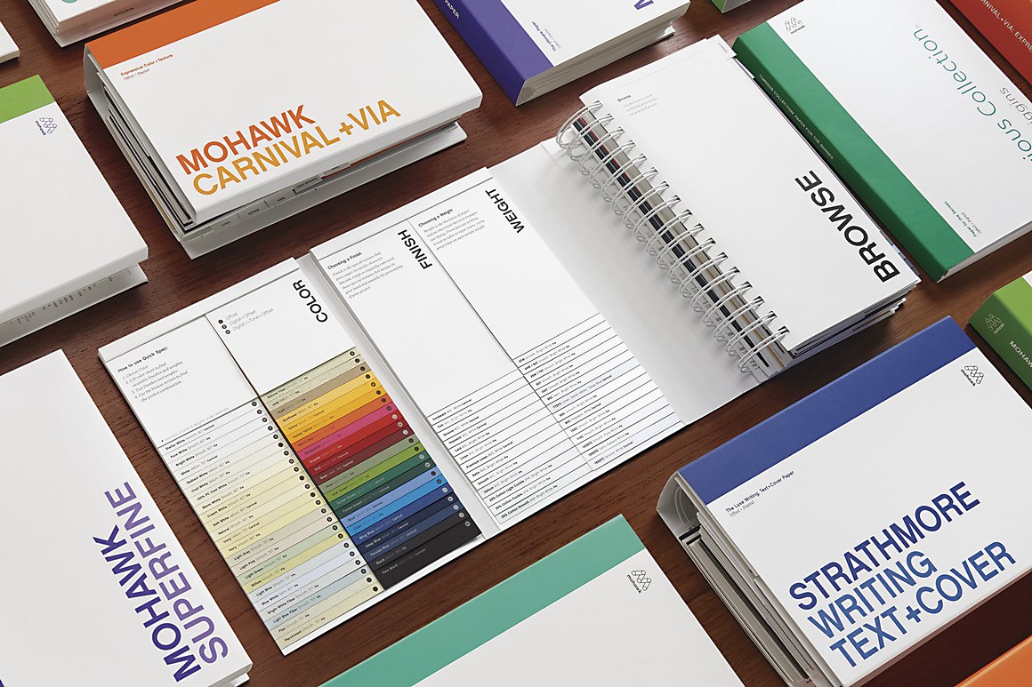
Instead, it is best to refer to your Pantone guides, which provide explicit CMYK (or CMYKOGV) values designed to achieve optimal results with process printing. These values should be entered into your design software manually. If you have access to a Pantone Color Bridge guide, be sure to grab the appropriate values (either Coated or Uncoated – remember, they will be different) based on the paper type you’ll be printing with.
Converting CMYK into Spot Colors
What if you design a piece in CMYK but later need to convert to spot?
This is rather easy to accomplish, and can be done either manually using a Pantone guide or electronically using a design program.
Generally, the most accurate results will be achieved through your Pantone guide. This allows you and your client to choose a Pantone swatch together, rather than relying on a computer algorithm to select for you.
However, in many cases, the spot colors chosen by your design software will suffice. For this, we’ll assume you’re using Adobe Illustrator. To begin the conversion process, you’ll want to:
1. Start by selecting an object or color to convert.
2. Next, select ‘Edit’, then ‘Edit Colors’, and finally ‘Recolor Artwork’. You’ll notice the color you
selected appears.
3. Then, look for an icon that resembles a color grid with a downward arrow…it is labeled as ‘Limits the
color group to colors in a swatch library’ and is located in the lower-right corner of the menu.
4. Upon clicking, choose ‘Color Books’ and select the appropriate Pantone color book you wish your
newly converted spot color to be generated from.
5. Click ‘OK’. Adobe Illustrator has now converted your CMYK color into the nearest Pantone reference
within the color book you’ve chosen.
When Double Bumps are Necessary to Achieve Optimal Color
Some spot colors on certain stocks have difficulty achieving a rich and even appearance when printed in a single pass.
If your design incorporates very dense solid areas, floods or crossovers – depending on the spot color chosen and printing press used – you may require what is known as a double-bump or double-hit in order to achieve vibrant, consistent coverage.
This essentially means that your printed sheet will be run through the press twice so the same color can be applied two times. Some spot colors are very vibrant and require double bumps to reach their full saturation. In other instances, the paper chosen may cause the color to print more muted, requiring this double hit to achieve optimal results.
Engage your Local Printing Representative Early and Often
As a reminder, it’s always good to speak with your local printer. They can provide you with helpful recommendations and should have access to Pantone guides. Similarly, they may have gamut extension capabilities (ie. with an HP Indigo, Kodak Nexpress or Xerox iGen 5) or metallic ink offerings to expand the range of spot colors you can achieve.
Keep the Dialogue Going!
Color is one of the most important, yet challenging, aspects of the printing process. This series really represents just the tip of the iceberg. If you still have questions or simply want to pass along a helpful piece of advice – please comment below to keep the conversation going!
Suggested Articles
Recently, we delved into the basics of spot colors. If you’re curious how they differ from process colors or when they should be used – we recommend you pause here and check out our introductory article.
In a previous post we dived deep into the nuances of color, including the differences between RGB and CMYK color spaces, when to use each and how to design for them. What about spot colors?
As digital printing evolves from compromise to sophisticated tool—advances in color, texture, and fiber papers push the boundaries of what's possible.
