


Mohawk Blog
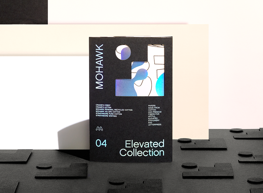
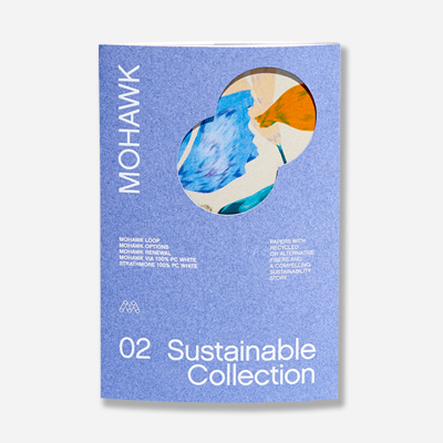
Mohawk Renewal marks a bold new chapter in our ongoing commitment to sustainability and innovation in papermaking.
If you are having trouble logging in please clear your browser cookies.
Don't have an account?
Register
Mohawk Renewal marks a bold new chapter in our ongoing commitment to sustainability and innovation in papermaking.
How one maker re-imagines his materials and processes to keep creating on the cutting edge
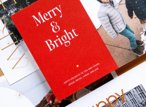
May the spirit of the season, and Mohawk's holiday card, uplift you.
Sonos has a simple purpose: to help the world listen better.
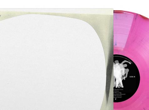
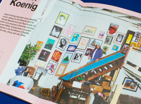
Leading creative Lawrence Azerrad reflects on the power of design—and the human touch—to inspire and delight music fans.
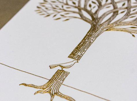
Lead Brand Designer Katelyn Stetler reflects on Crane’s tradition of craftsmanship, and introduces 77 timeless designs to 2019’s holiday capsule collection.
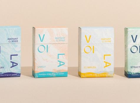
Craft and intentionality from product to packaging.
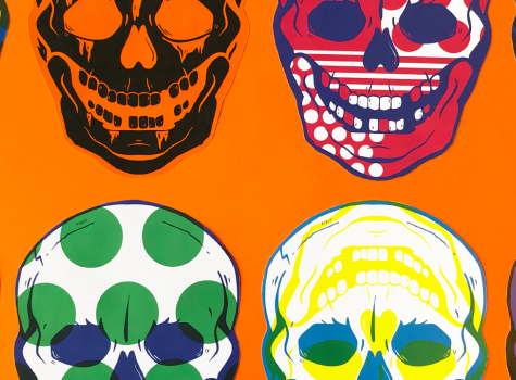
It's officially spooky season and we have something for you that's scary-good.
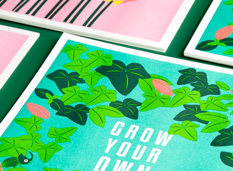
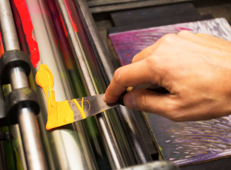
Riso's colors make ilootpaperie co-founders' hearts beat fast.
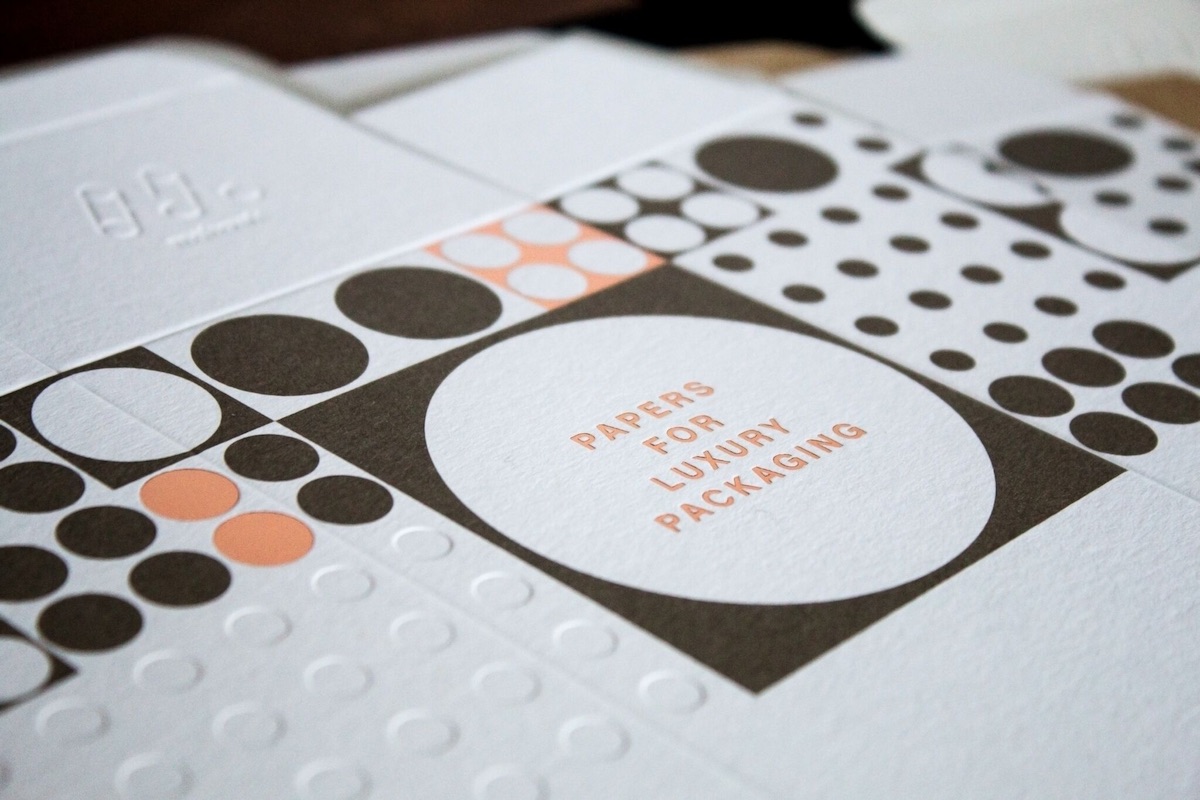
Evoking the beach through lush, tactile paper for a luxury oceanfront residence.
Mohawkconnects.com will be performing scheduled maintenance on Saturday, January 20th, 2024 between the hours of 9am and 12pm EST.
We apologize for any inconvenience or interruption to stock check, Xpress Check, product pages and the add to cart feature during this time. If any issues persist beyond this window, please contact [email protected] or 800-THE-MILL during normal business hours resuming Monday, January 22nd at 8am EST. Thank you.