


Mohawk Blog
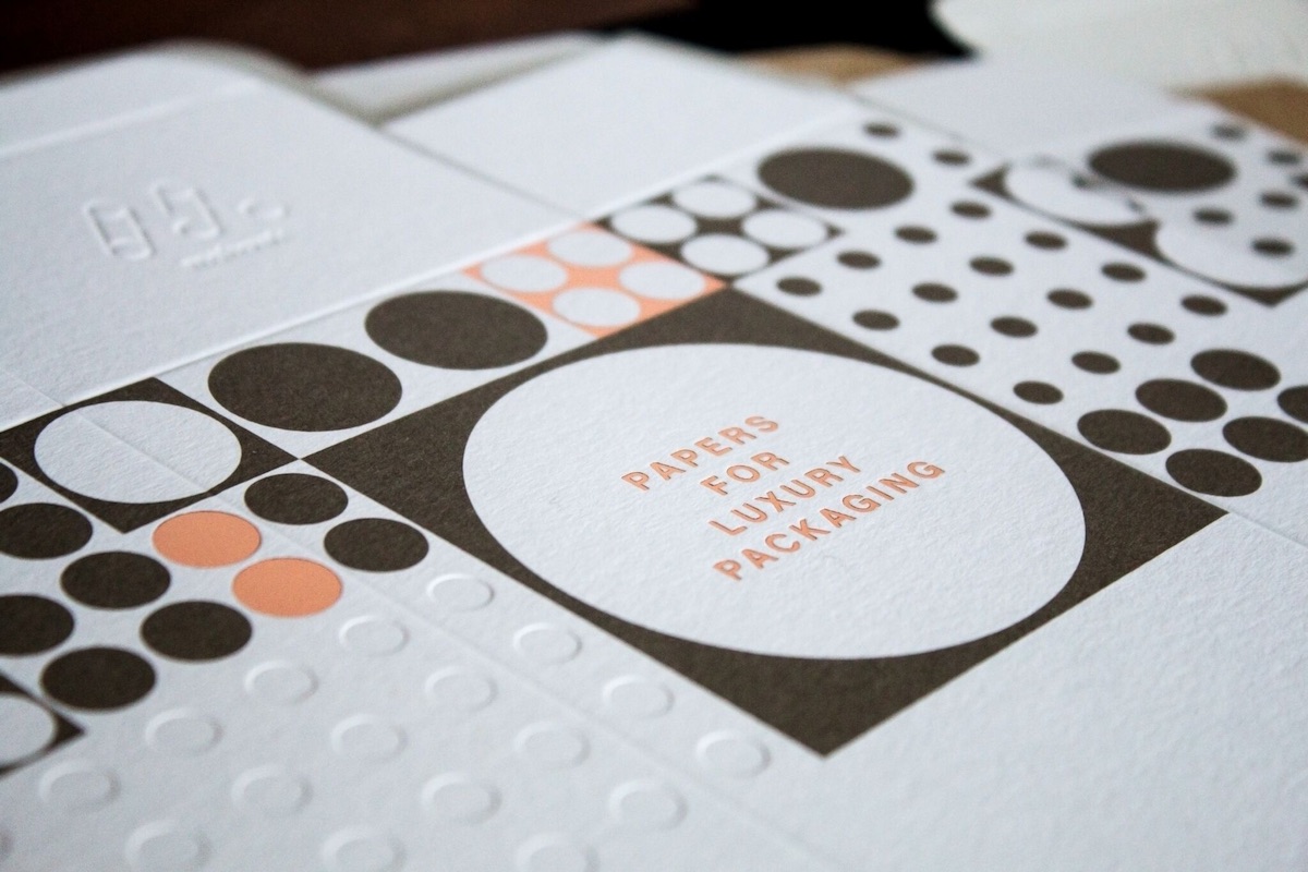
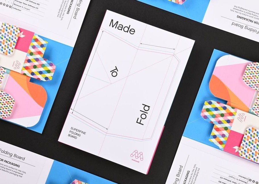
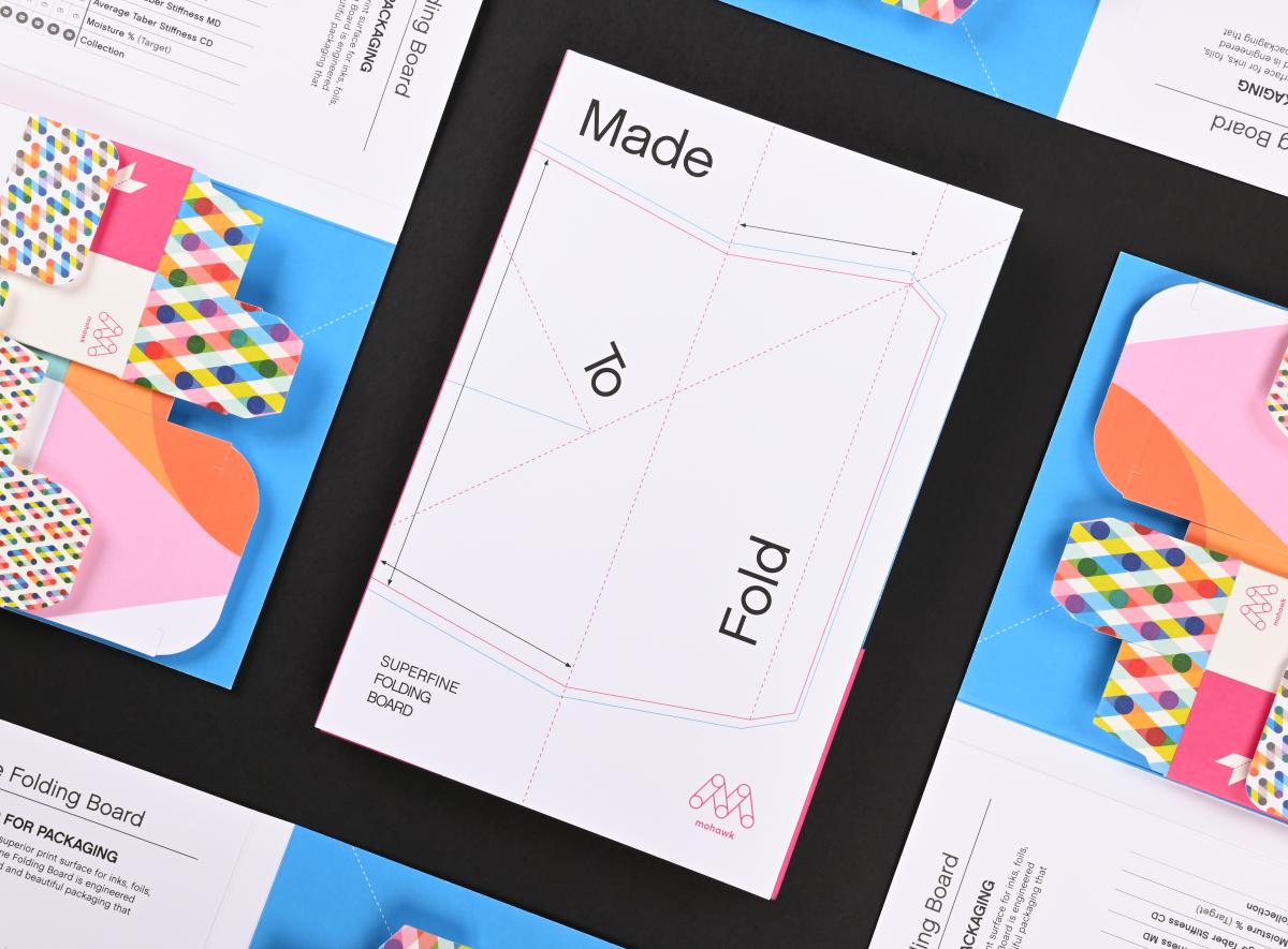
To Have and to Fold: Superfine Specifically Engineered for Packaging
If you are having trouble logging in please clear your browser cookies.
Don't have an account?
Register
To Have and to Fold: Superfine Specifically Engineered for Packaging

Who needs a new favorite notebook? We've teamed up with Chronicle Books to bring you The Go-To Notebook.

We all love a good poster. But, what makes the design for a poster effective?
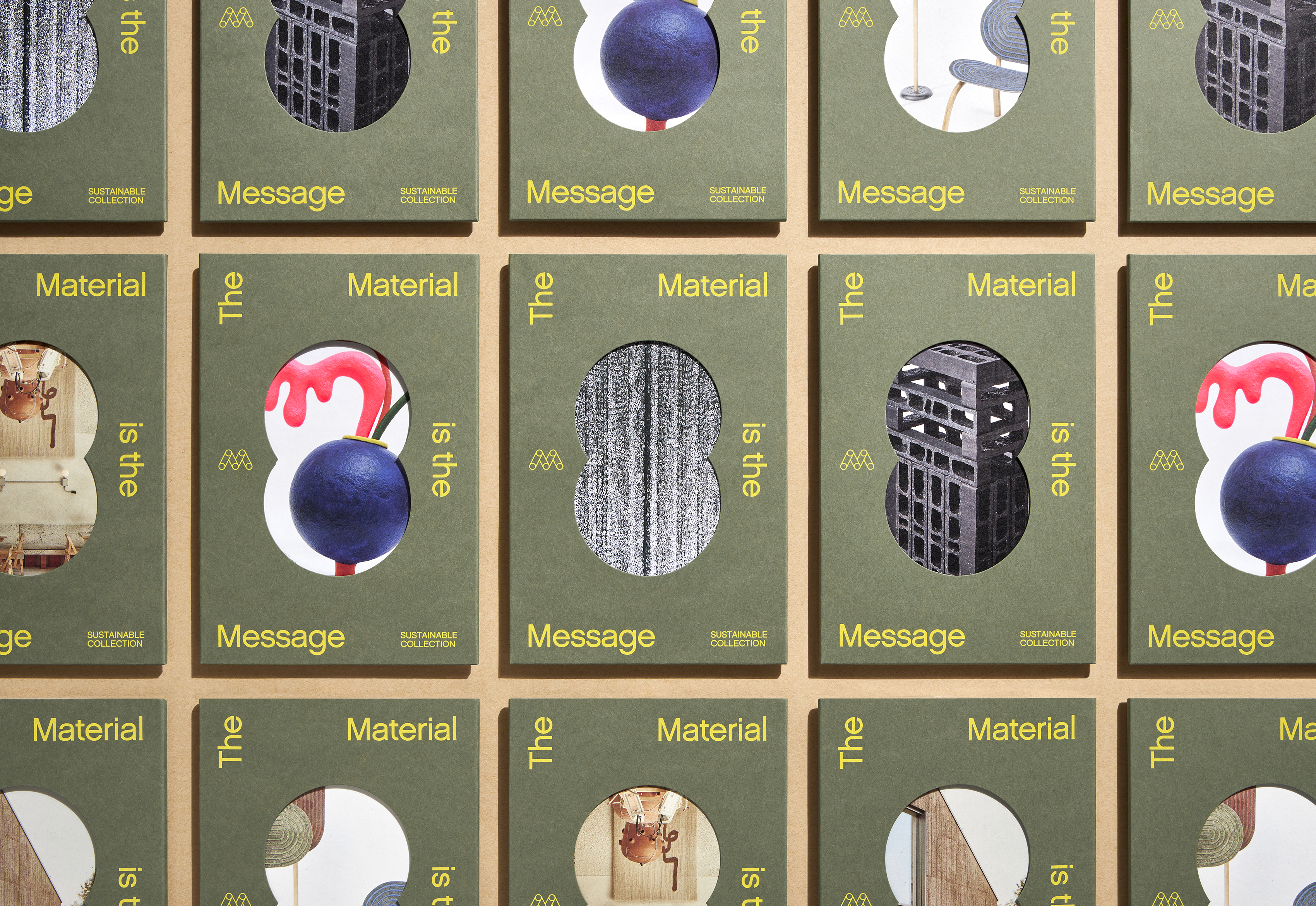
Stories do more than allow us to share our past. They can be the building blocks needed to shape and construct our future.

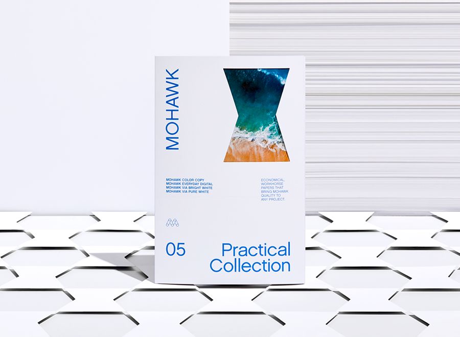
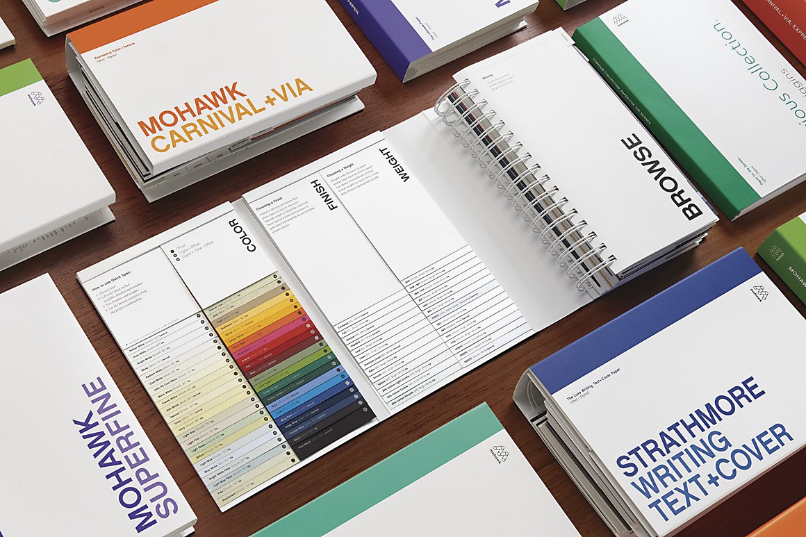
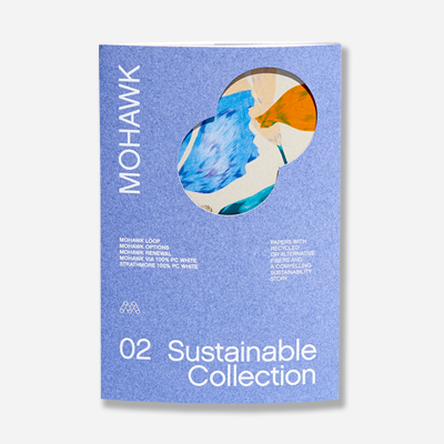
43 colors, 2 weights, 1 finish.
Adding a tactile element to your brand experience will strengthen your material communication. Have you ever thought about using the same texture across a variety of printed material to unify your brand?
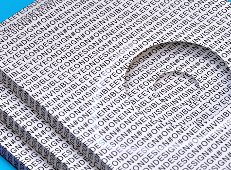
Since 2014, Eye on Design has been captivating creatives. With stories that are not only visually striking, but that highlight the world’s most influential designers and the issues that affect them, the online publication has elevated the conversation surrounding visual communication. Now, Eye on Design is available in print.

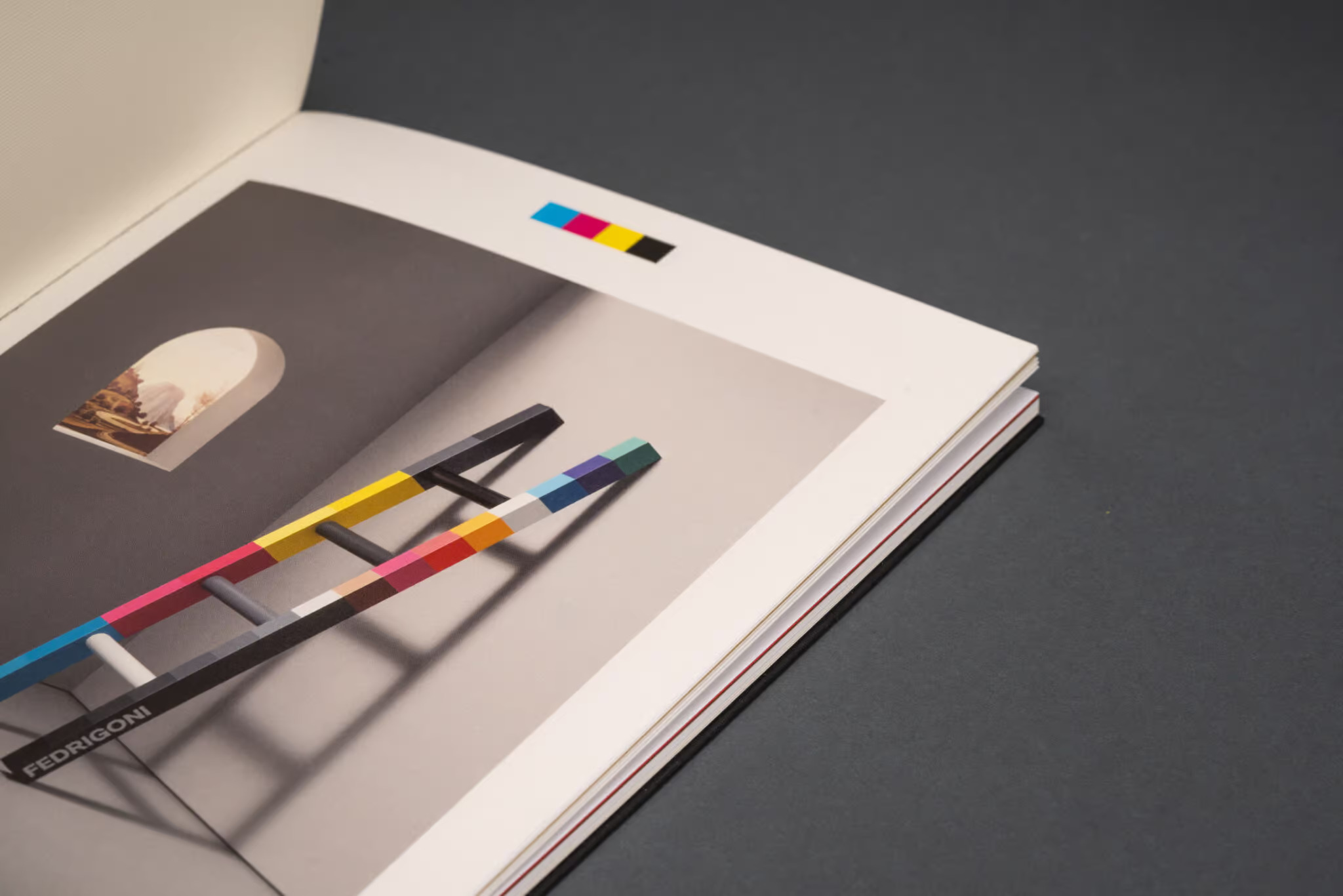
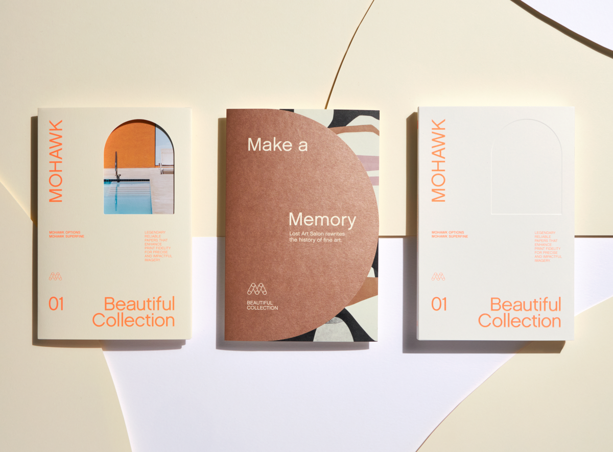
Paper choice can influence the way we experience photography in a printed piece. Lightly colored paper can elegantly shift the tone of an image, while subtly textured paper can make a big statement. Have you ever thought how choosing the right paper can add a unique and surprising layer of interest?
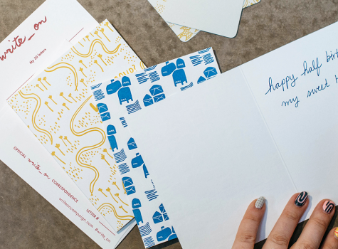
In a technological era punctuated with e-mail, smart phones, tablets and texts, Mohawk believes strongly in the power of personal expression on paper. That’s why we are proud to support the 2018 Write_On campaign, an initiative designed to support and encourage the act of letter writing.
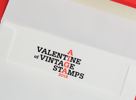
Let’s say you want to show some designers how much you appreciate them. Not just any designers, mind you, but designers who are true advocates for design. In fact, designers who are the presidents of the 72 AIGA chapters across the U.S.
Mohawkconnects.com will be performing scheduled maintenance on Saturday, January 20th, 2024 between the hours of 9am and 12pm EST.
We apologize for any inconvenience or interruption to stock check, Xpress Check, product pages and the add to cart feature during this time. If any issues persist beyond this window, please contact [email protected] or 800-THE-MILL during normal business hours resuming Monday, January 22nd at 8am EST. Thank you.