Mohawk Blog

Liz Miller: Unify with Texture

Words
Ariel Smullen
Photography
Cast Iron Design
Close-up of Liz Miller business card

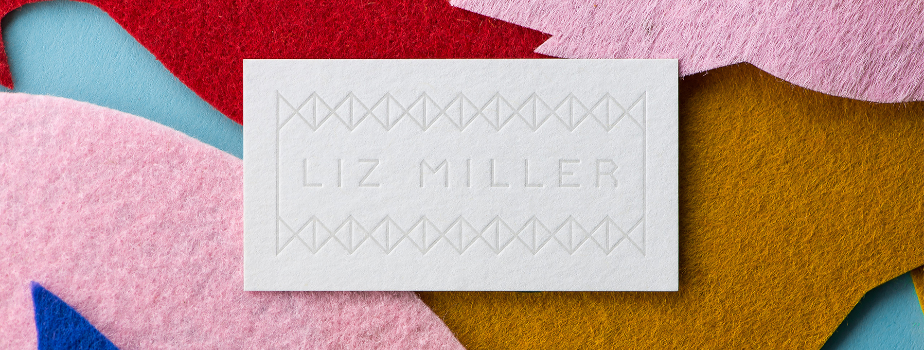
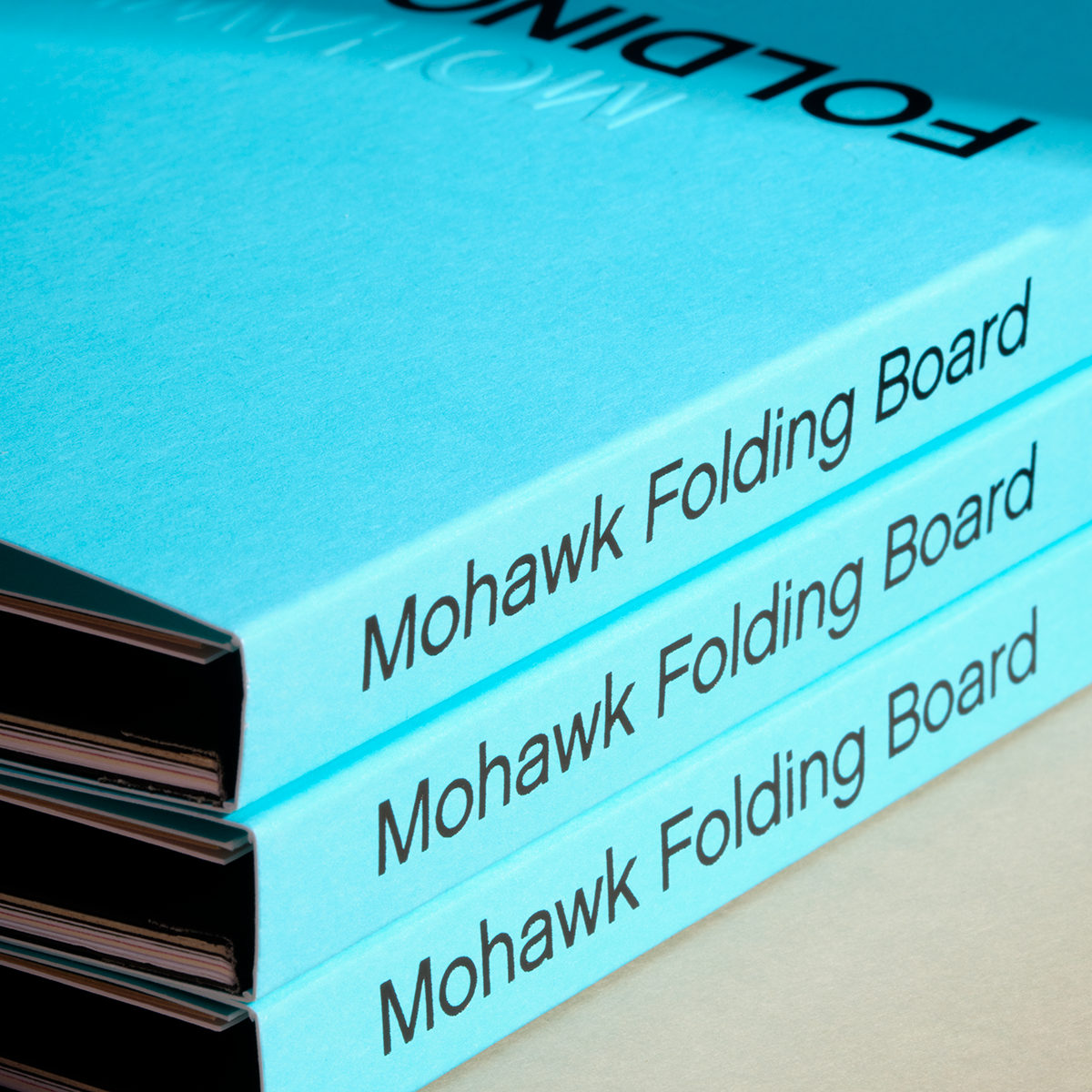
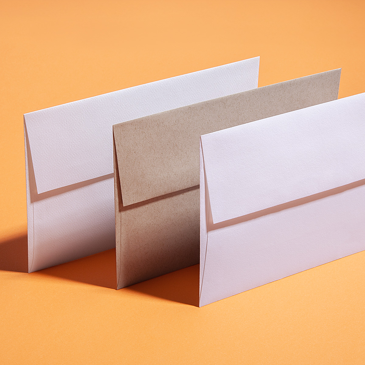
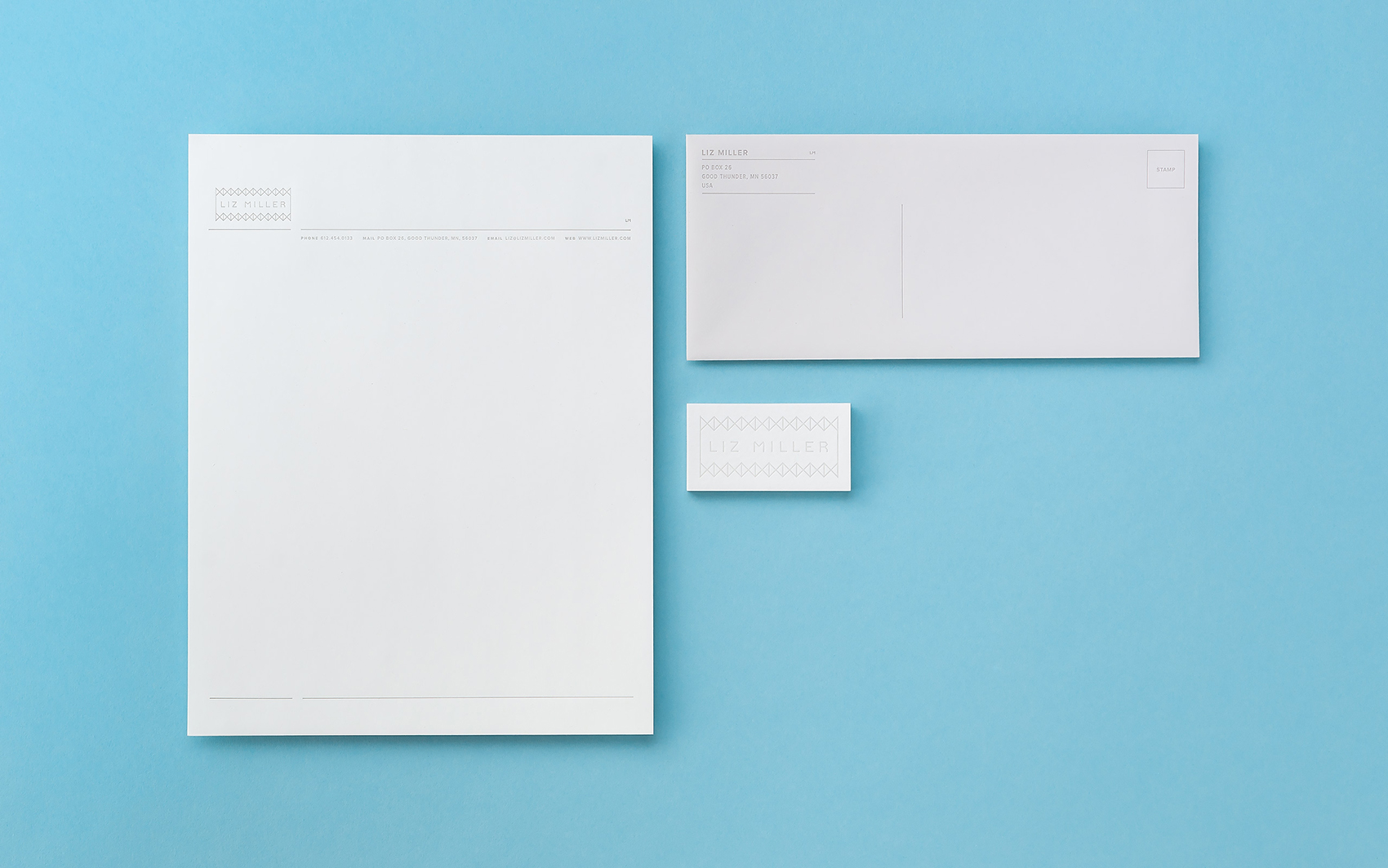
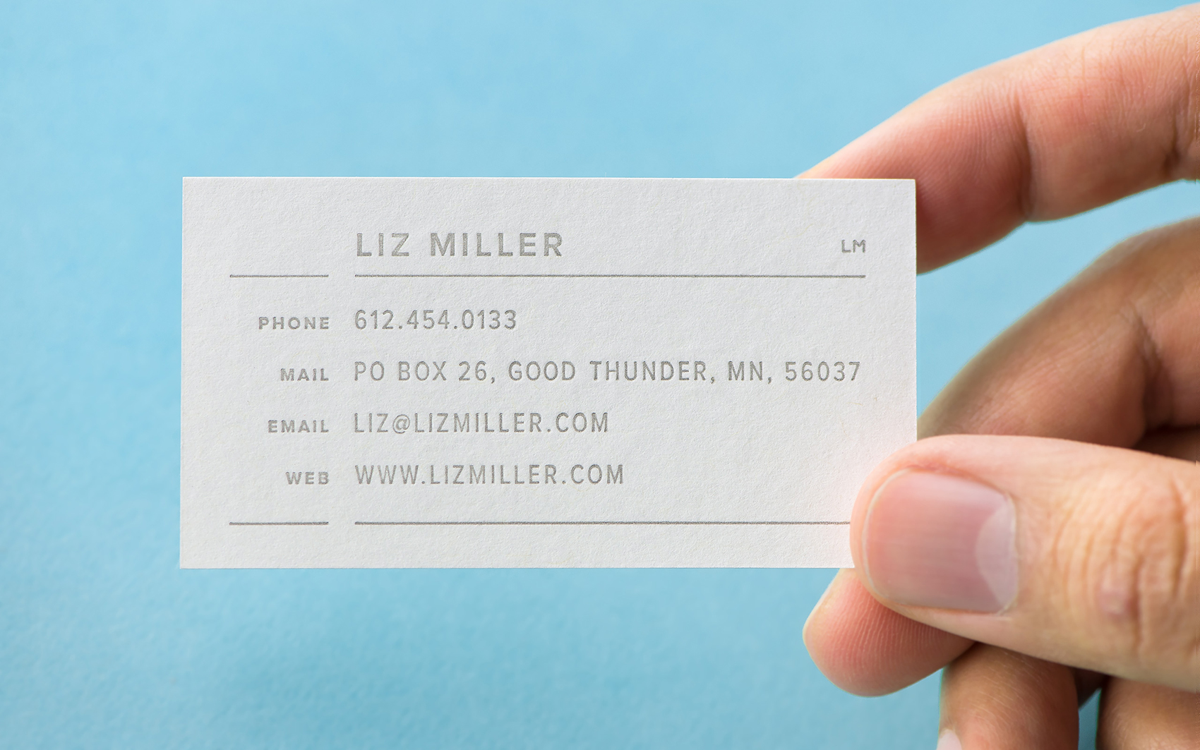
Adding a tactile element to your brand experience will strengthen your material communication. Have you ever thought about using the same texture across a variety of printed material to unify your brand?

Boulder, Colorado-based Cast Iron Design is a studio on a mission to promote environmentally-friendly graphic design through smart design and a bit of humor. The studio worked with installation artist, Liz Miller, to create an identity and website to showcase her extensive catalog of intricate, bold, and colorful work.

Liz Miller art
Close-Up of Liz Miller art

“When working with Liz to develop a visual strategy, she requested the identity be contemporary, clean, elegant, and bold,” states Cast Iron Design. “Our explorations resulted in a solution that starkly contrasts her audacious and vibrant installations, referencing the geometry and repetition in her work and balancing its personality with a restrained color palette.”

Liz Miller business card and stationery on a blue background

The color palette of the identity was carried through to all of the printed collateral, printed in various weights and two different shades of Mohawk Loop Smooth (Sustainable Collection)


“When working with Liz to develop a visual strategy, she requested the identity be contemporary, clean, elegant, and bold. Our explorations resulted in a solution that starkly contrasts her audacious and vibrant installations, referencing the geometry and repetition in her work and balancing its personality with a restrained color palette.”
Cast Iron Design

Paper stock curled to show color and texture
Liz Miller business card in a hand
Envelope flap close-up detail image

“The business card was printed on Mohawk Loop Smooth White 18pt/365gsm (Sustainable Collection) and took well to a letterpress printed, double-sided design. To allow the logo on the front to have a substantial impression, we kiss-hit the back side of the card in order to avoid bleed-through to the back. Initially the client commissioned only the envelope and business card, however, upon seeing the results she commissioned us to create a matching letterhead to complete the set,” states Cast Iron Design.

By using the same texture across varied printed elements, Cast Iron was able to unify Liz Miller’s brand and make every printed piece a cohesive part of her brand experience.

Client: Liz Miller, Good Thunder, MN
Design: Cast Iron Design, Boulder, CO
Printer: Letterpress Finesse
Paper Stock:

  • Business Card: Mohawk Loop Smooth White 18pt/365gsm
  • Letterhead: Mohawk Loop Smooth White 70 text/104gsm
  • Envelope: Mohawk Loop Smooth Gray 70 text/104 gsm, #10 Commercial

Printing: Letterpress printed with rubber-based inks


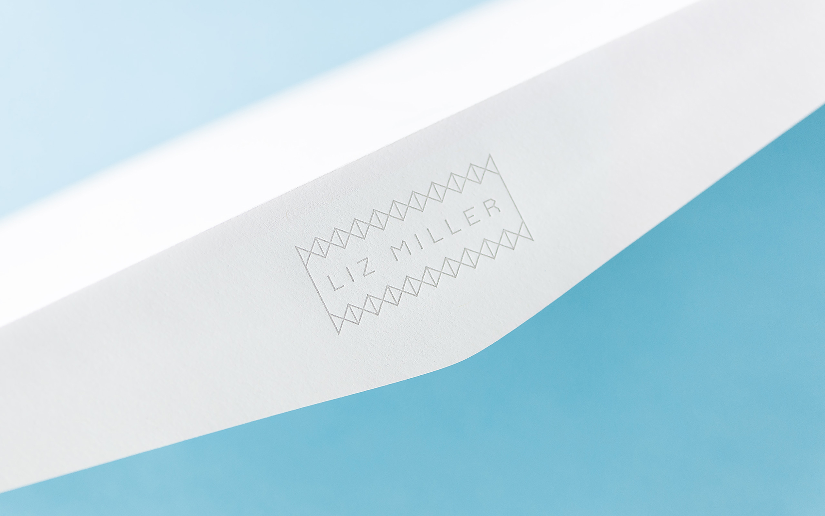
Tips on how unify with textured paper:

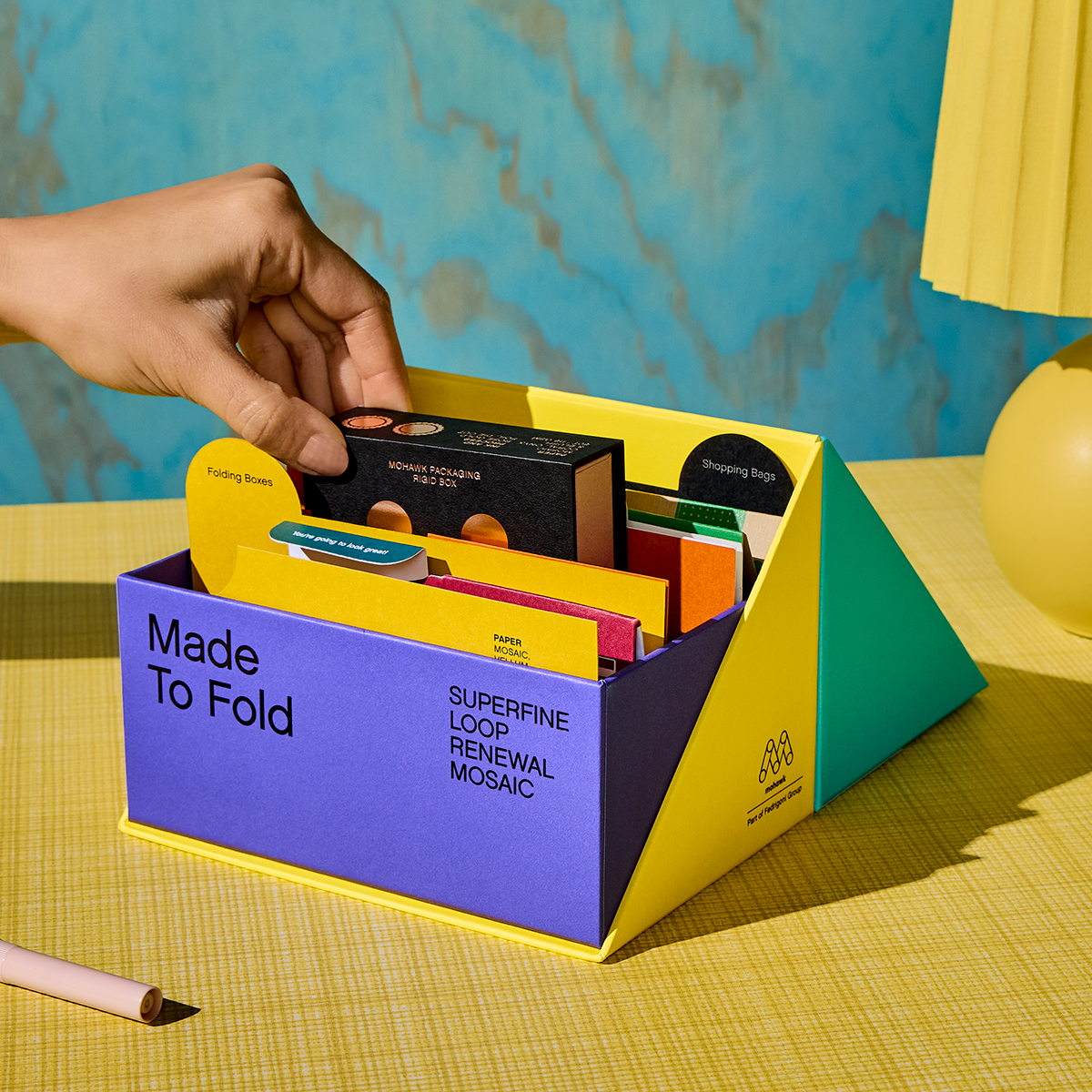
  • Control the spec. As with color and type, build a paper spec into your style guides to ensure a textural through-line across all communications.
  • Look for adaptability. A paper available in a variety of weights can keep brand consistency from double thick cover hangtags to text weight catalogs.
  • Don’t forget digital. Papers are available in many textures to maintain consistency between digital and offset printing, allowing consistency regardless of technique.

If you’re looking for inspiration, examples, and more tips on how to increase the impact of your next printed project through careful paper selection, click here to learn more and take your work from good to great.


Production Notes

PN-print-process
Print Process
Letterpress
capability_infoi
PN-designer
Designer
Cast Iron Design

Materials Used

Suggested Articles

Mohawk Blog

David Prince: Using Paper to Enhance Photography

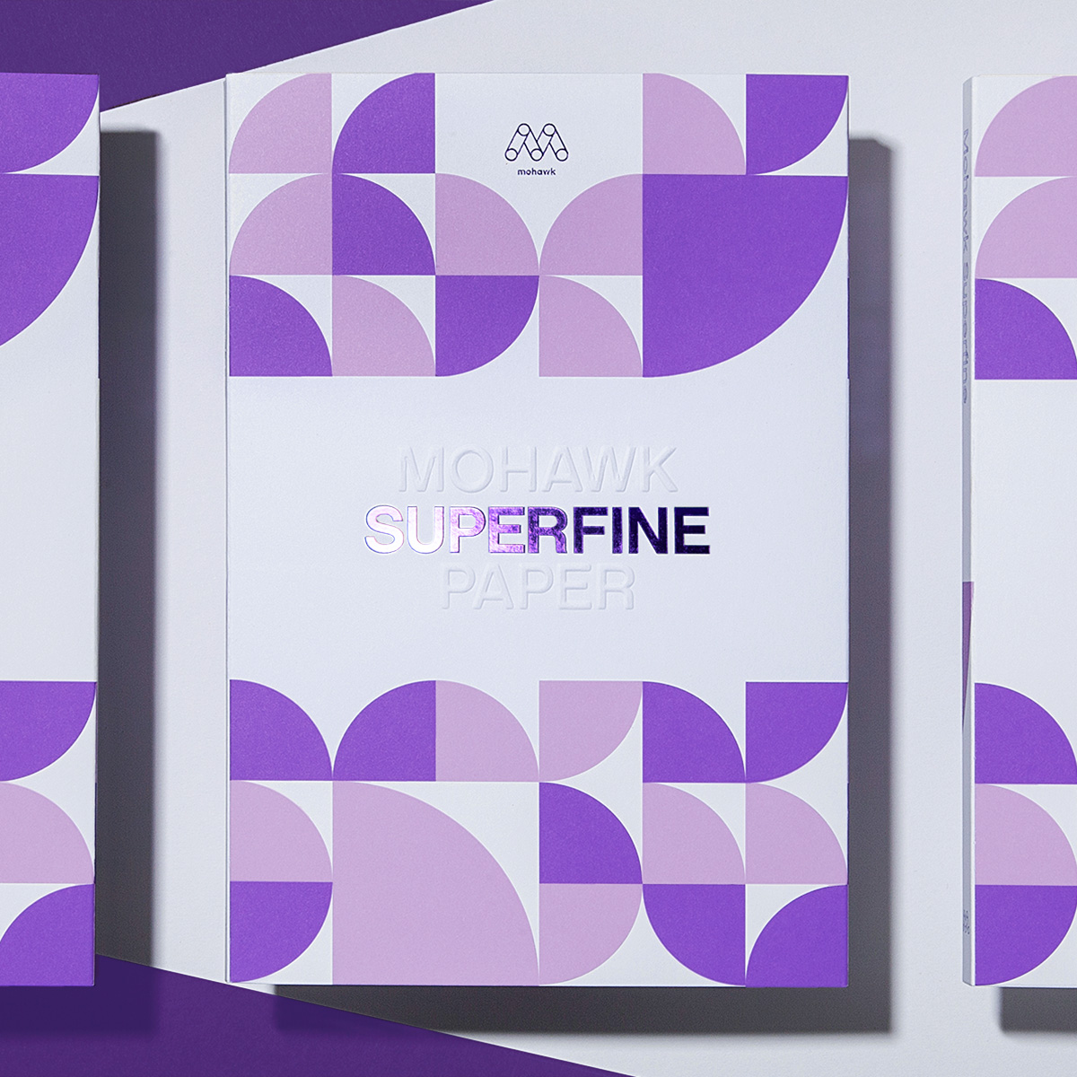
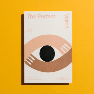
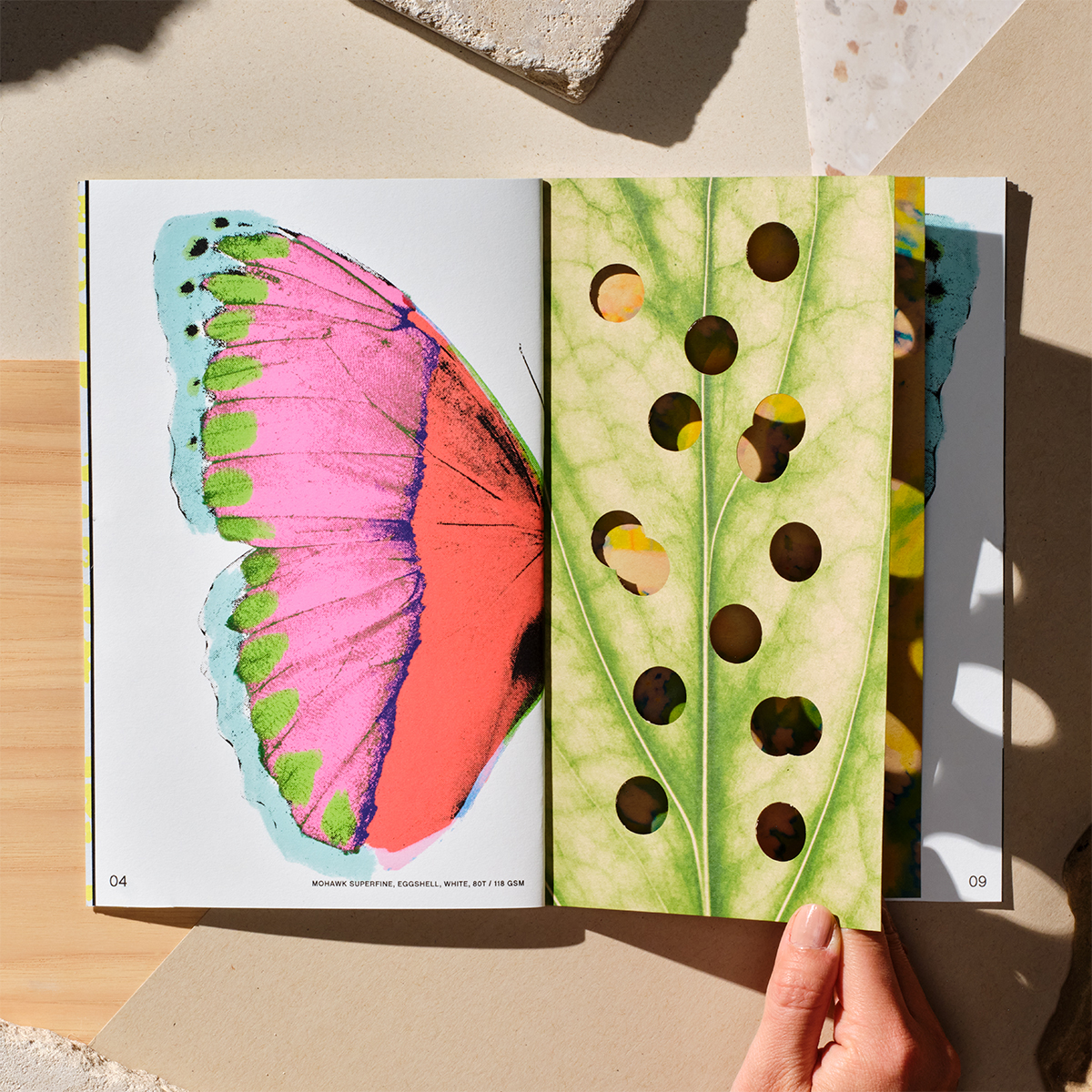
Paper choice can influence the way we experience photography in a printed piece. Lightly colored paper can elegantly shift the tone of an image, while subtly textured paper can make a big statement. Have you ever thought how choosing the right paper can add a unique and surprising layer of interest?

Mohawk Blog

Will Bryant: Use Paper as a Bonus Color

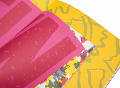
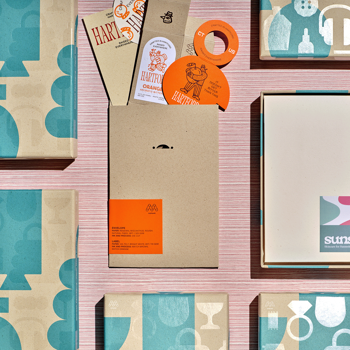
Colored paper opens up new possibilities for design and communication. Used with 4-color printing, it can become part of the image itself, giving you an additional color to work with. Have you ever thought about using colored paper as a bonus in your project?

Mohawk Blog

Perennials Fabrics: Matching Texture to Content

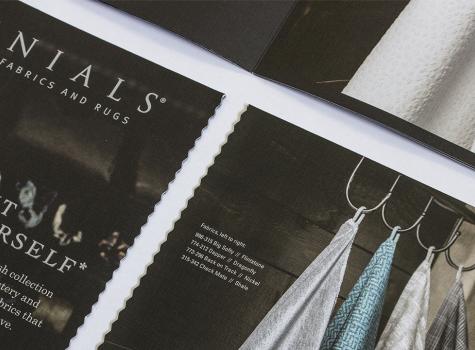
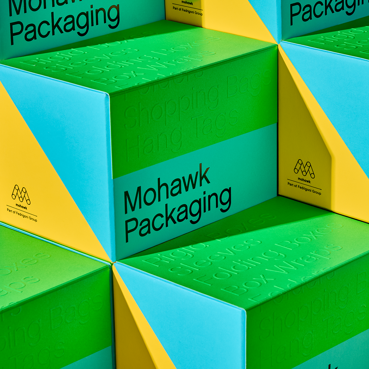
We’ve seen that the way paper feels is powerful and how we use it can make a difference. Every project is about something, be it adventure travel or single origin chocolate. Have you ever thought about finding textures in the content, product or stories that you can emulate through paper?