
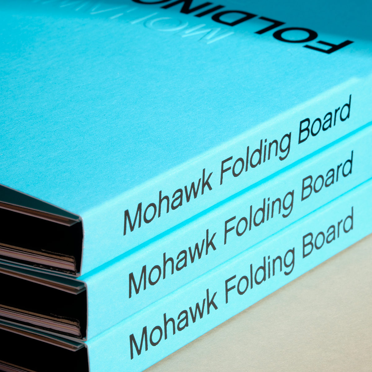


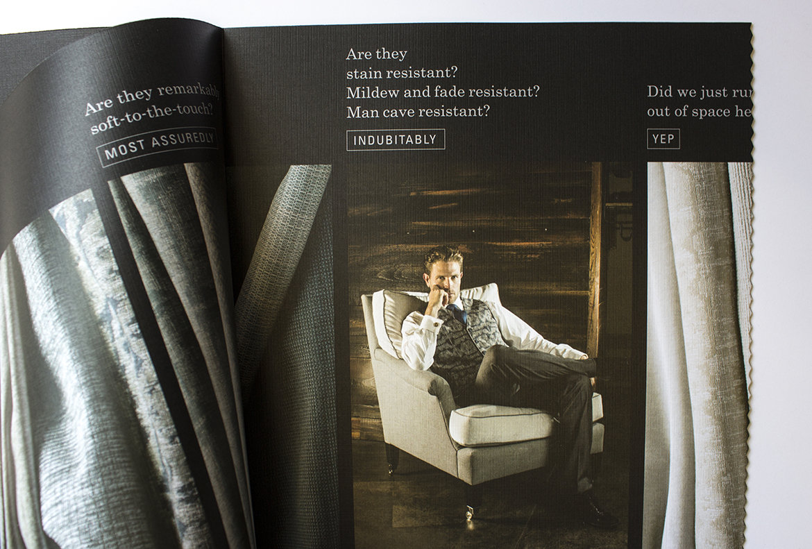
Perennials Fabrics: Matching Texture to Content
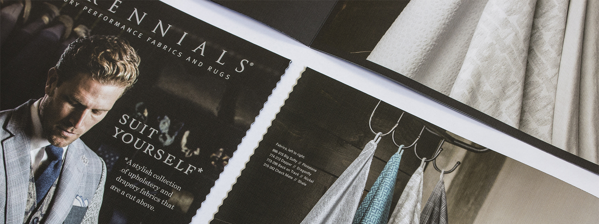
We’ve seen that the way paper feels is powerful and how we use it can make a difference. Every project is about something, be it adventure travel or single origin chocolate. Have you ever thought about finding textures in the content, product or stories that you can emulate through paper?

Tips on how to match texture to content:
- Look for the physical characteristics of your product. Consider weight and texture. Also take into account the environment where your product is at home.
- Match textures to character. Even a brand without physical texture has a character or emotion to convey. Find the texture that best represents the essence of your brand.
- Be open to an array of options. You don’t need a 100% texture match to achieve a striking effect. Something in the right ballpark can have similar results.
If you’re looking for inspiration, examples, and more tips on how to increase the impact of your next printed project through careful paper selection, click here to learn more and take your work from good to great.
Production Notes
Offset Printing
A commonly used printing technique in which the inked image is transferred from a plate to a rubber blanket, then to the printing surface. When used in combination with the lithographic process, which is based on the repulsion of oil and water, the offset technique employs a flat (planographic) image carrier on which the image to be printed obtains ink from ink rollers, while the non-printing area attracts a water-based film (called "fountain solution"), keeping the non-printing areas ink-free.
Metallic Inks
Metallic powders in a varnish base create images with metallic luster. Leafing inks which have metal flakes that rise to the top of the ink mixture have more shine, but increased rub off. The metal flakes in non-leafing metallic inks sink down with less rub off and a little less shine. Non-leafing inks with a dull varnish or aqueous coating perform most reliably on uncoated paper.
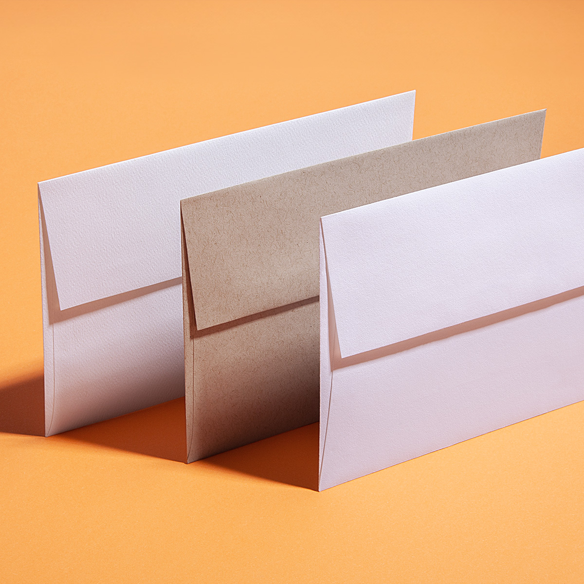
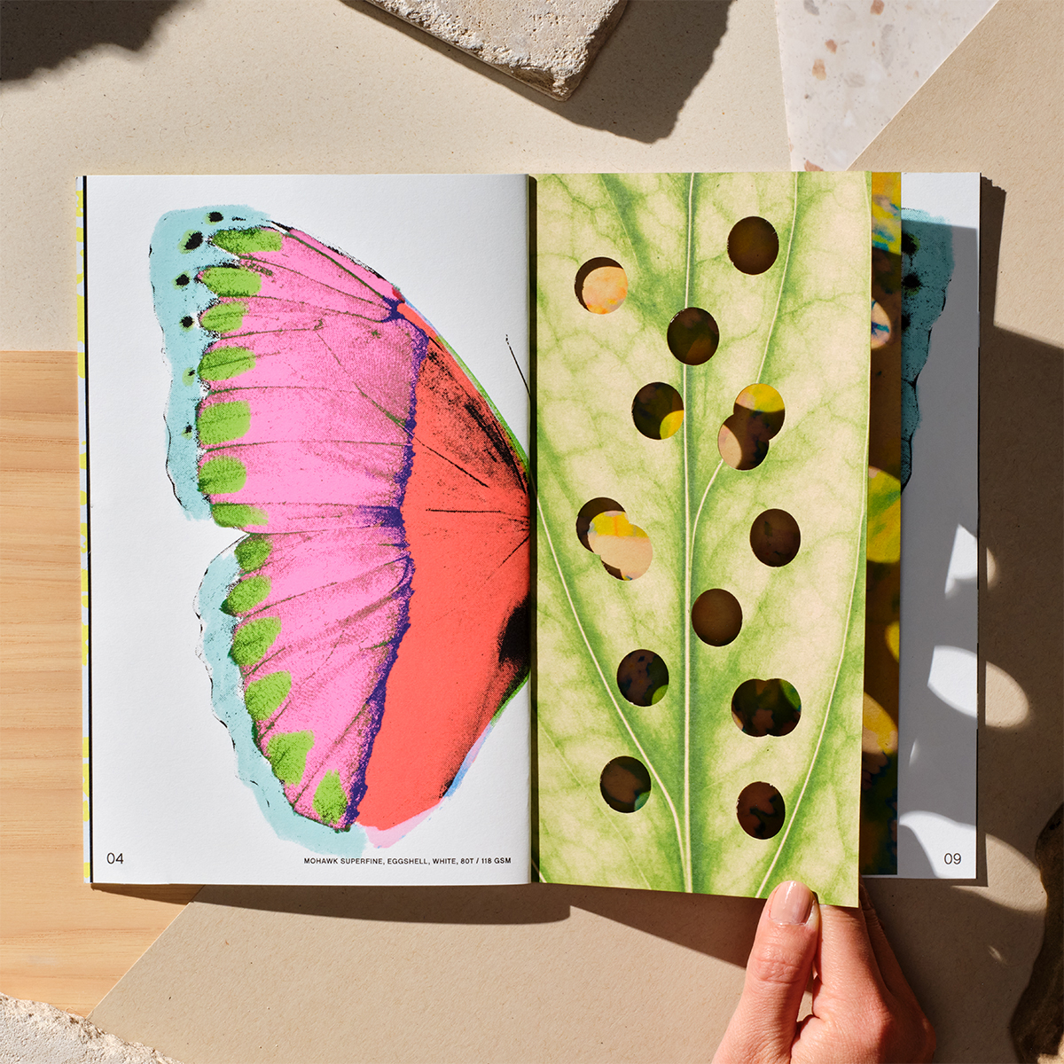
Materials Used

Suggested Articles
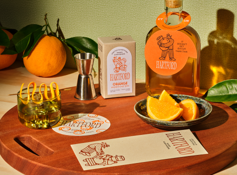
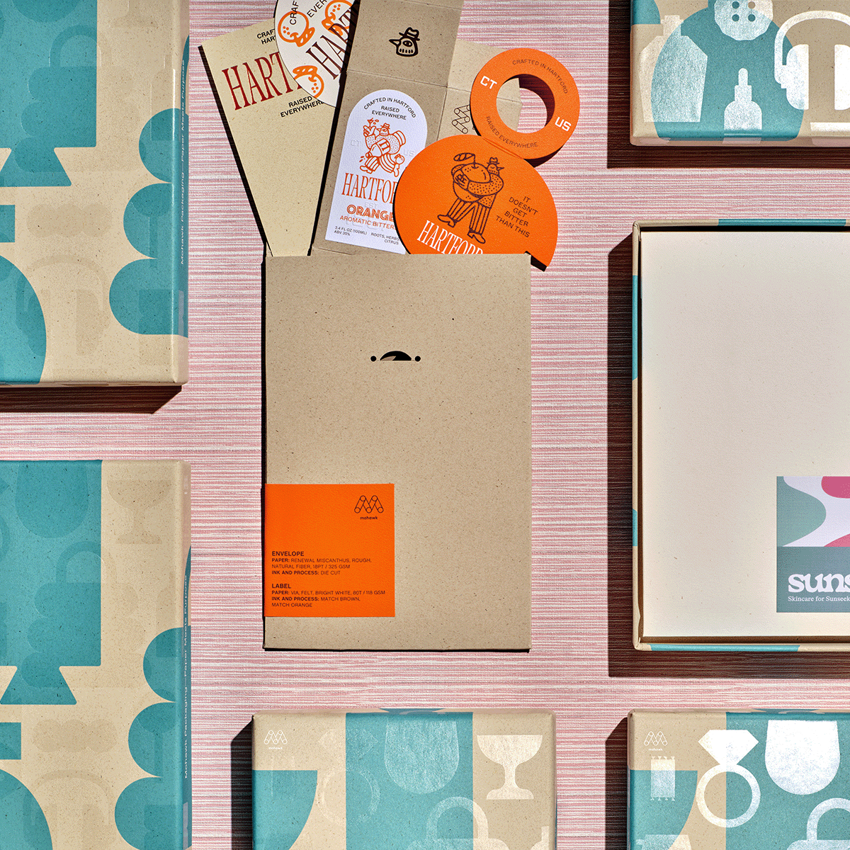
If Sunsalt is a sunlit afternoon, Hartford is the quiet hour that follows — unhurried, intentional, and crafted with care.
In a world saturated with digital impressions, the brands that endure are the ones you can feel.
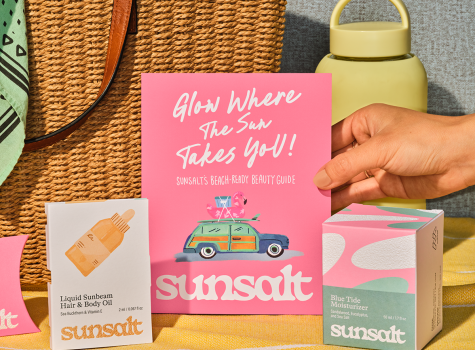
Sunsalt's identity is built on warmth, ease, and the quiet pleasure of a long summer day — the kind you feel on your skin long after the sun has set.