





Paper Meets Purpose: Explore Hartford
If Sunsalt is a sunlit afternoon, Hartford is the quiet hour that follows — unhurried, intentional, and crafted with care.
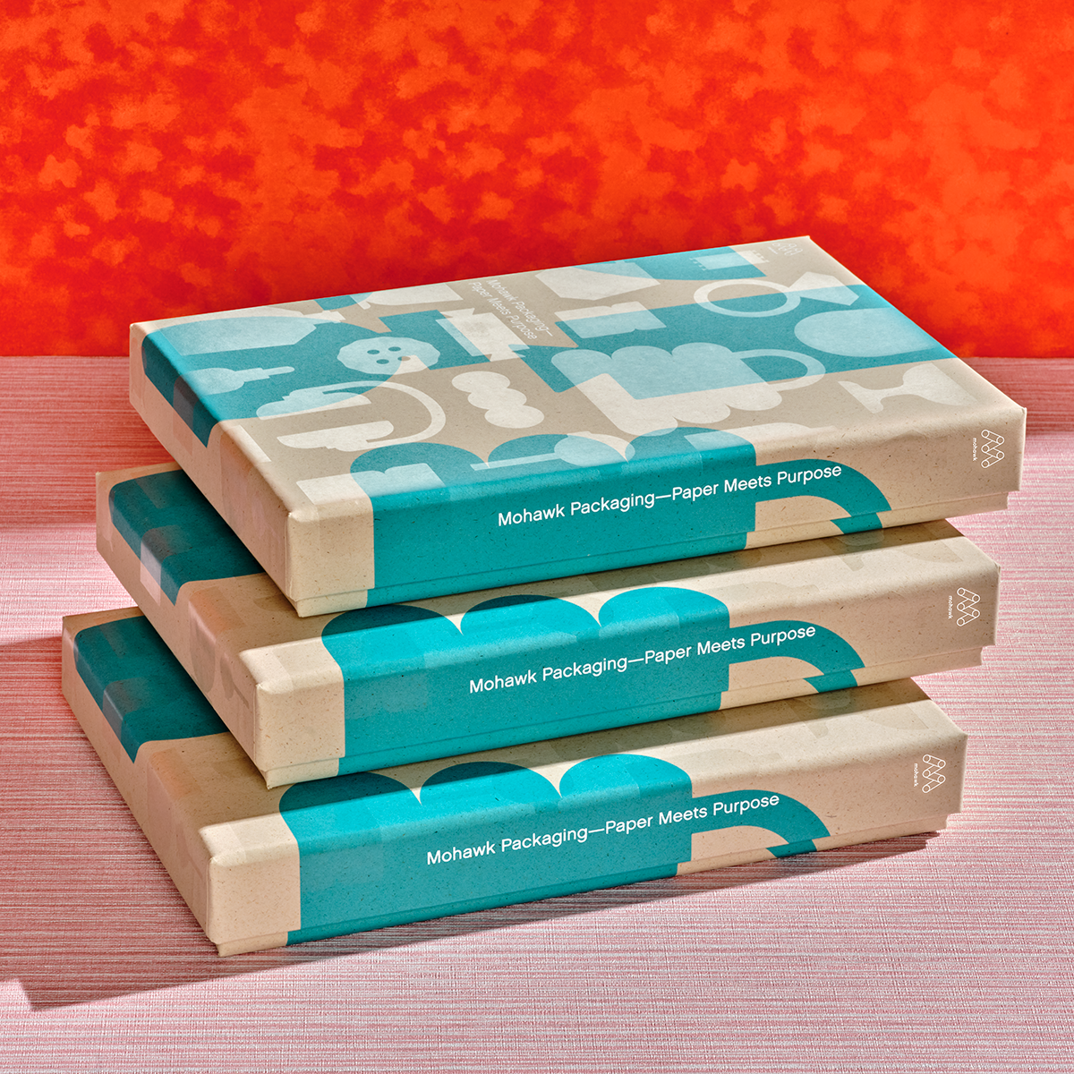
Texture as a Flavor Story
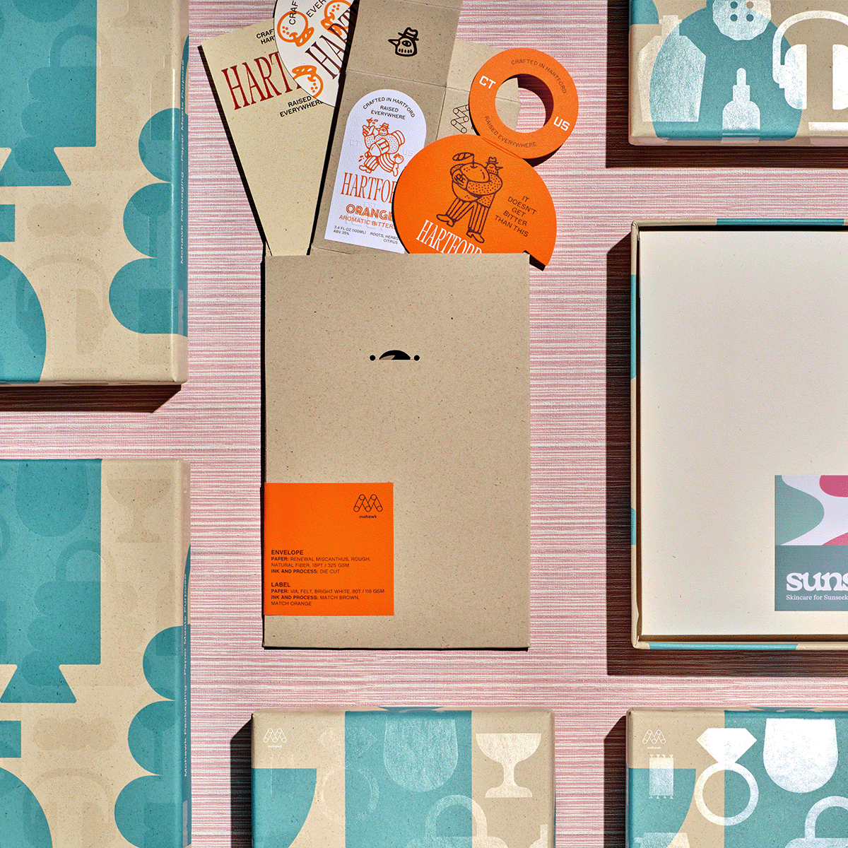
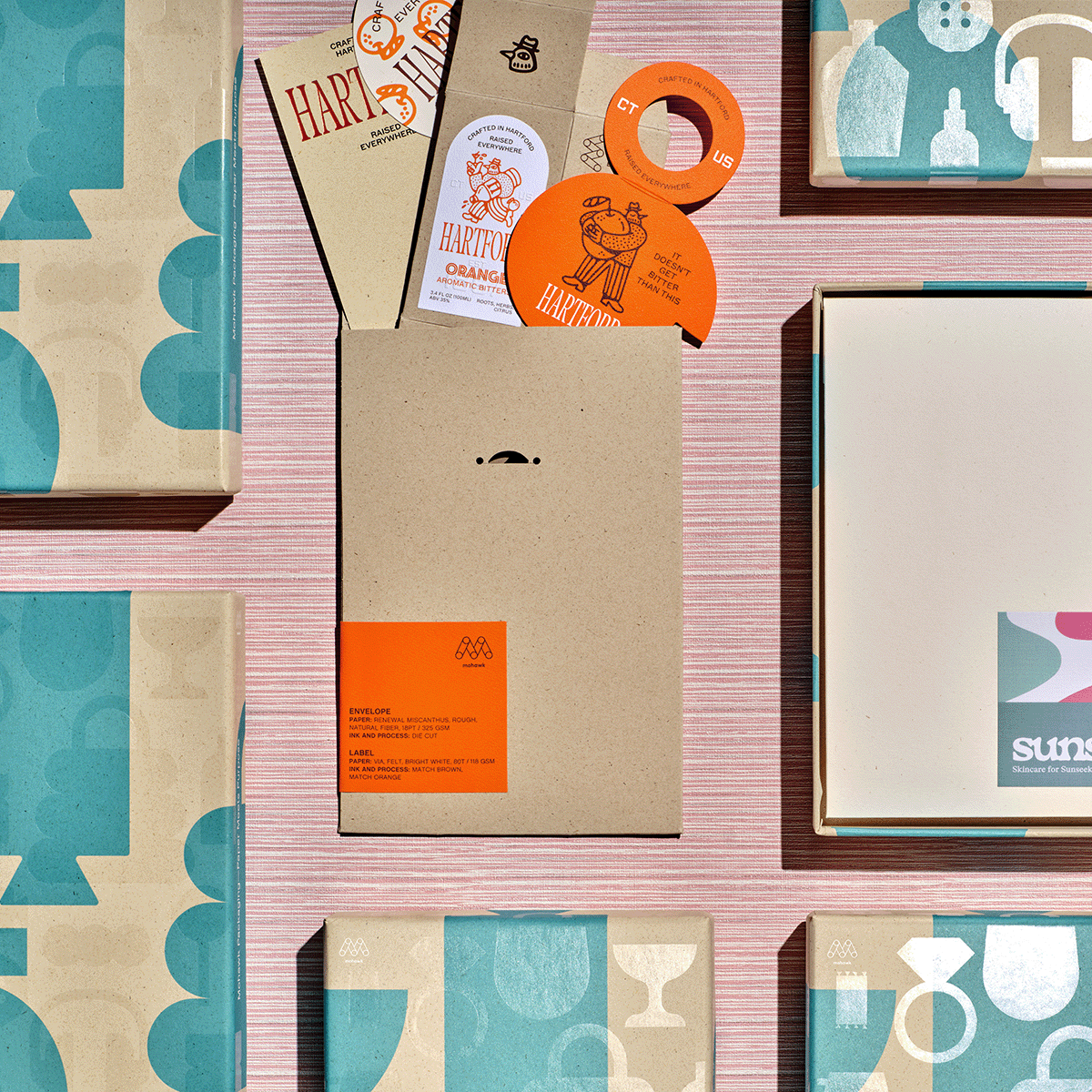
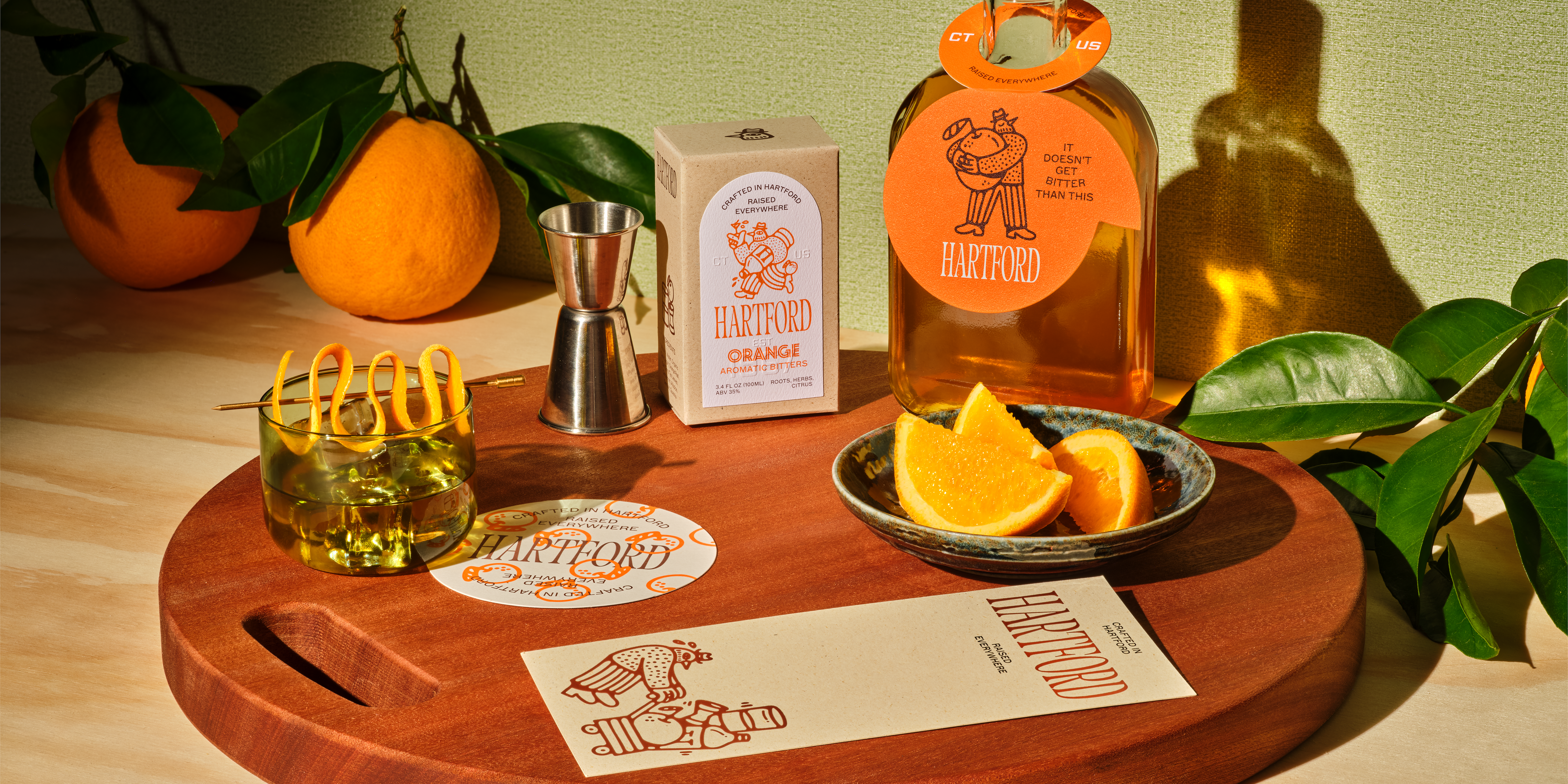
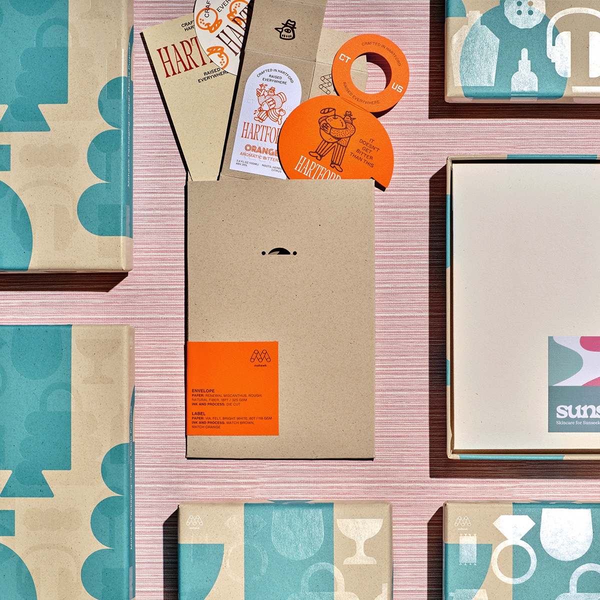
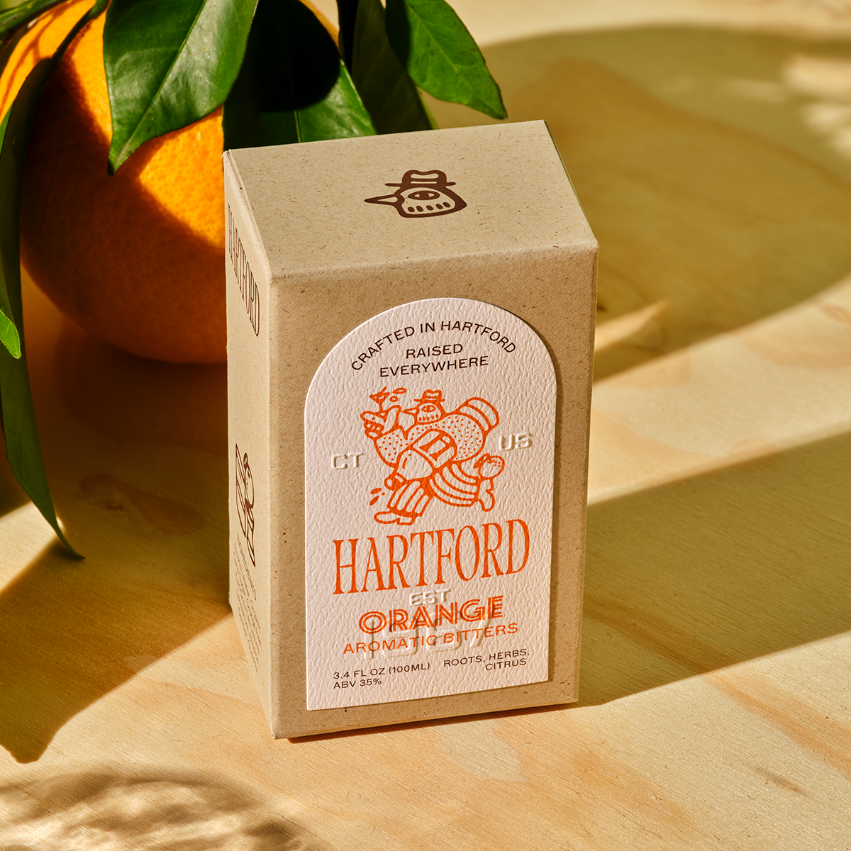
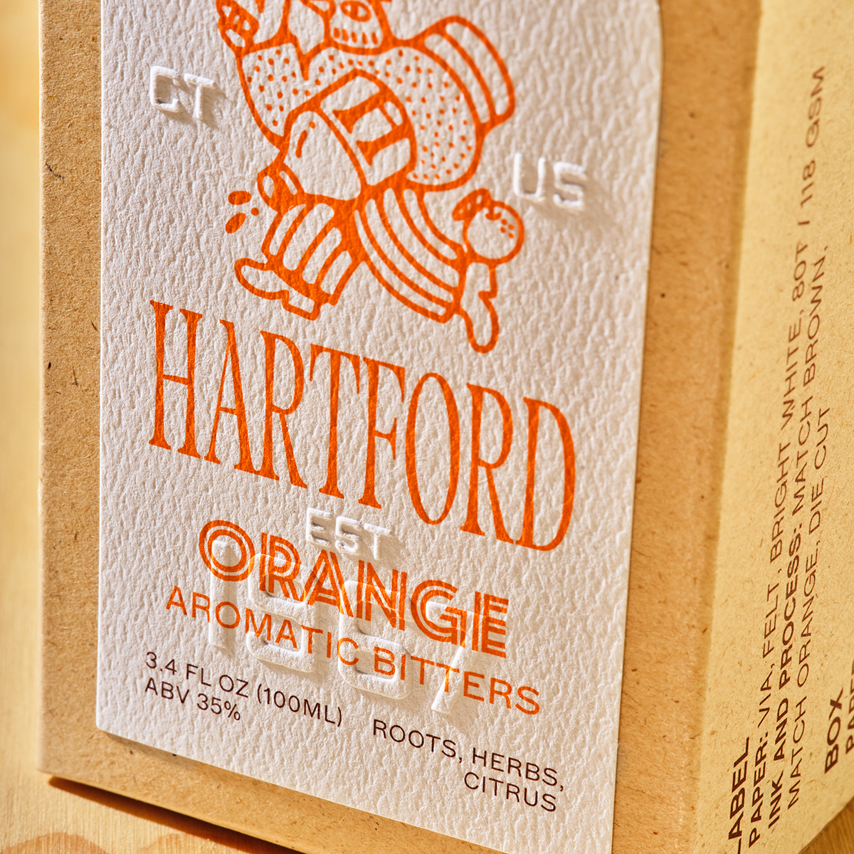
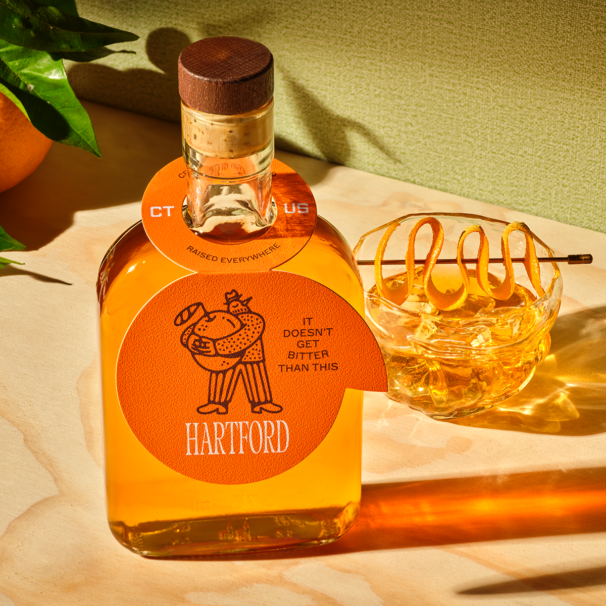
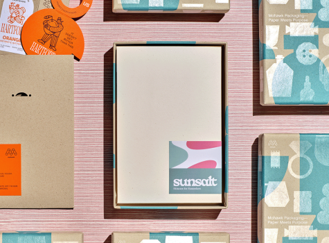
Hartford’s brand system uses texture as narrative. The Via Felt label (Bright White, 80t) appears on both the carrier envelope and the folding box, adding a soft, tactile surface that subtly echoes the feel of citrus rind. It’s a sensory cue that reinforces the bitters’ flavor story.
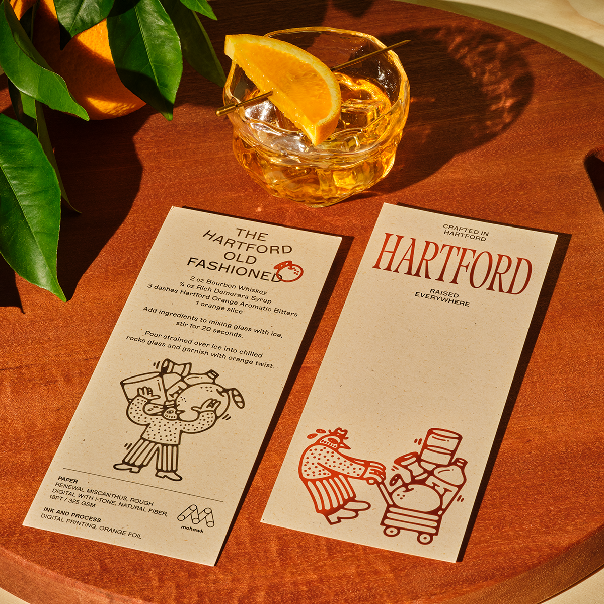
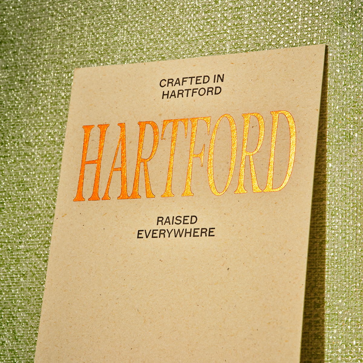
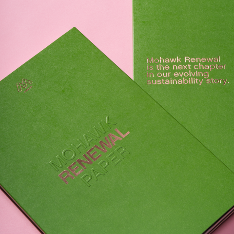
The folding box continues this material language with Renewal Miscanthus, Rough, Natural Fiber (18pt), a deliberate choice that keeps the brand grounded in natural texture and fiber. The recipe card, printed on Renewal Miscanthus Rough with i‑Tone (Natural Fiber, 18pt), extends that story with a surface that feels both crafted and utilitarian, like something you’d keep tucked in a kitchen drawer or on your bar cart for years.
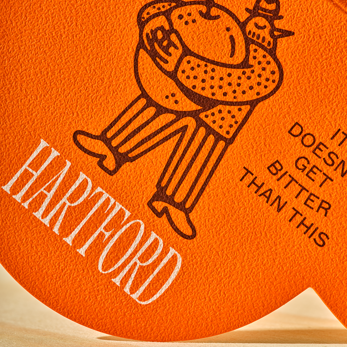
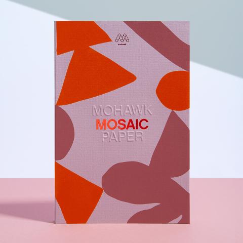
Then there’s the bottle neck hangtag, produced on Mosaic Coral/Vellum, Aspen (20pt). Its subtle, pebbled texture creates a quiet moment of surprise — a tactile flourish that ties back to the brand’s orange accents and citrus-forward profile.
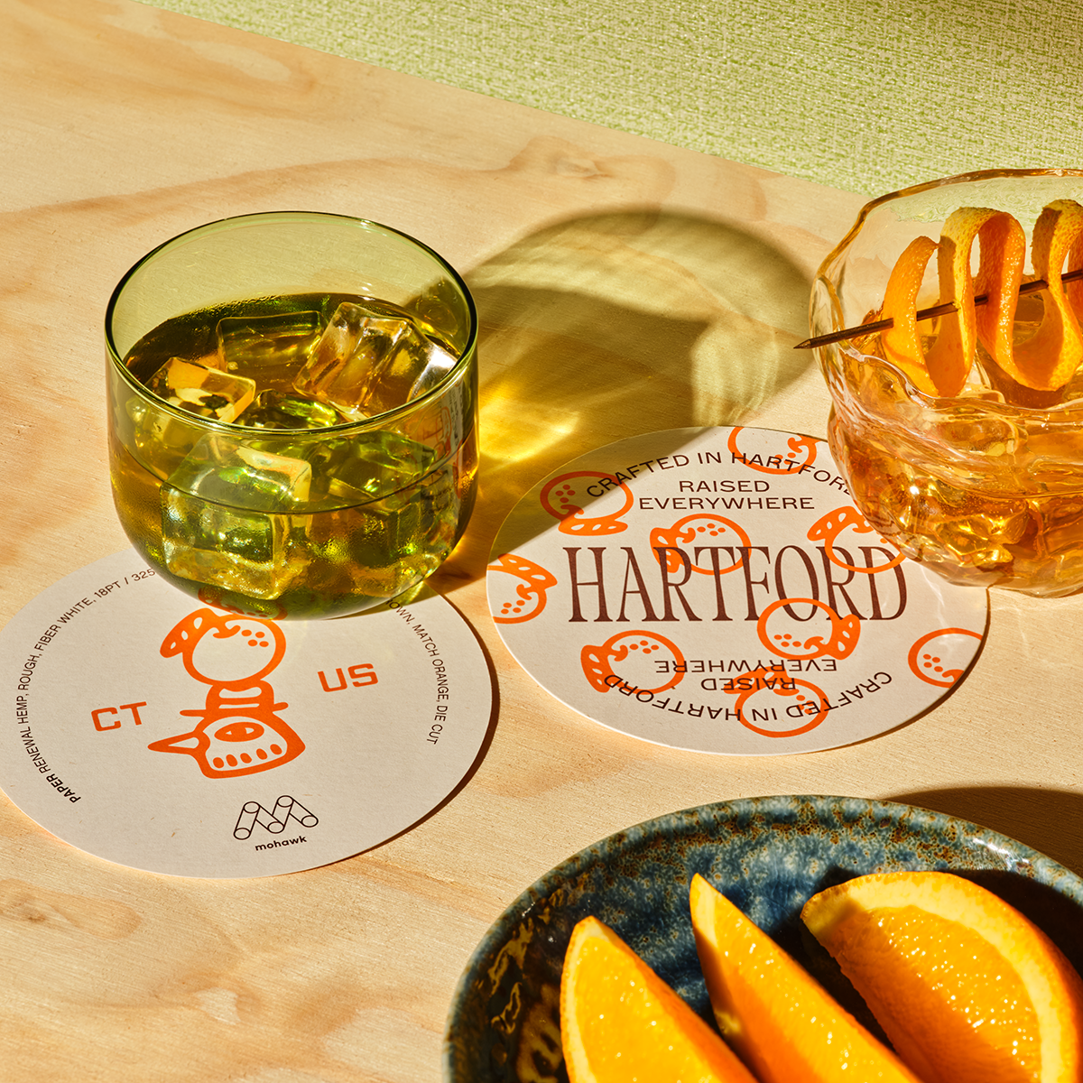
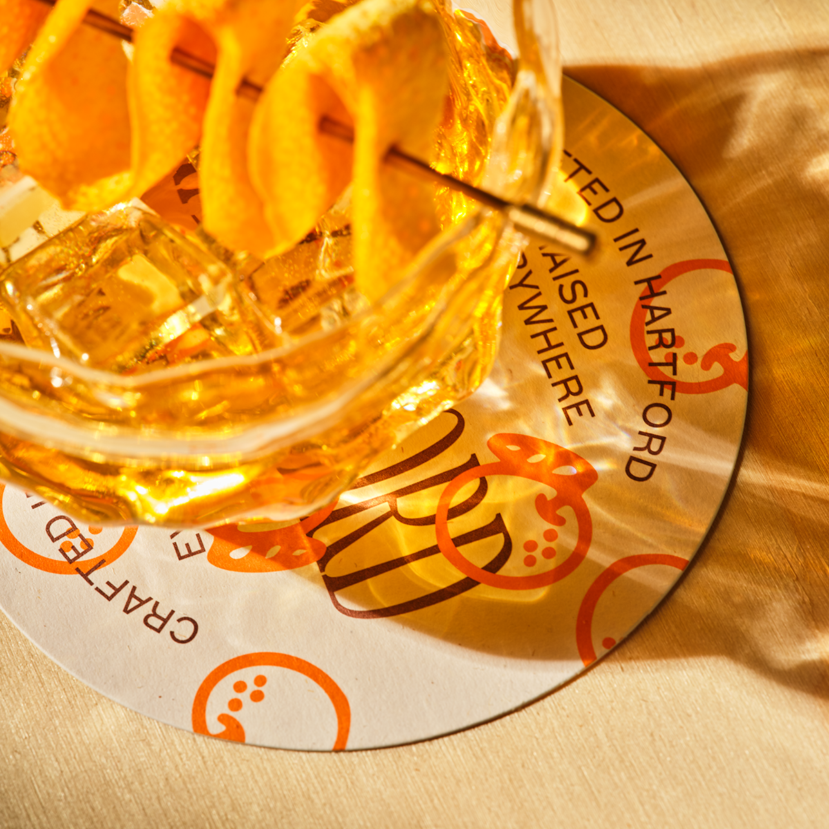
Finally, the coaster, made from Renewal Hemp, Rough, Fiber White (18pt), brings the system full circle. The handcrafted look and feel is a small but meaningful reminder that Hartford is meant to be enjoyed slowly, one sip at a time.
Cohesion Through Material
What makes Hartford compelling isn’t just the individual papers, but the way they work together. Renewal Miscanthus, Renewal Hemp, Via Felt, and Mosaic Coral/Vellum form a cohesive brand story — one that feels handmade, grounded, and deeply considered. The materials don’t just support the brand; they are the brand.
Every touchpoint reinforces the same idea: this is a product shaped by patience, craft, and care. A product that rewards slowing down.
Material-First Branding, Revisited
Hartford stands as a counterpoint to Sunsalt, yet both brands share a common truth: when materials are chosen with intention, they become powerful storytelling tools. In Hartford’s case, paper becomes a proxy for process — a way to communicate authenticity, craft, and flavor before the bottle is even opened.
This is the essence of Paper Meets Purpose. Whether bright and breezy or grounded and artisanal, brands gain depth when their materials do more.
If you’re exploring how paper can elevate your own brand storytelling, we’d love to help you find the right starting point.
Production Notes
Offset Printing
A commonly used printing technique in which the inked image is transferred from a plate to a rubber blanket, then to the printing surface. When used in combination with the lithographic process, which is based on the repulsion of oil and water, the offset technique employs a flat (planographic) image carrier on which the image to be printed obtains ink from ink rollers, while the non-printing area attracts a water-based film (called "fountain solution"), keeping the non-printing areas ink-free.
i-Tone
Mohawk’s proprietary Digital with i-Tone surface has a unique affinity for both liquid and dry toners, offering breakthrough performance on HP Indigo presses and color digital production presses using dry toner. Mohawk’s i-Tone papers have exceptional transfer, adhesion and image durability on smooth and textured papers.
Materials Used

Suggested Articles
In a world saturated with digital impressions, the brands that endure are the ones you can feel.
Sunsalt's identity is built on warmth, ease, and the quiet pleasure of a long summer day — the kind you feel on your skin long after the sun has set.

Luxury packaging is more than just a mere container - it’s a powerful brand statement that resonates long before your product is revealed.