



Paper Meets Purpose: Explore Sunsalt
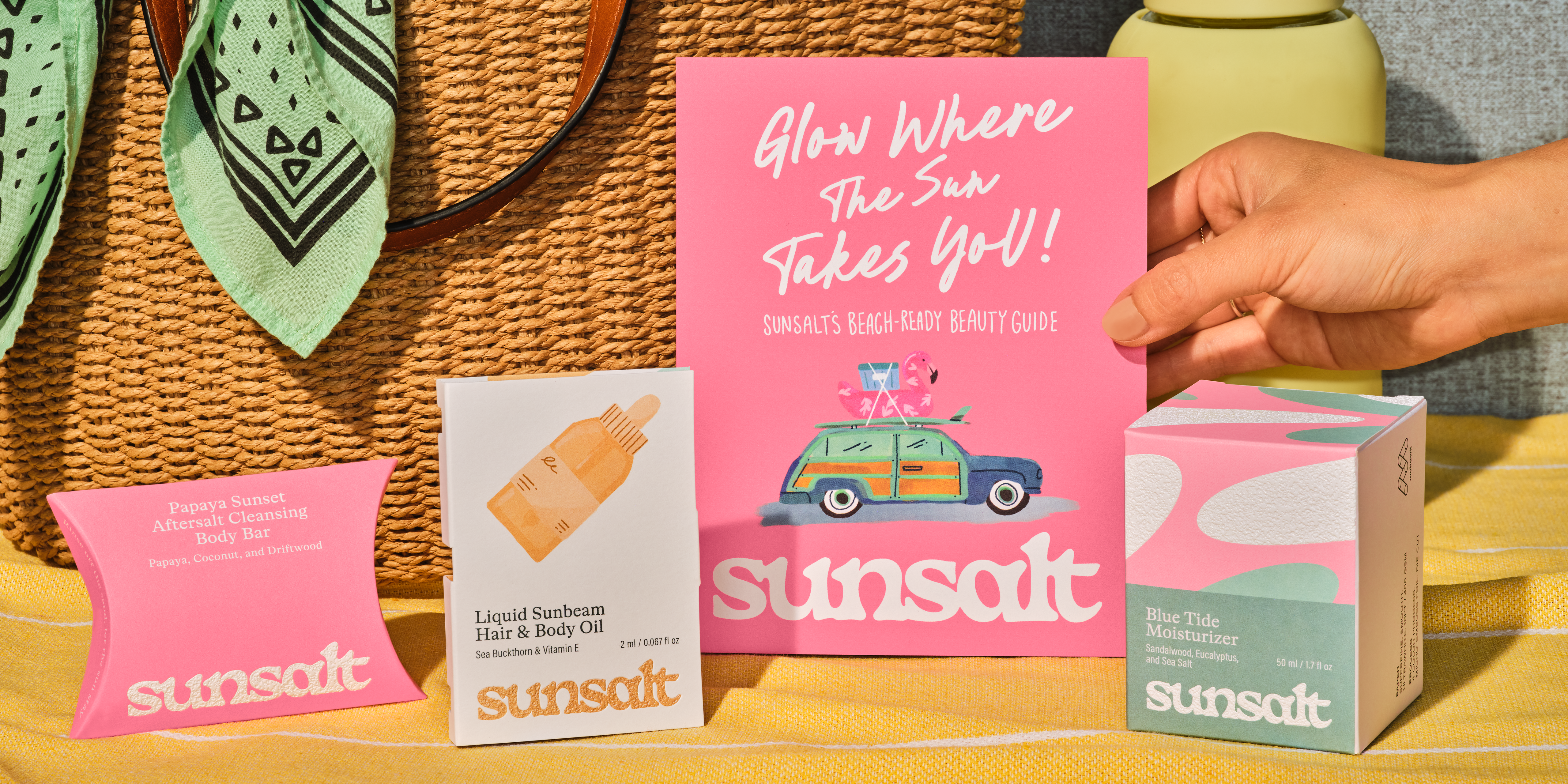
Sunsalt's identity is built on warmth, ease, and the quiet pleasure of a long summer day — the kind you feel on your skin long after the sun has set.
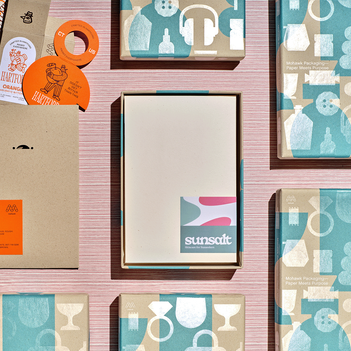
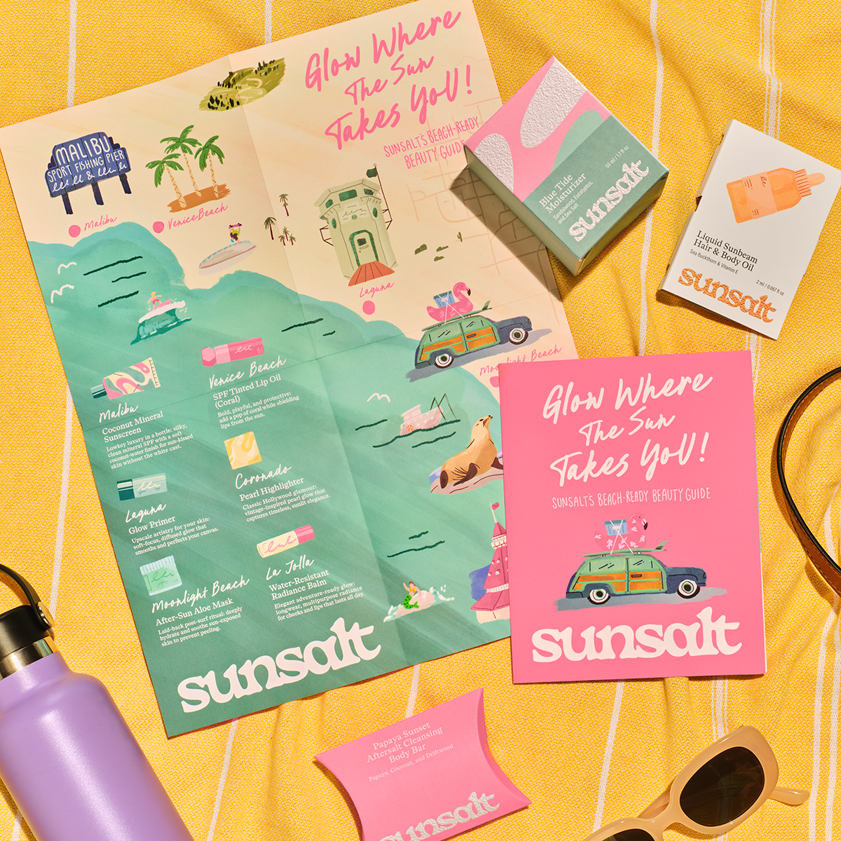
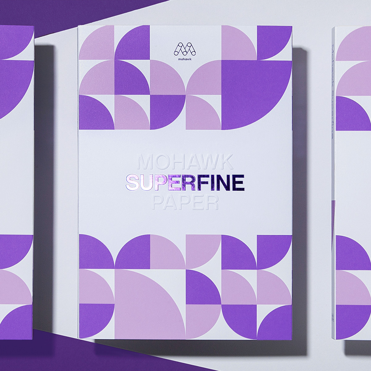
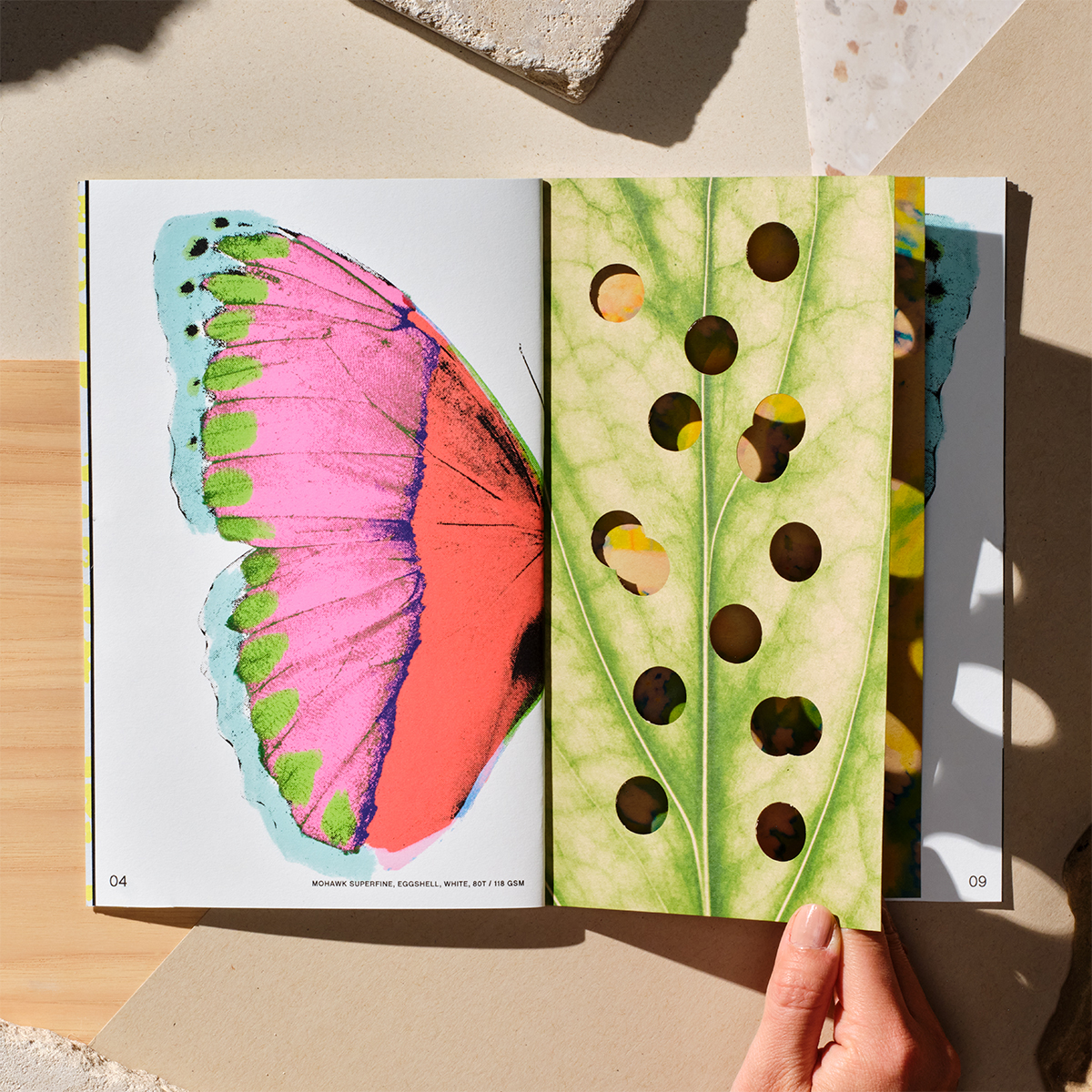
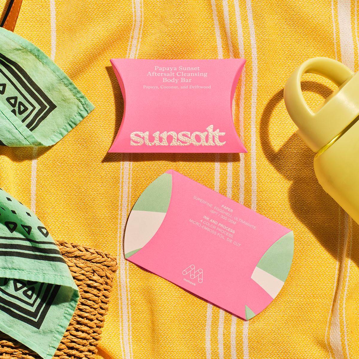
Inside, the system unfolds through a series of Superfine papers chosen for their superb formation and versatility:
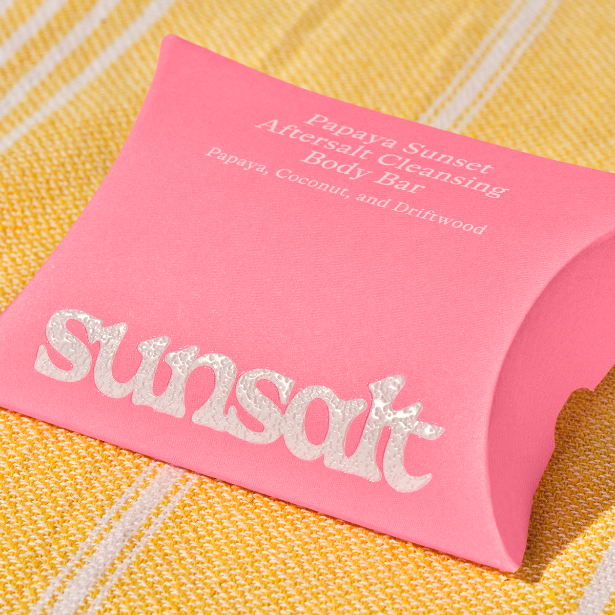
• Pillow Box: Superfine Eggshell, Ultrawhite, 16pt
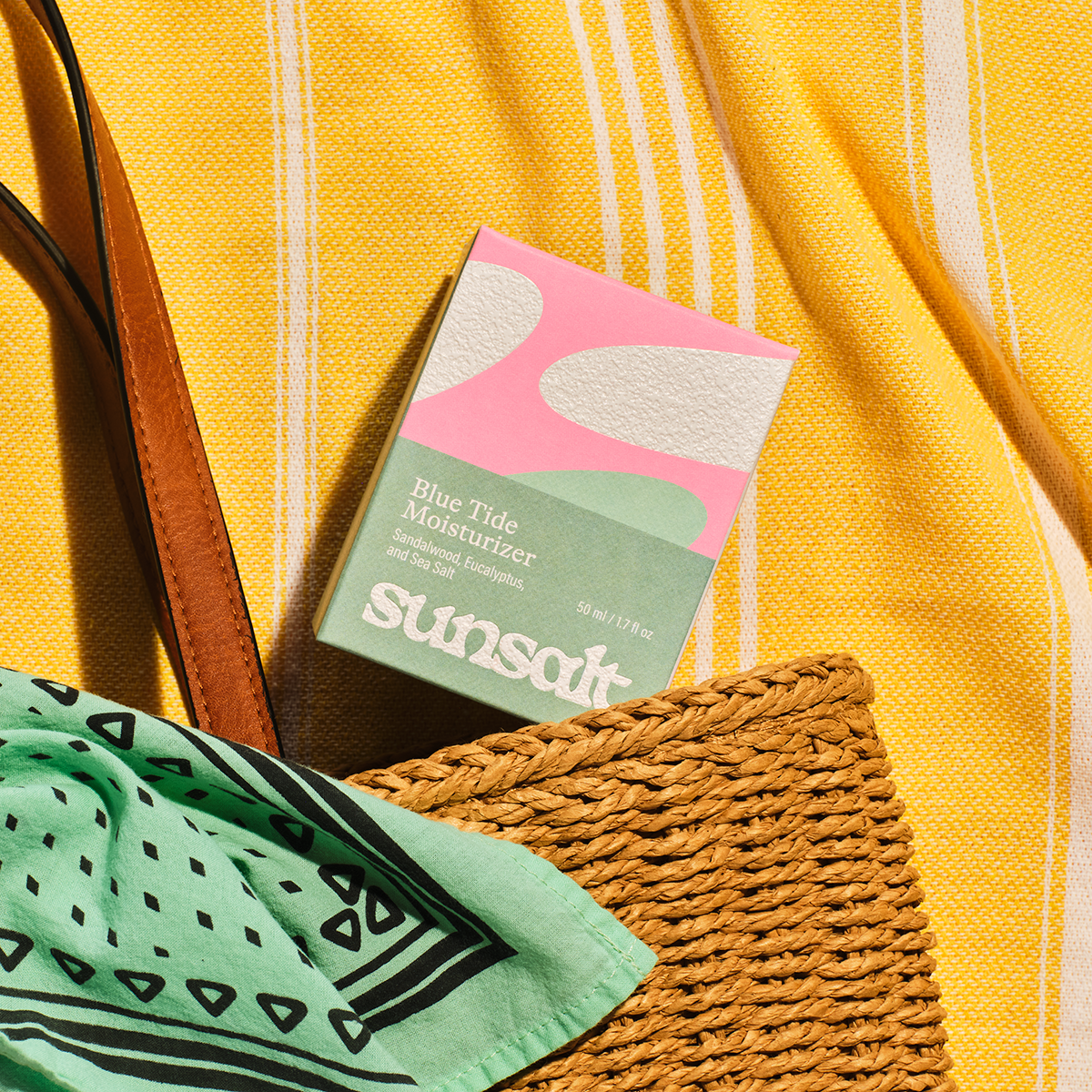
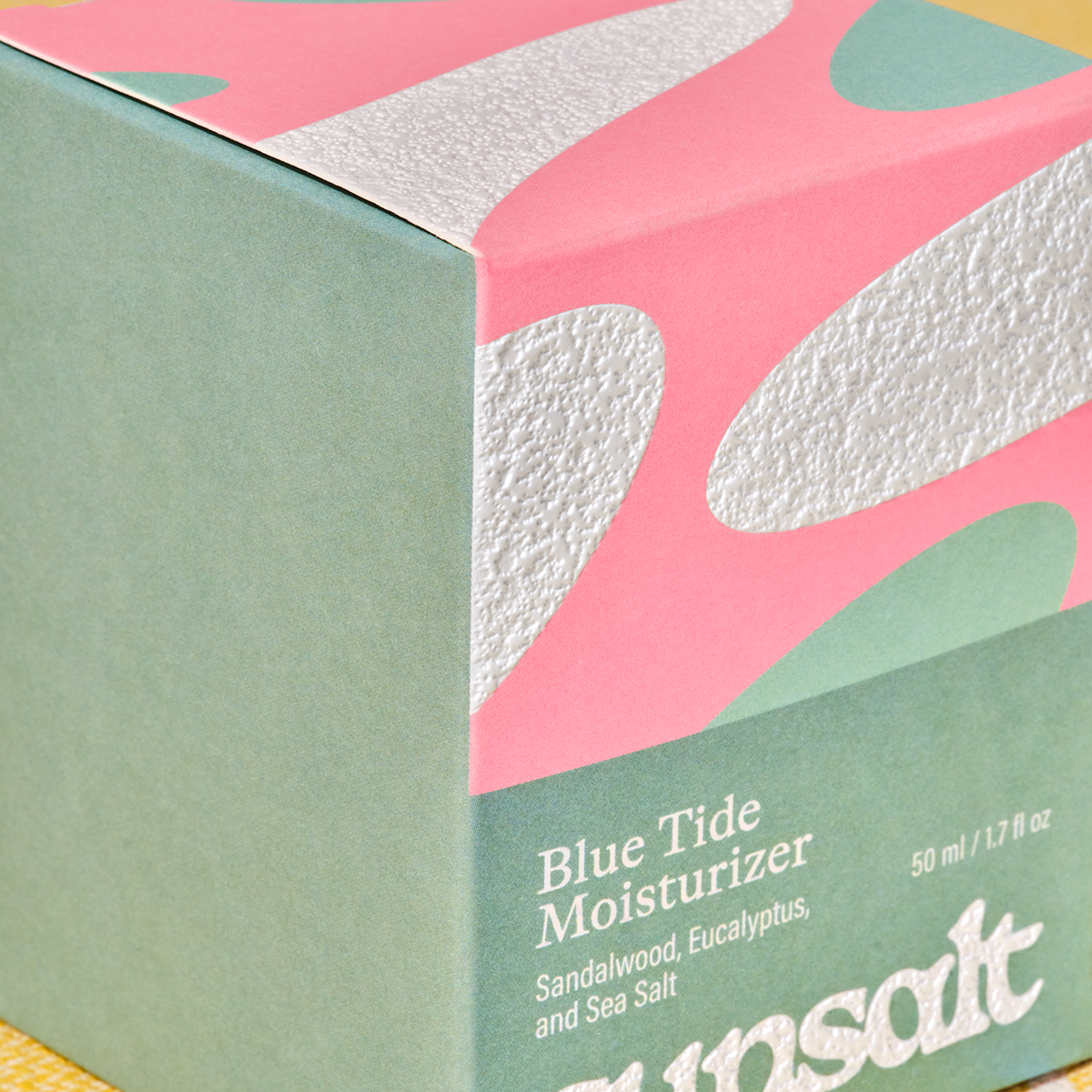
• Folding Box: Superfine Smooth, Ultrawhite, 18pt
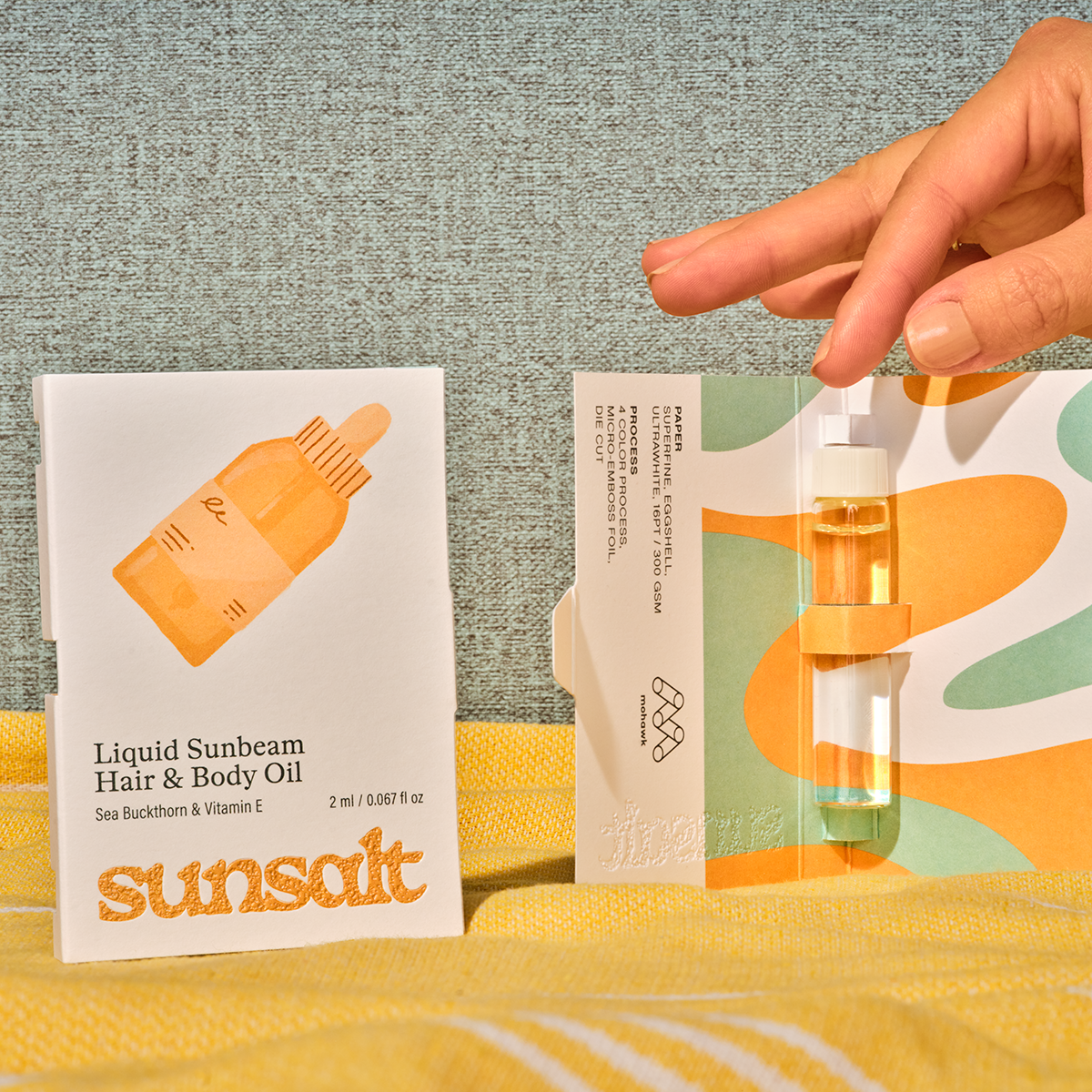
• Vial Card: Superfine Eggshell, Ultrawhite, 16pt
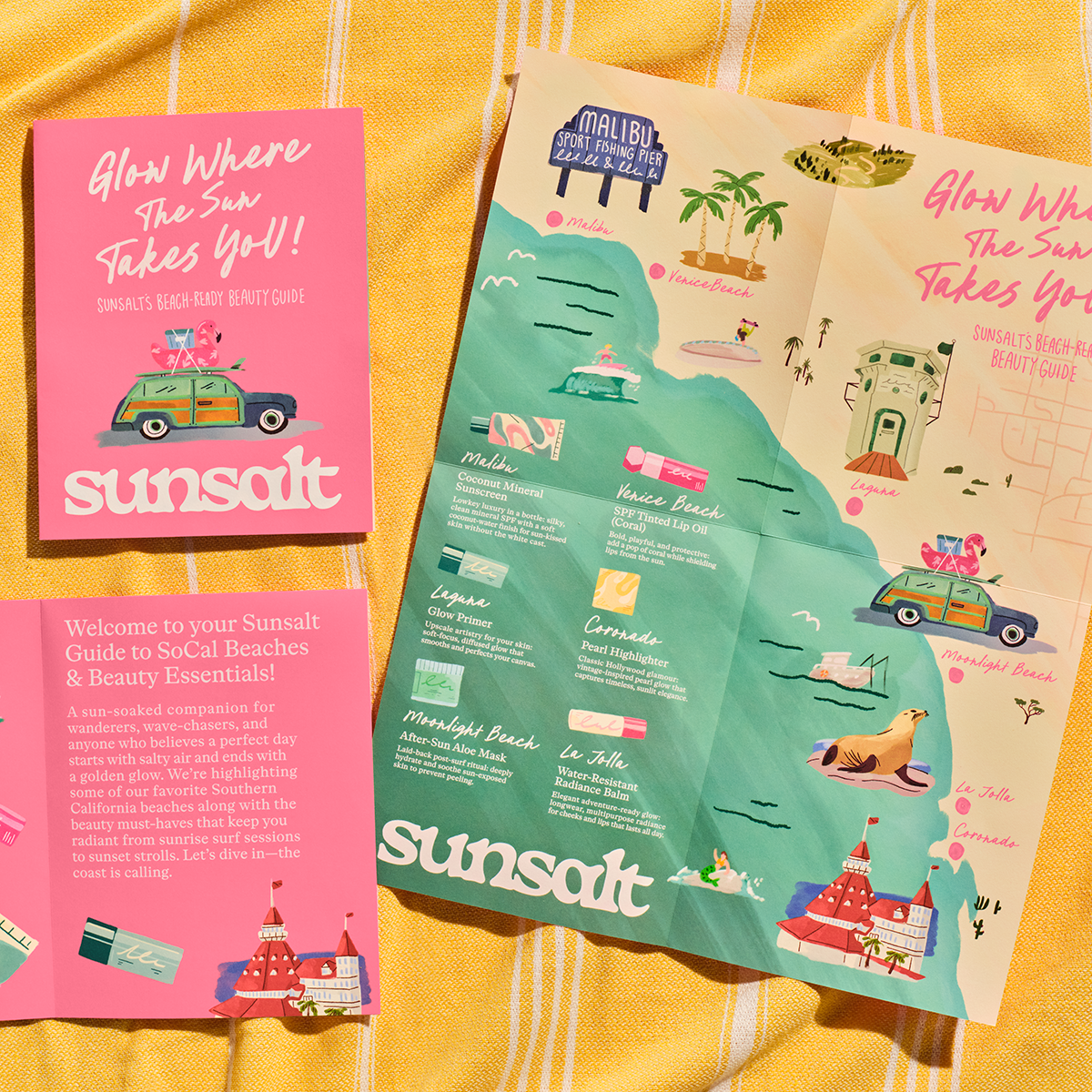
• Brochure/Poster: Superfine Eggshell with i-Tone, Ultrawhite, 80t
Each piece feels crisp, elevated, and intentional — a balance of refinement and ease that mirrors Sunsalt’s brand promise.
Texture as Storytelling
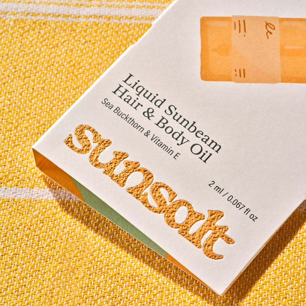
Beyond the papers themselves, Sunsalt uses texture to deepen its narrative. A micro‑emboss pattern mimics the subtle irregularity of sand, creating a tactile moment that instantly transports you to the beach. It’s a small detail, but it carries weight. Texture becomes memory. Touch becomes place.
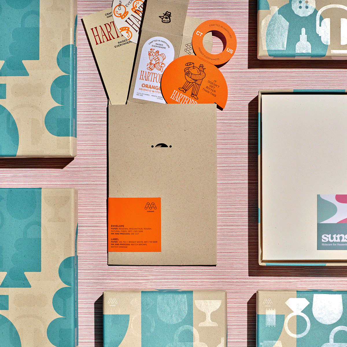
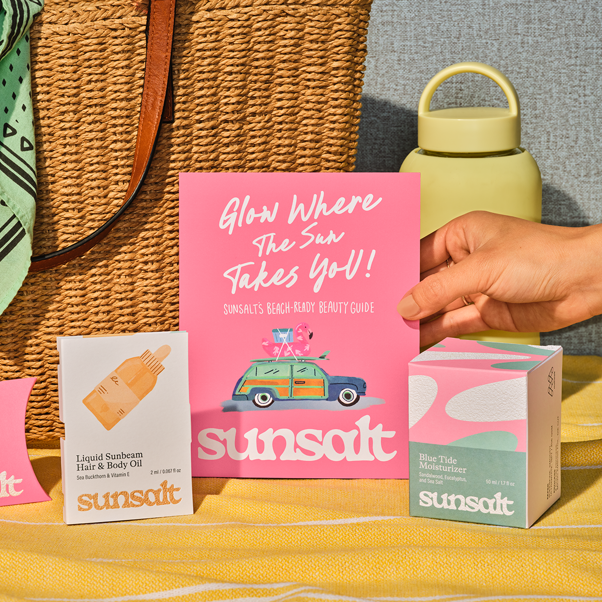
Combined with the watercolor artwork and sun-washed palette, the system achieves cohesion. Every component — from the envelope that begins the experience to the poster that concludes it — reinforces the same quiet promise: sun, surf, and sand.
Material-First Branding in Action
Sunsalt is more than a brand system. It’s a case study in how material choices can shape emotion. By grounding the brand in papers that feel natural, warm, and tactile, Sunsalt becomes more than a skincare line. It becomes a sensory escape.
This is the heart of Paper Meets Purpose: when designers choose materials with intention, paper becomes a storytelling device. It sets the tone before a single word is read. It creates connection before the product is even revealed. Sunsalt shows what’s possible when you let the material lead.
Production Notes
Materials Used

Suggested Articles
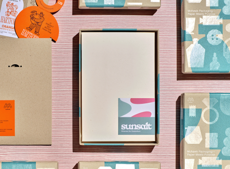
In a world saturated with digital impressions, the brands that endure are the ones you can feel.

In today's competitive marketplace, packaging plays a crucial role in brand perception and consumer satisfaction.

Luxury packaging is more than just a mere container - it’s a powerful brand statement that resonates long before your product is revealed.