


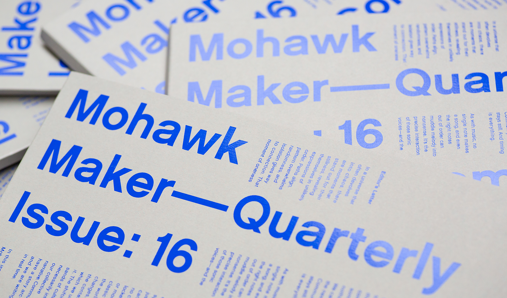
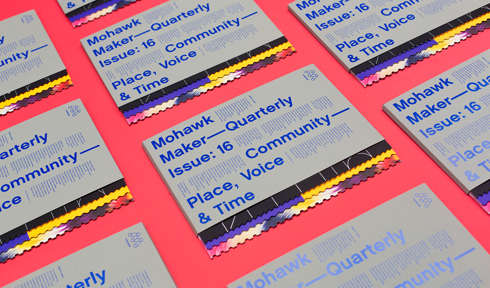
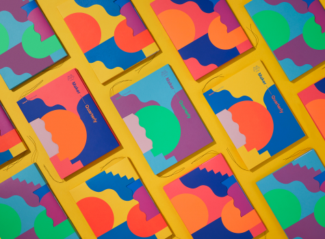
Mohawk Maker Quarterly Issue #16: Community
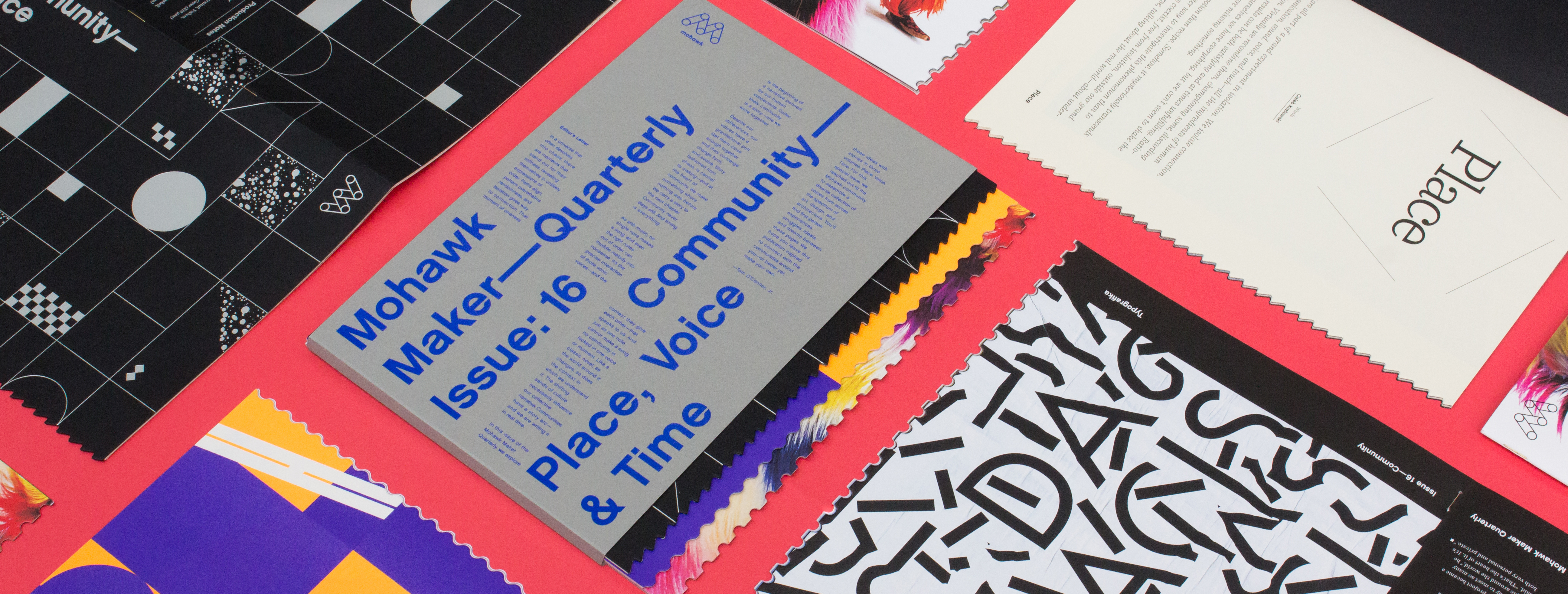
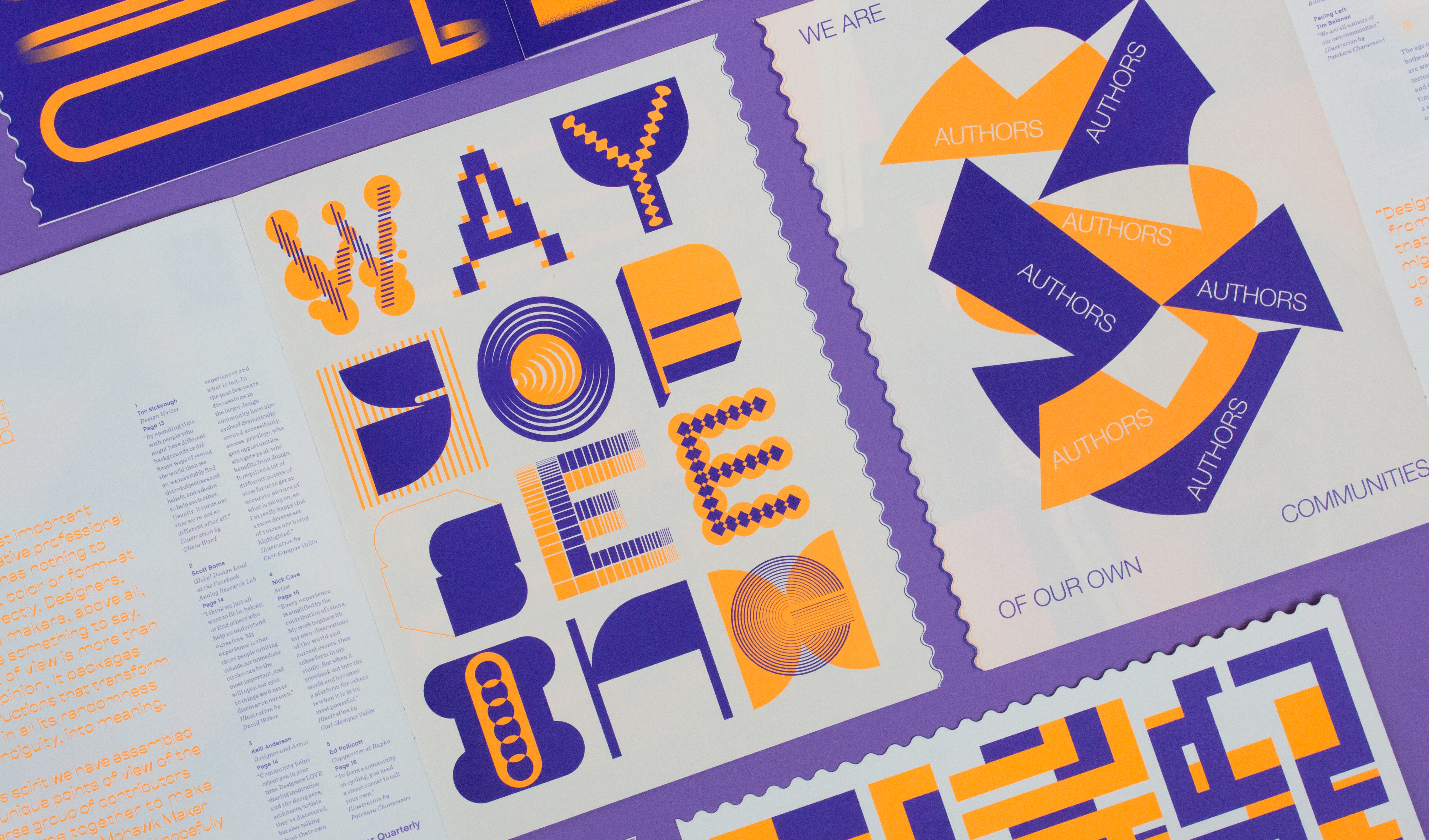
Nothing is created in a vacuum. Our community—the always-evolving context of our physical, social, and emotional lives—has everything to do with how we make and view art.

Production Notes
Offset Printing
A commonly used printing technique in which the inked image is transferred from a plate to a rubber blanket, then to the printing surface. When used in combination with the lithographic process, which is based on the repulsion of oil and water, the offset technique employs a flat (planographic) image carrier on which the image to be printed obtains ink from ink rollers, while the non-printing area attracts a water-based film (called "fountain solution"), keeping the non-printing areas ink-free.
i-Tone
Mohawk’s proprietary Digital with i-Tone surface has a unique affinity for both liquid and dry toners, offering breakthrough performance on HP Indigo presses and color digital production presses using dry toner. Mohawk’s i-Tone papers have exceptional transfer, adhesion and image durability on smooth and textured papers.
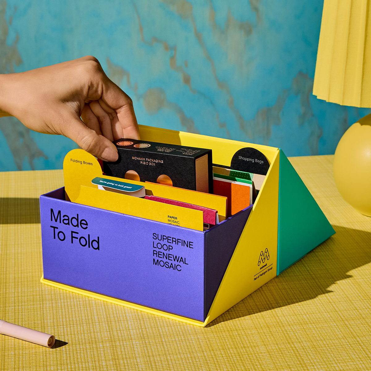
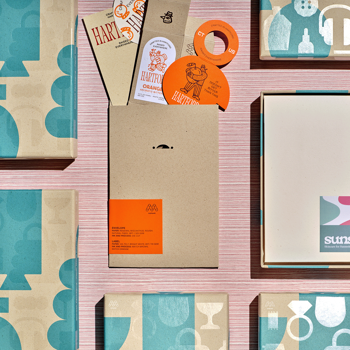
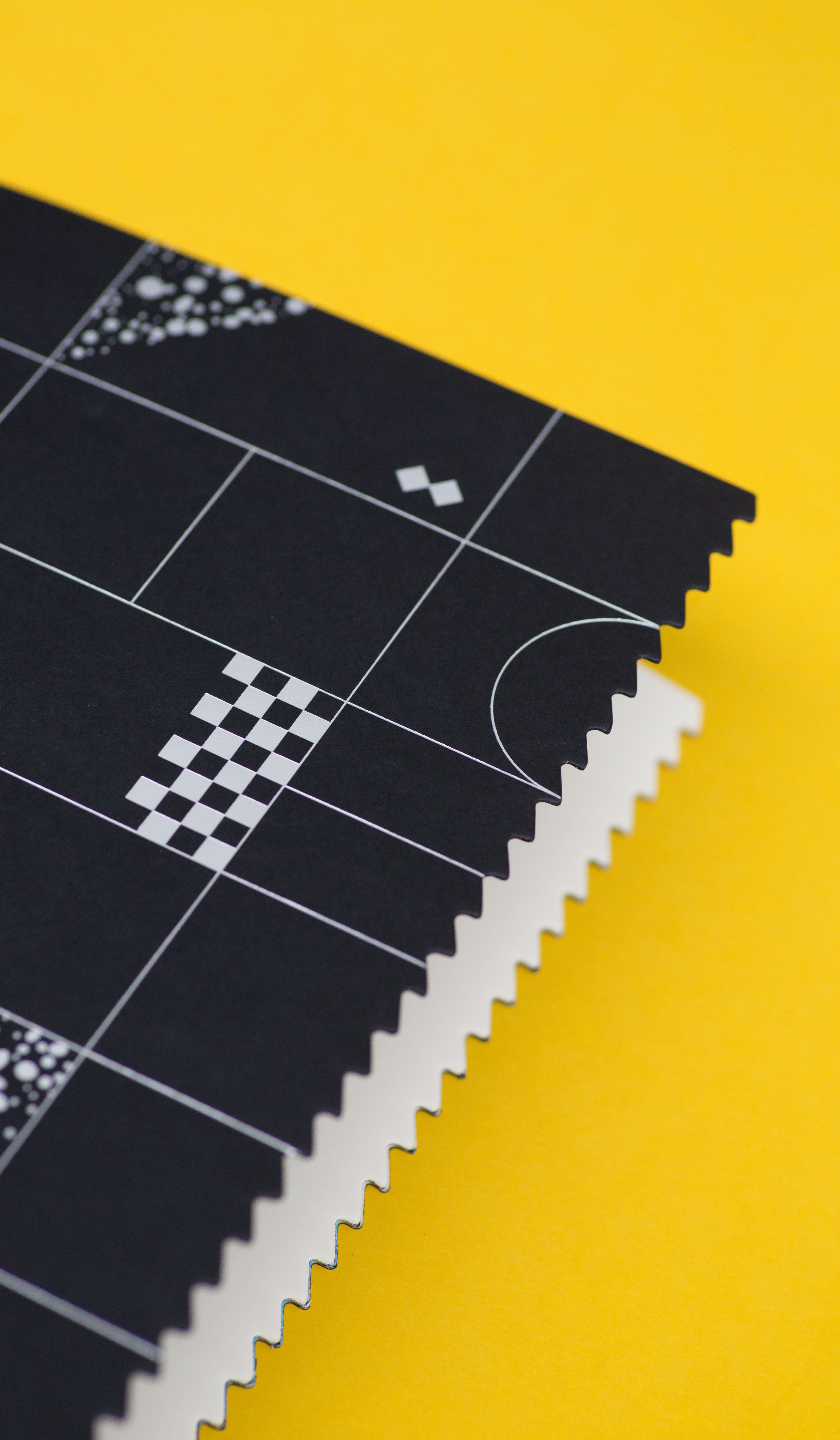
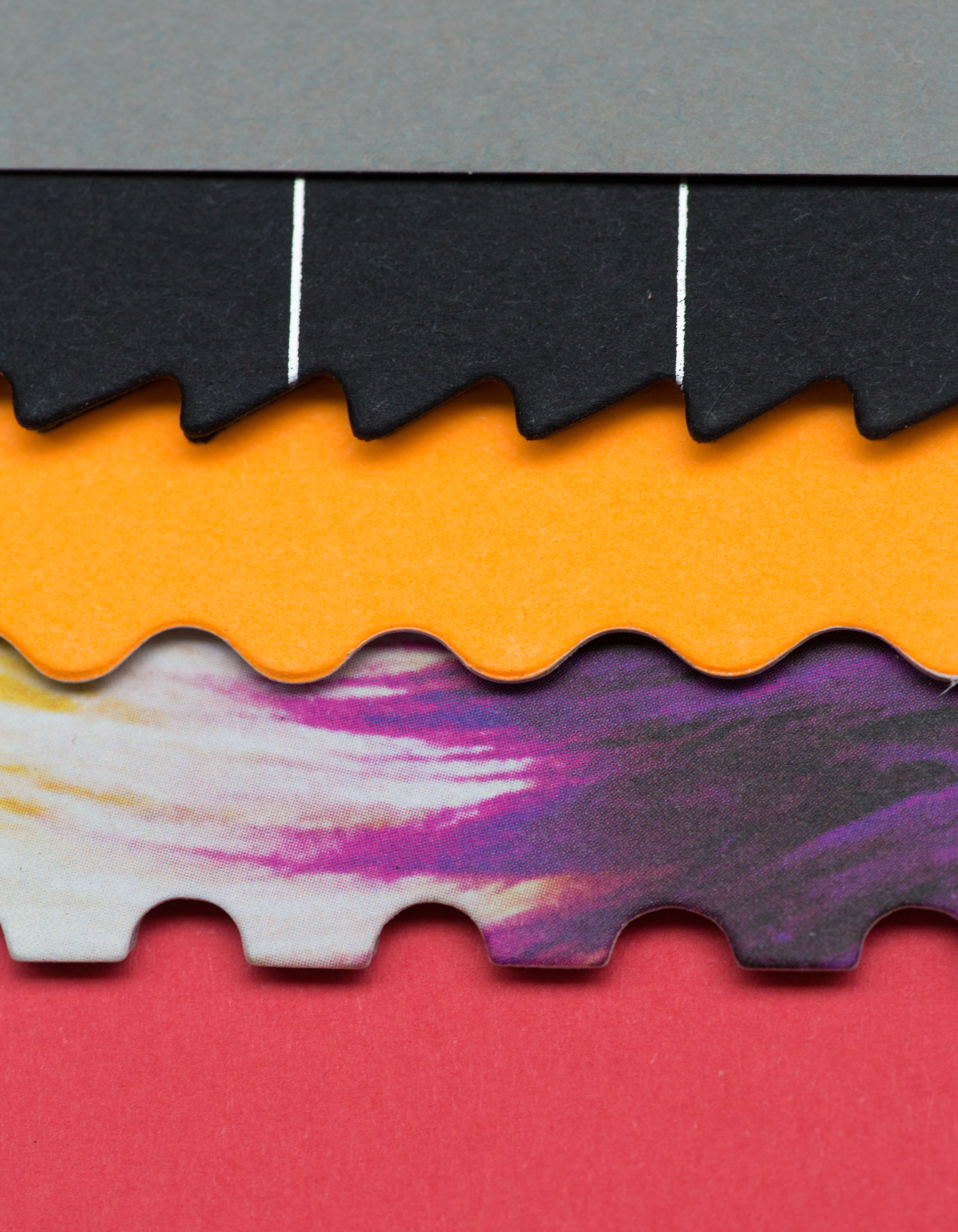
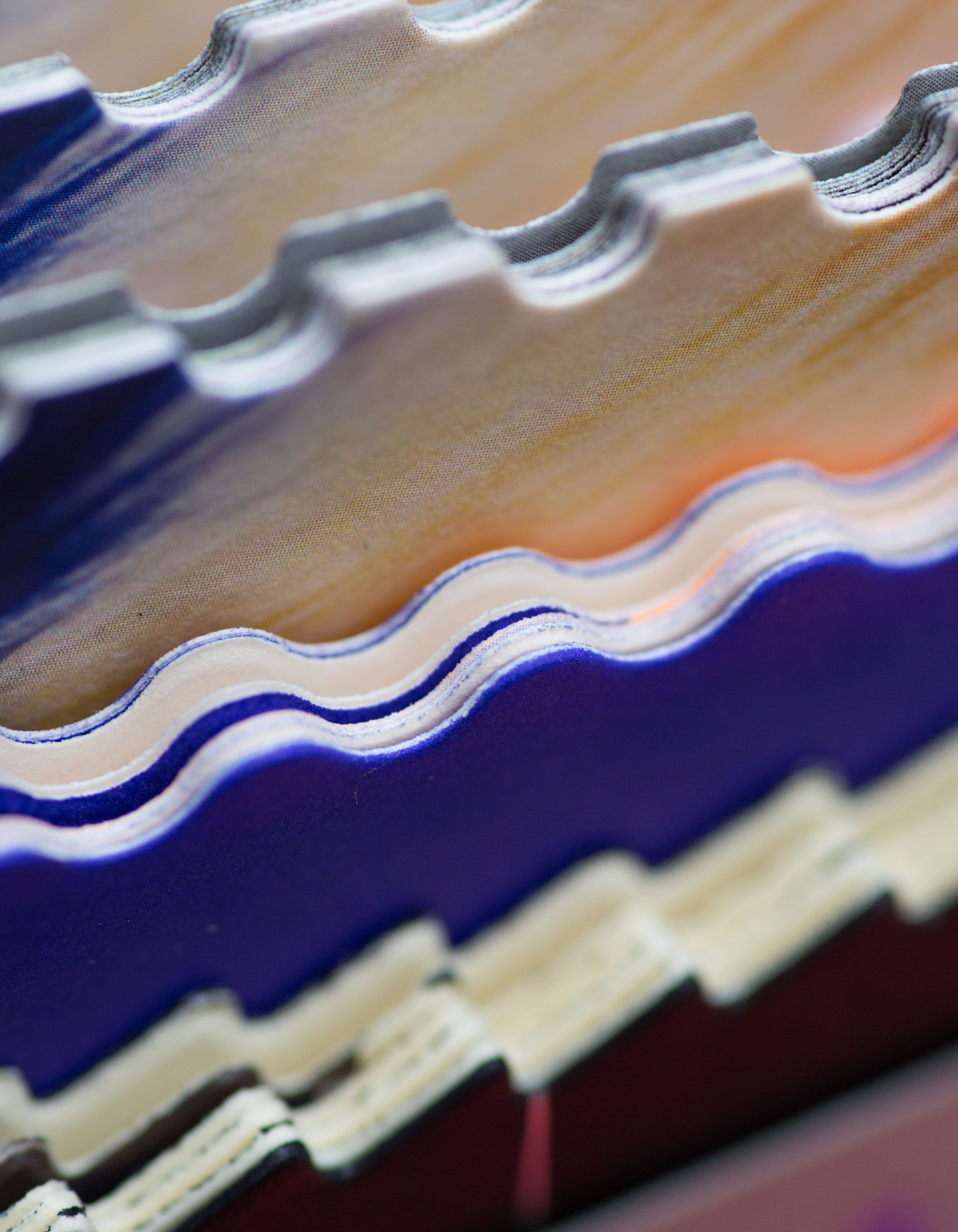
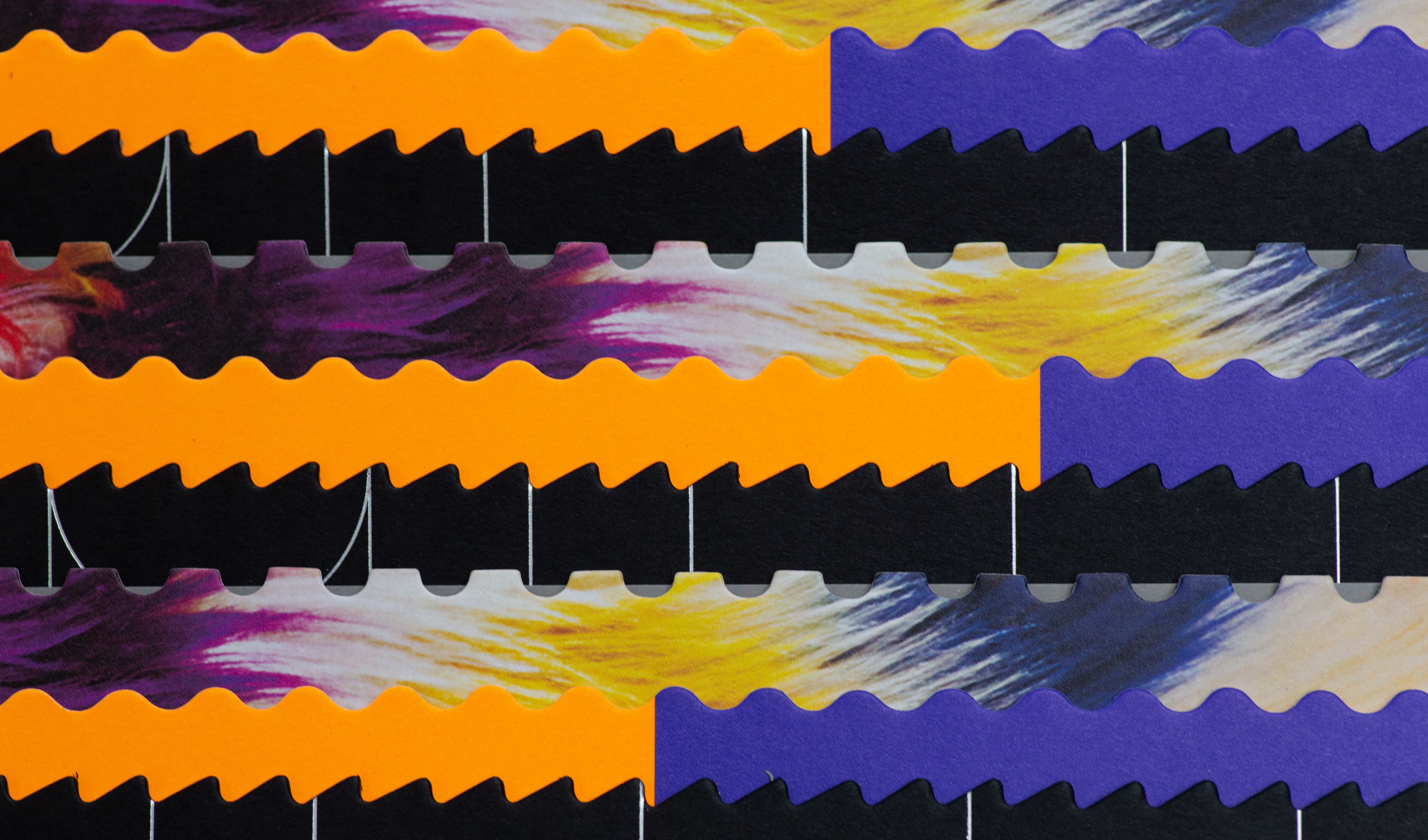
Materials Used

Suggested Articles
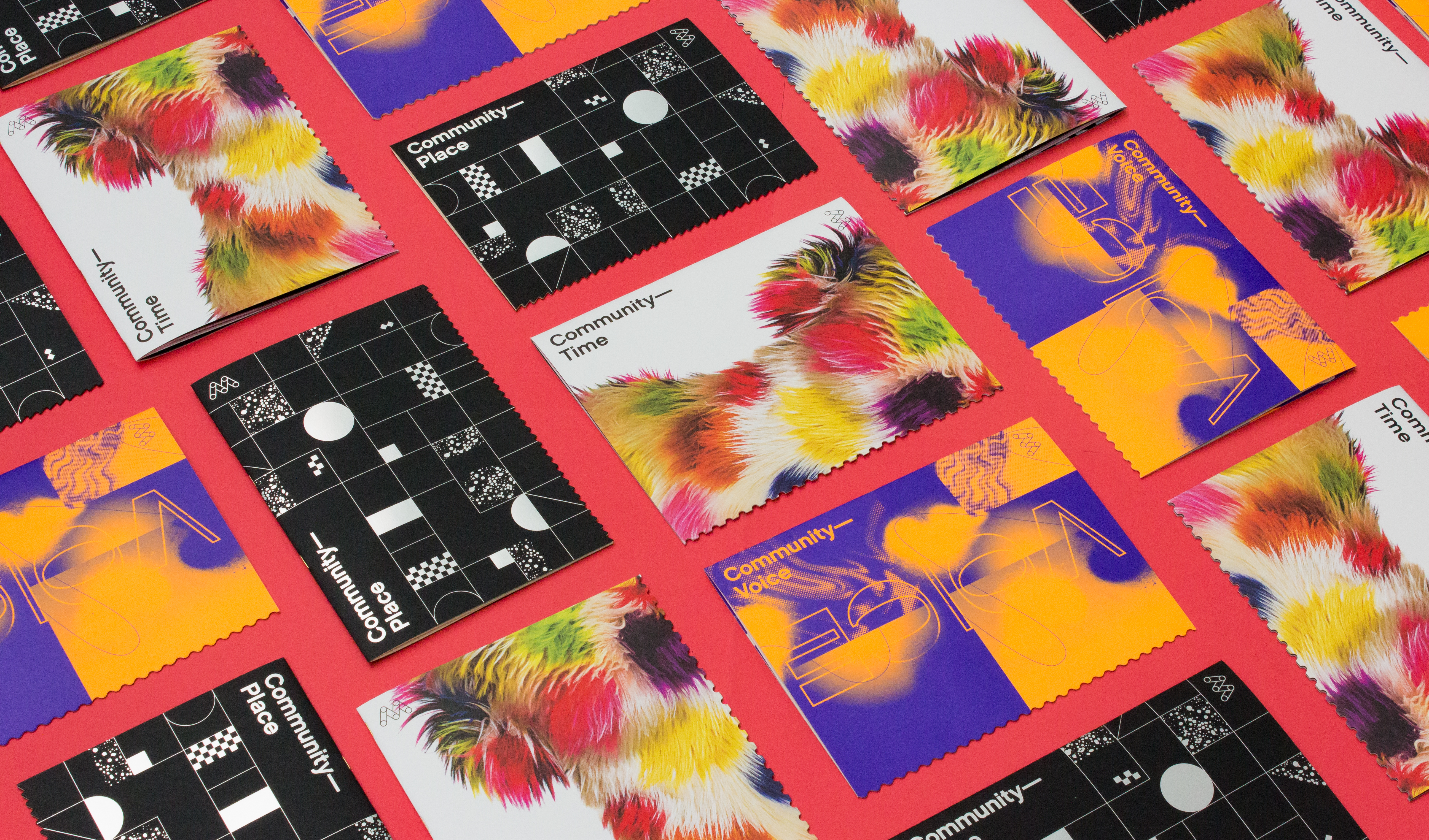
Materials are an emotional filter. Through texture, color and form, they reveal how we should feel about what we see and read.
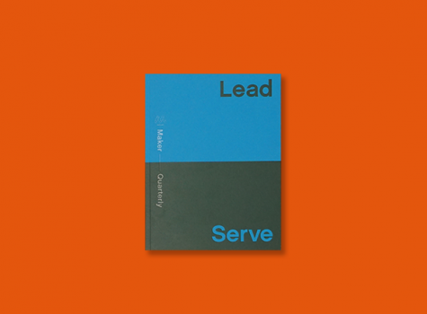
Issue No. 14 of the Mohawk Maker Quarterly is titled Lead & Serve and celebrates those who pave the way by helping others find their paths.
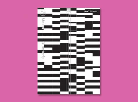
Each issue of the Mohawk Maker Quarterly relies on a single word for its creative framework. In issue thirteen, that word is “disruption.”