


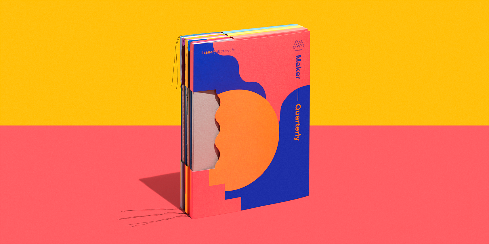
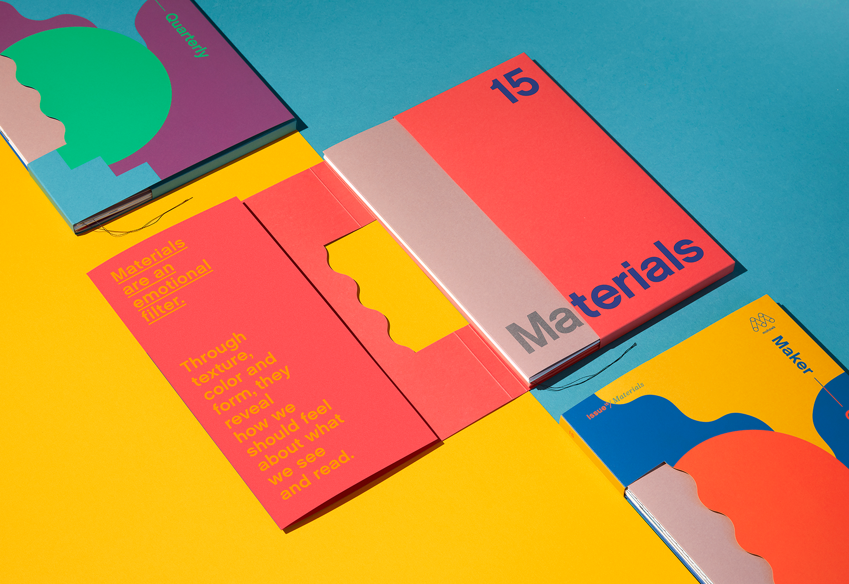
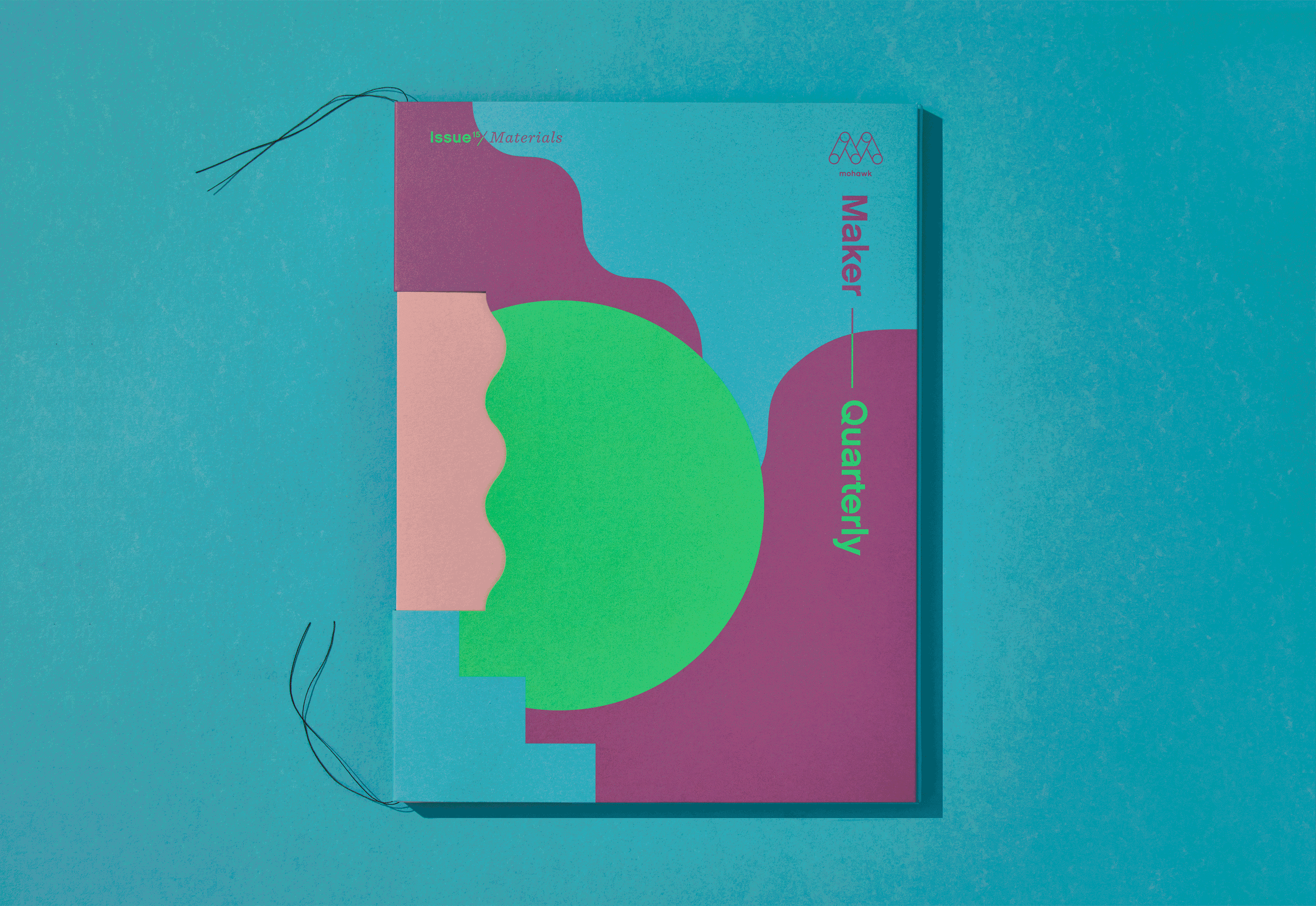
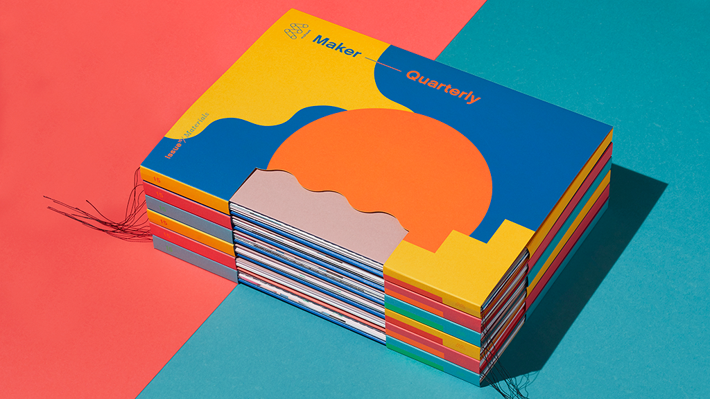
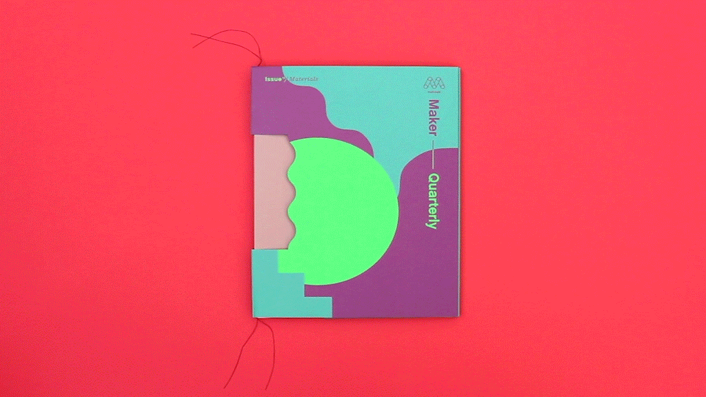
Mohawk Maker Quarterly Issue #15: Materials
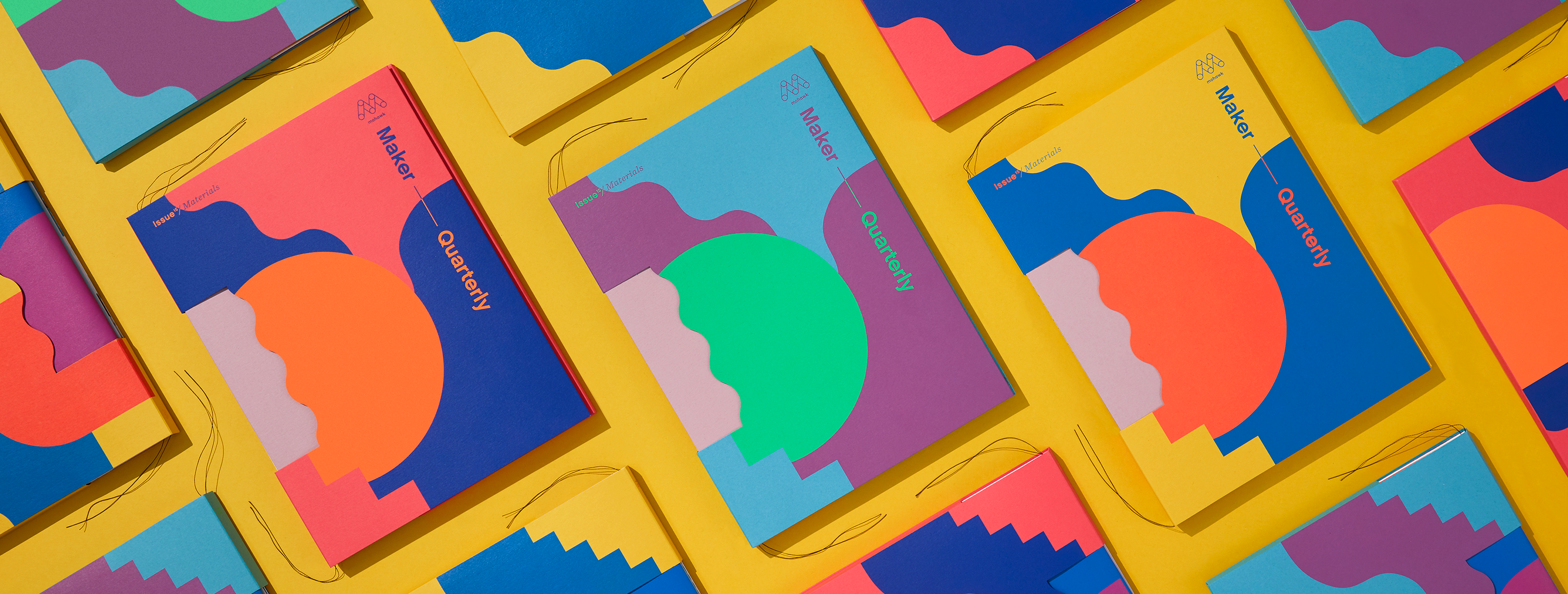
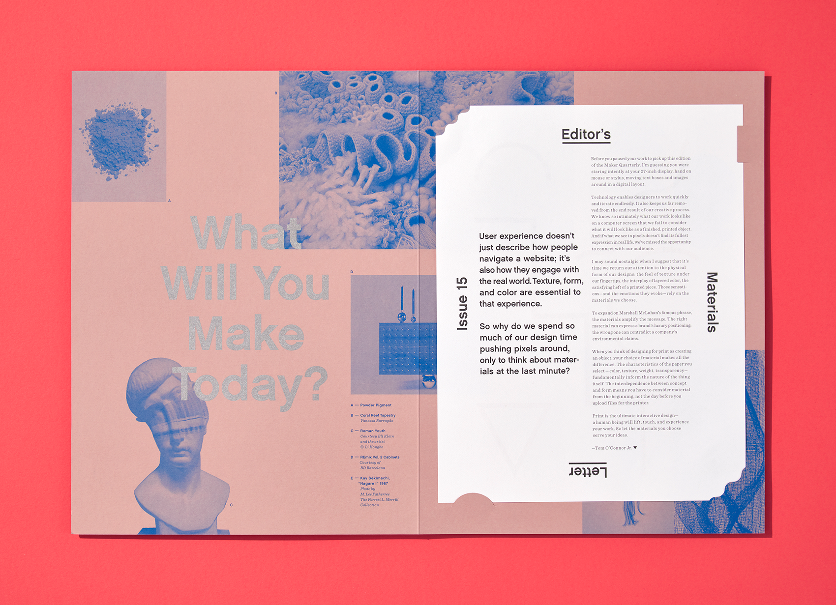
Materials are an emotional filter. Through texture, color and form, they reveal how we should feel about what we see and read.
Production Notes
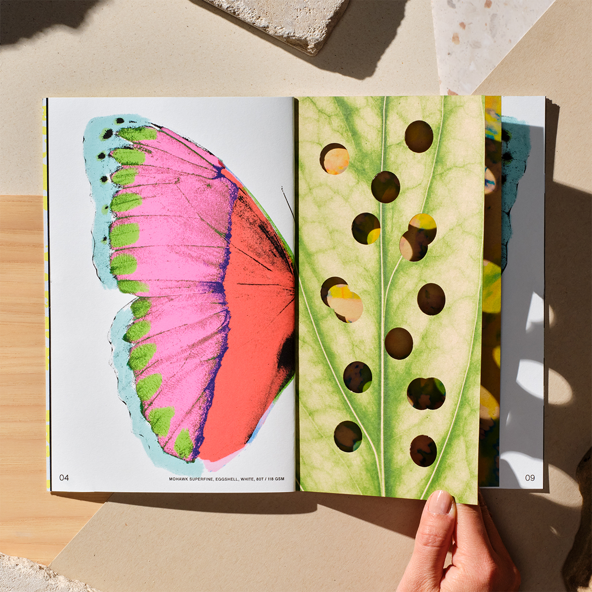
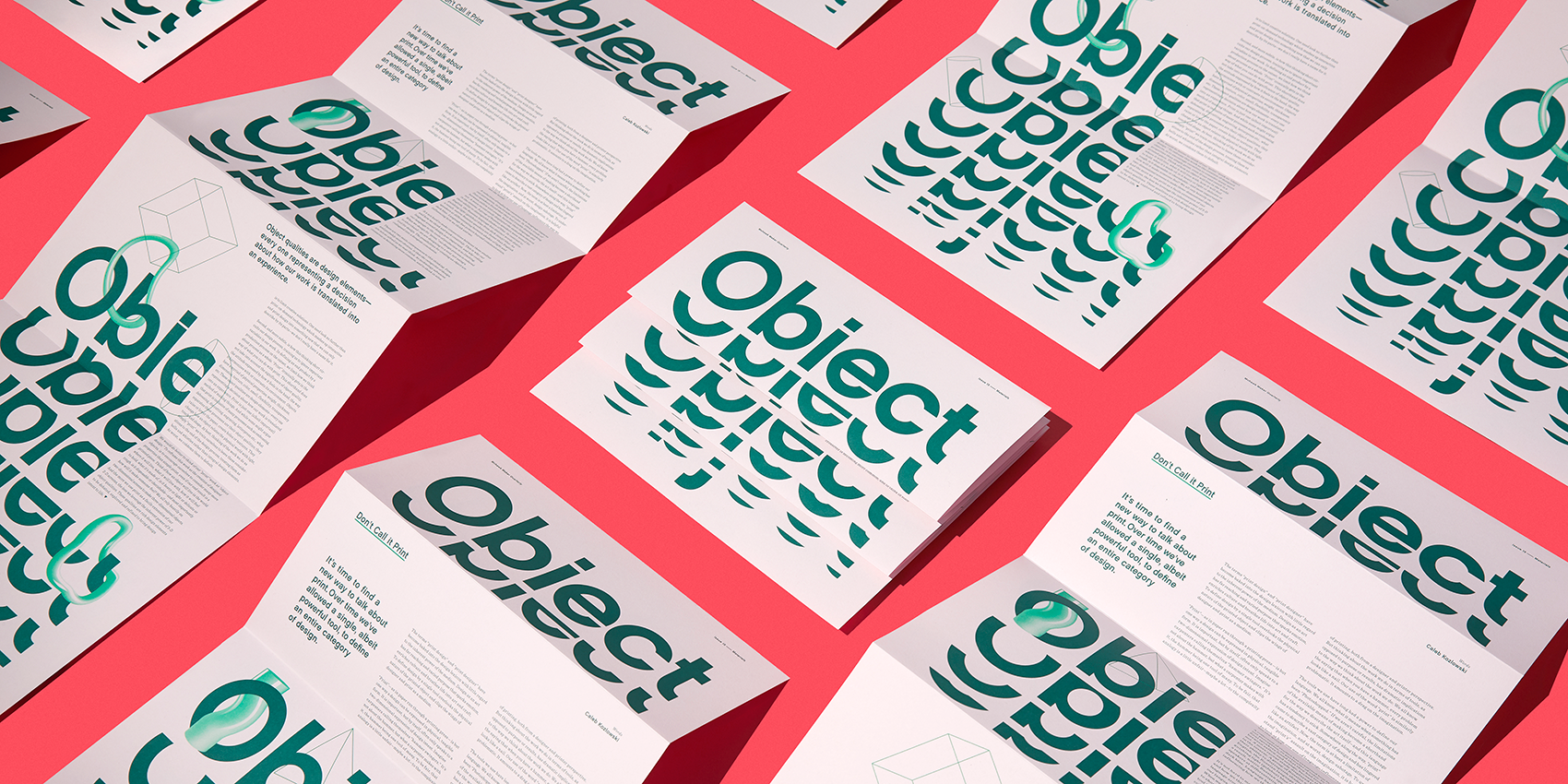
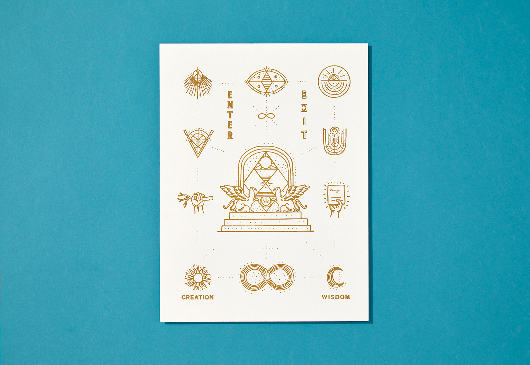
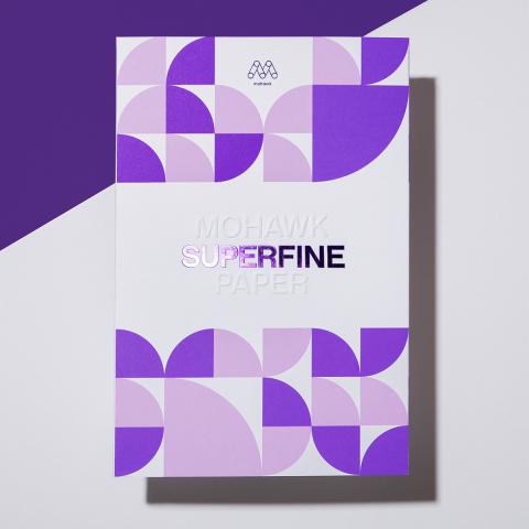
Metallic Inks
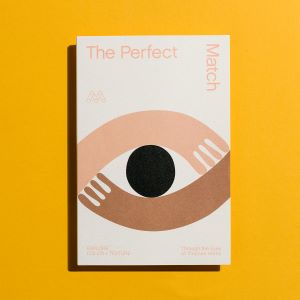
Metallic powders in a varnish base create images with metallic luster. Leafing inks which have metal flakes that rise to the top of the ink mixture have more shine, but increased rub off. The metal flakes in non-leafing metallic inks sink down with less rub off and a little less shine. Non-leafing inks with a dull varnish or aqueous coating perform most reliably on uncoated paper.
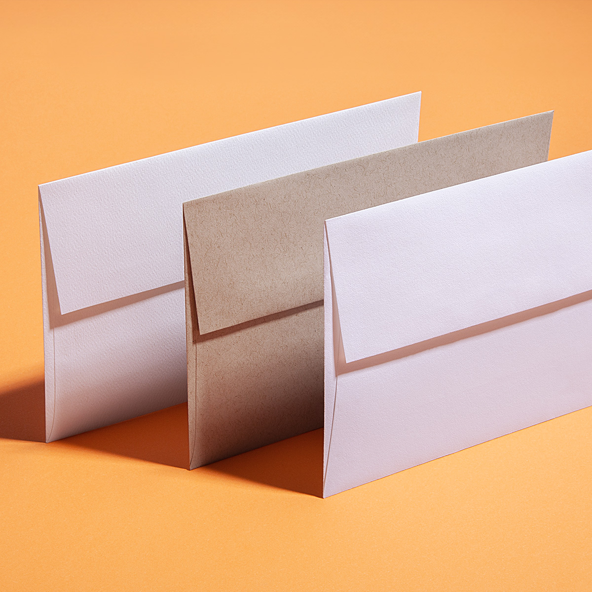
White Ink
Opaque white ink can create a unique print effect — it is a non-transparent ink which does not let any of the base color show though. The more hits of white used, the more it stands out from the background. White ink can be used alone, or as the base to print color on top, which allows full color imagery to be printed on dark colored paper.
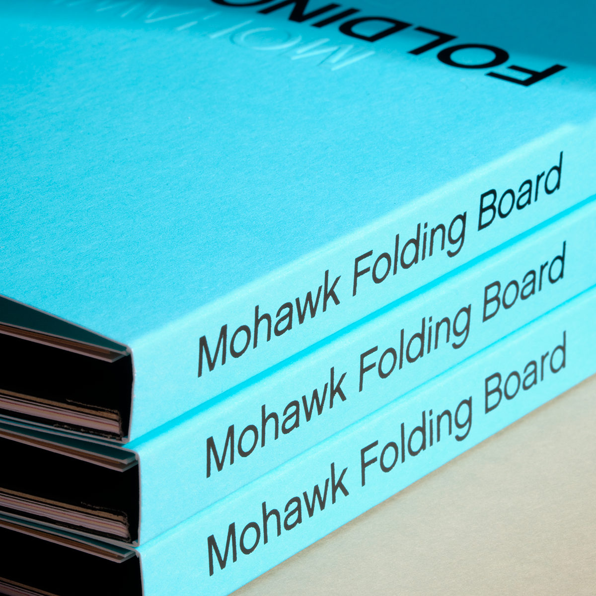
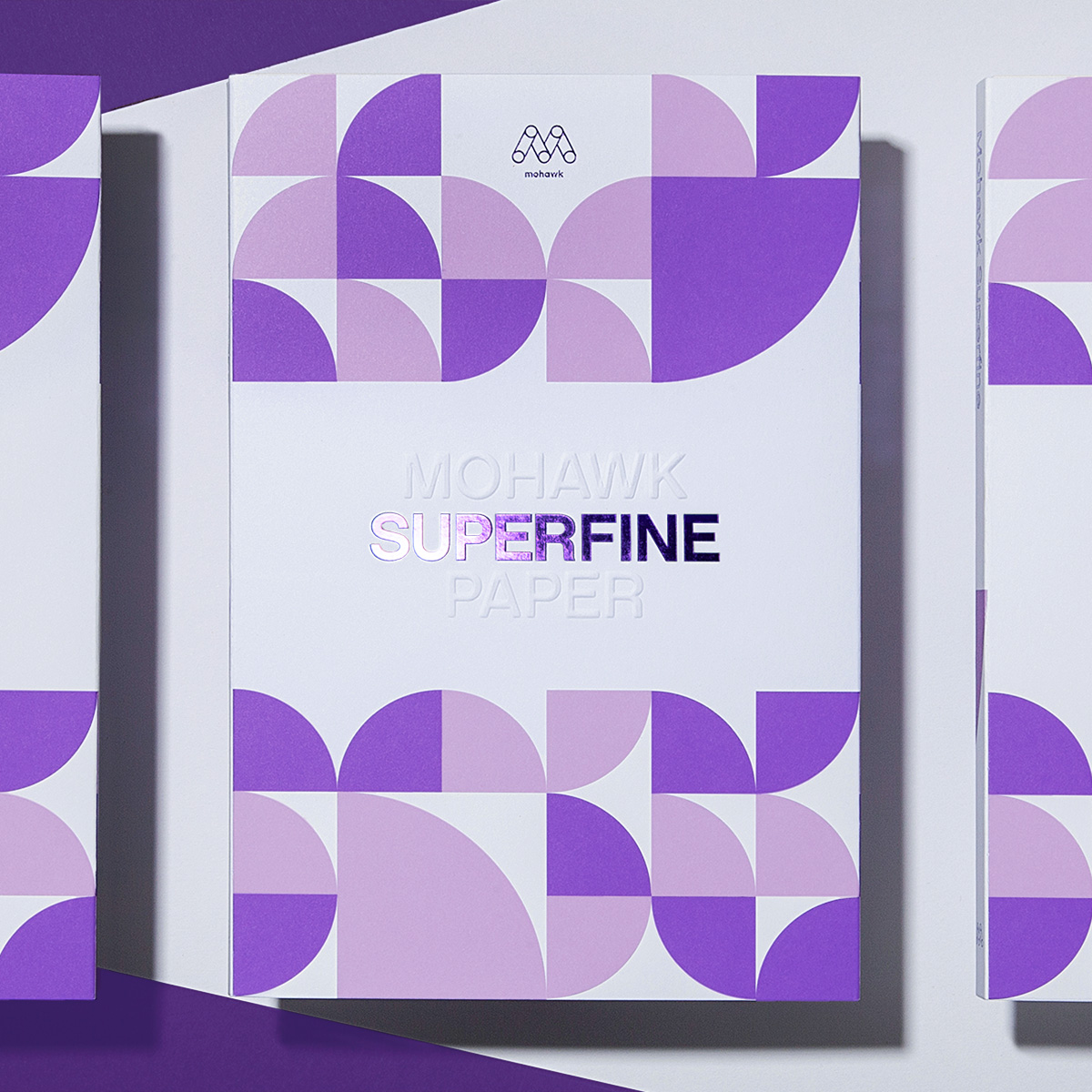
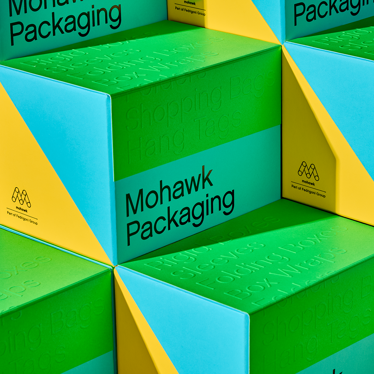
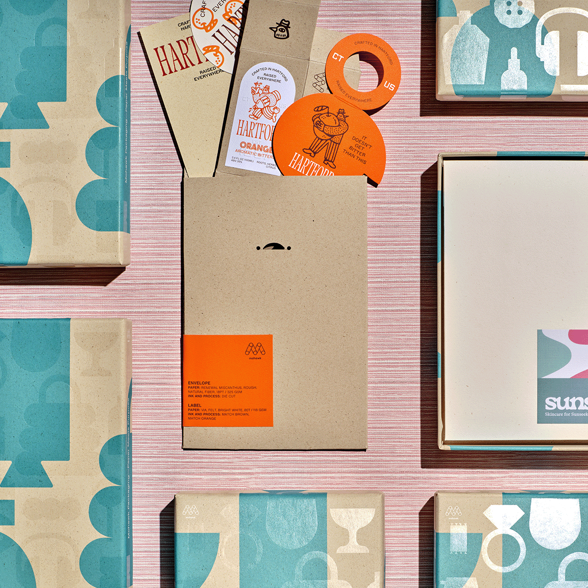
Materials Used


Suggested Articles
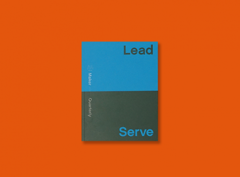
Issue No. 14 of the Mohawk Maker Quarterly is titled Lead & Serve and celebrates those who pave the way by helping others find their paths.
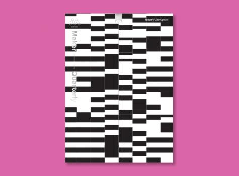
Each issue of the Mohawk Maker Quarterly relies on a single word for its creative framework. In issue thirteen, that word is “disruption.”
We tend to romanticize the mythology of the solo creative genius. However, humanity’s greatest achievements have happened when people—two or two thousand—worked together.