Mohawk Blog

Materials Matter: Chobani Impact Report

Words
Rebecca Gatto
Photography
Rebecca Gatto
Chobani header

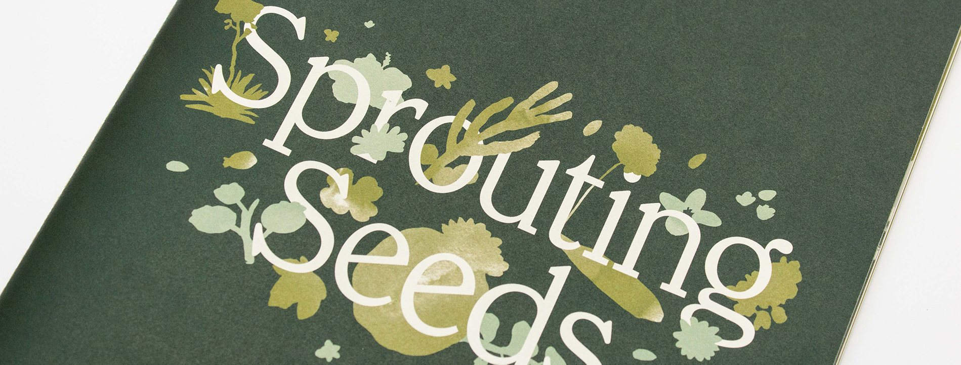
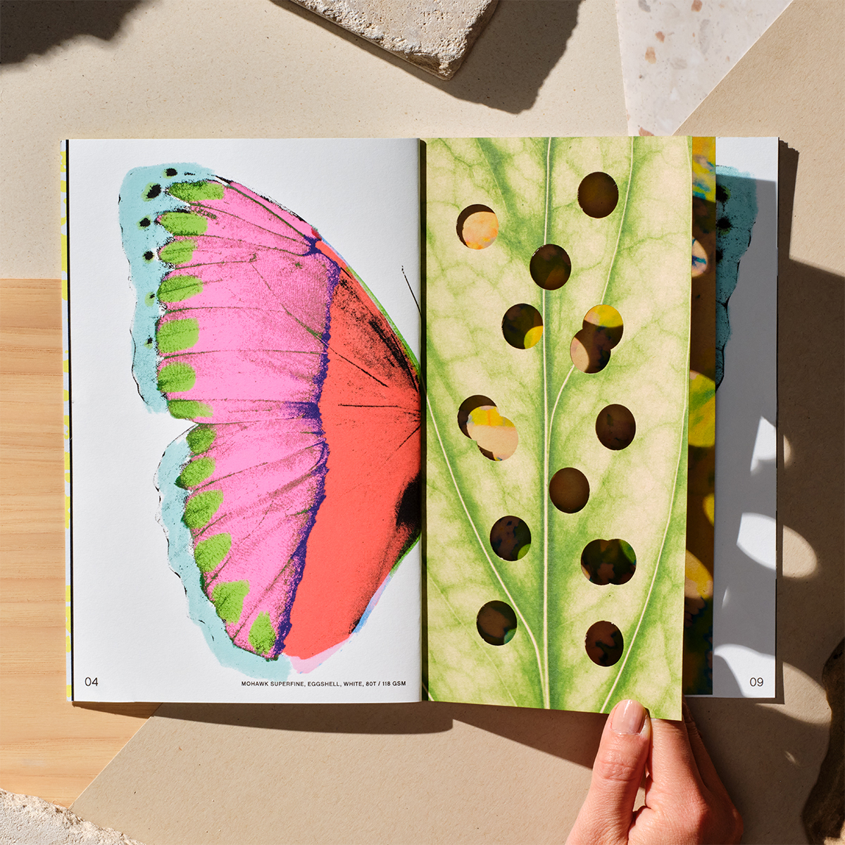
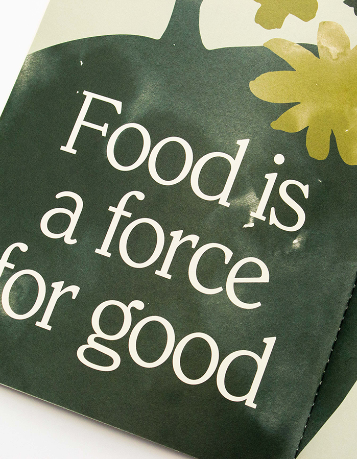
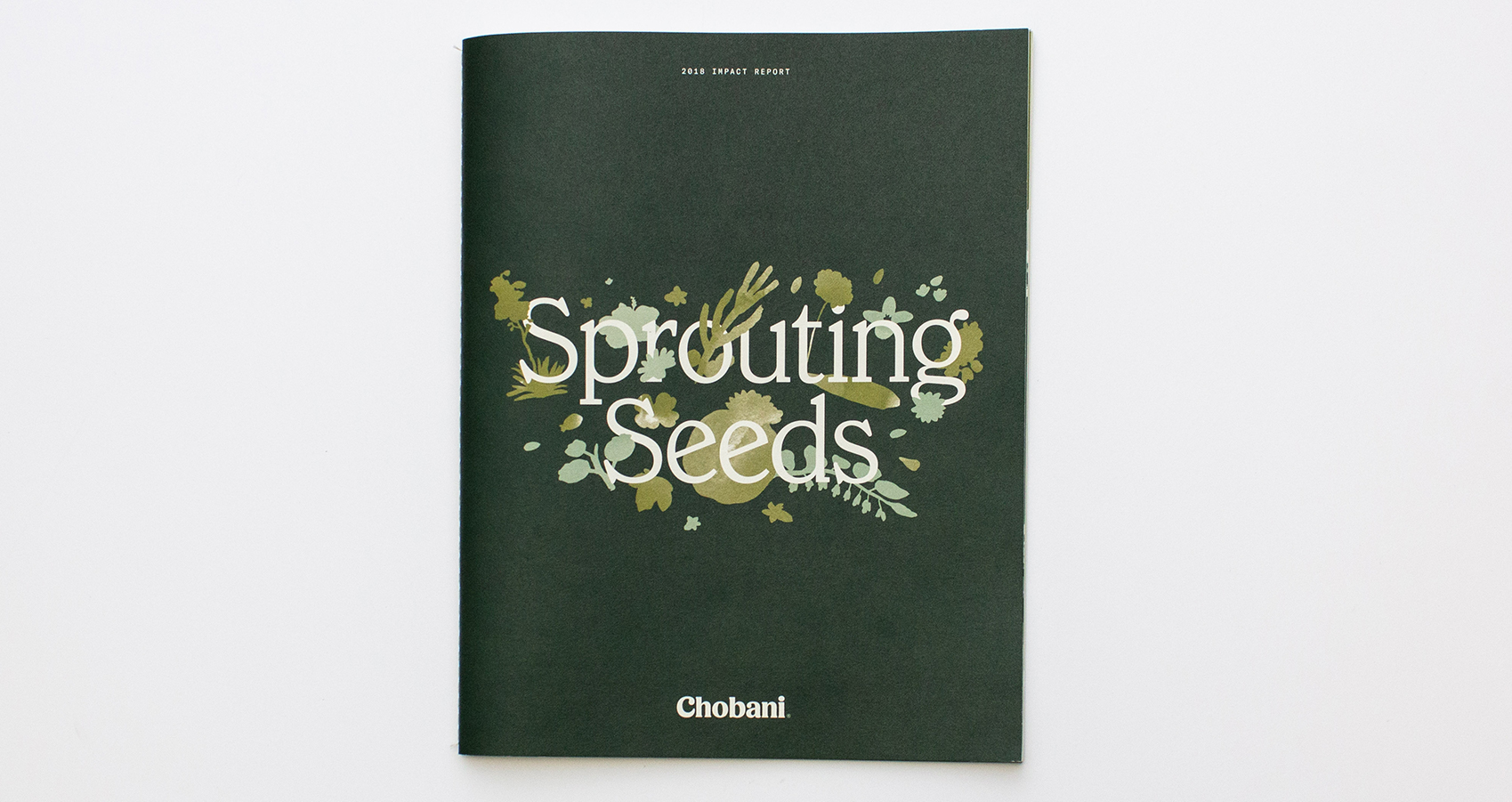
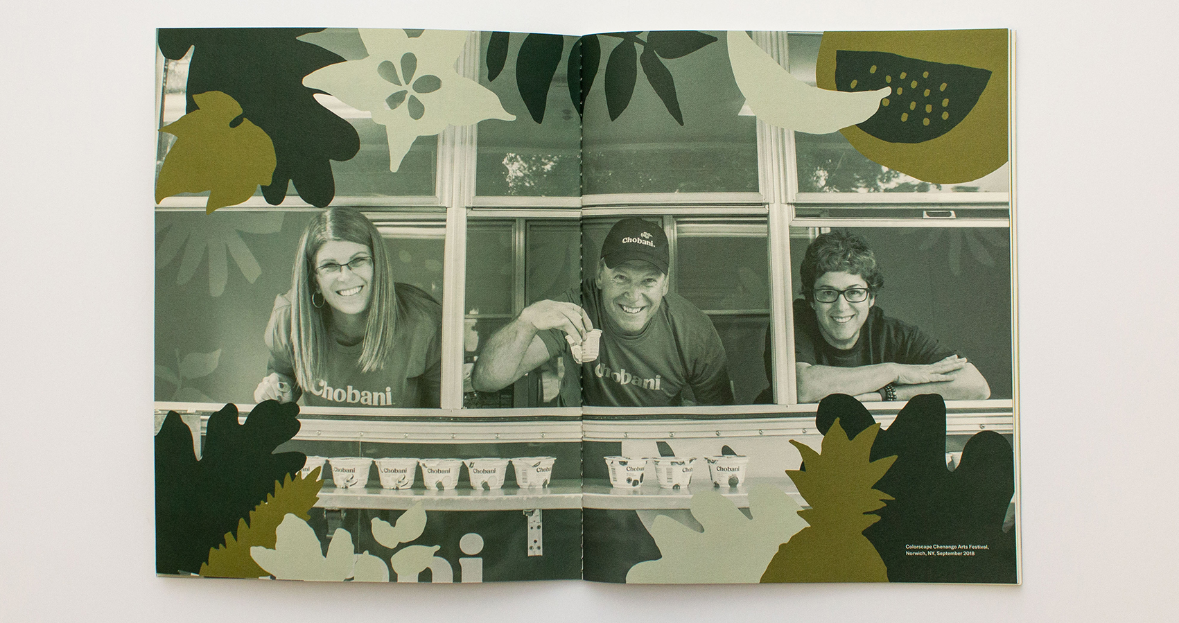
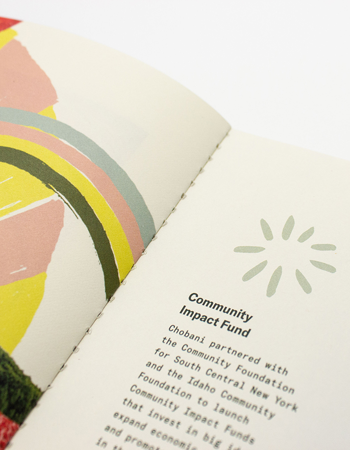
Food is a force for good—that's the belief that drove Chobani to create their first-ever impact report.

Chobani, of course, makes yogurt. But the company prides itself on following its founding mission: "Better food for more people." Over time, Chobani's guiding principles have expanded to include the ambitious goal of pursuing "universal wellness." To that end, they have created and nurtured programs to help incubate new businesses, feed families in need, and even pay off school lunch debt in the communities surrounding their plants.

In 2019, as the company's leaders reflected on more than a decade of offering consumers nutritious, whole food, they also assessed the impact their manufacturing has had on the food supply, the economy, communities, and people's lives. The 2018 impact report focuses on the company's charitable operations in 2018 using photography, words, and infographics. 

Food is a Force for Good illustration
Impact Report close-up
book cover
inner page illustration
inner page duotone

When it came time to select paper for the project, Chobani's in-house design team considered the multisensory way that people interact with print. They chose Strathmore Wove Natural White 80 Text (Elevated Collection) for its printability—the designers love the way ink lays on its surface—and memorable texture. The Natural White shade is a nod to the background color of their recognizable Greek yogurt packaging. Combined with the tactile, saddle-sewn binding, the booklet emphasizes craftsmanship and natural ingredients before the cover is even opened. 

close-up of spine with saddle-stitched binding
another view of the spine and binding

Kirkwood Press in Wilmington, MA printed the project using a traditional 4 color process and printed UV. Illustrations, duotones, and four-color photographs shine side-by-side, proving that you don't have to sacrifice tactility for crisp and colorful graphics. 

In addition to being a valuable marketing tool for the company, Chobani's inaugural Impact Report is a tangible reminder of the company's commitment to its values. Thanks to the designers' careful material choices, their message of wellness through community action is exceptionally effective.

Merchant: Bulkley Dunton, a division of Veritiv

close-up of pastel rainbow illustration and typography
close-up of back cover design

Production Notes

PN-print-process
Print Process
Ultraviolet (UV) Printing
capability_infoi
bindary
Bindery
Saddle Stitching
capability_infoi
roll
Offset Printing Capabilities
4 Color
capability_infoi
PN-printer
Printer
PN-designer
Designer
Chobani

Materials Used

Suggested Articles

Mohawk Blog

Waste Not

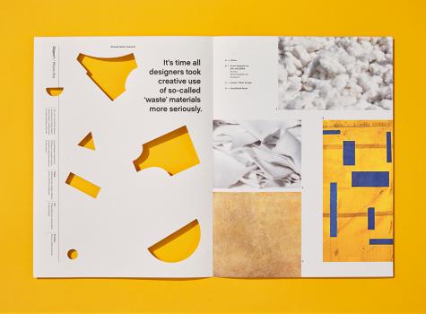
It's time all designers took creative use of so-called 'waste' materials more seriously.