


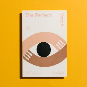


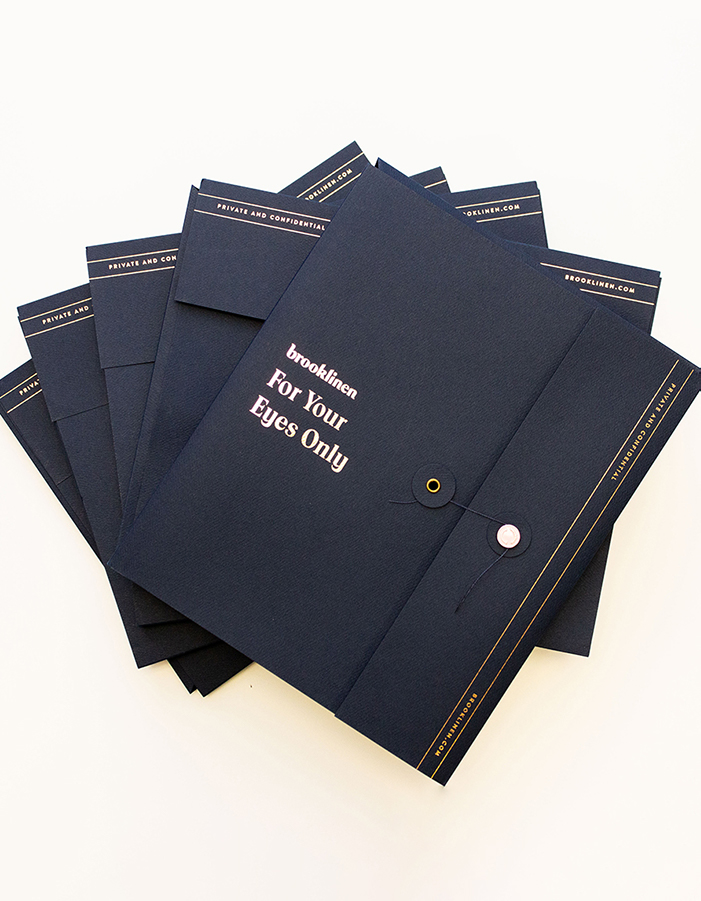
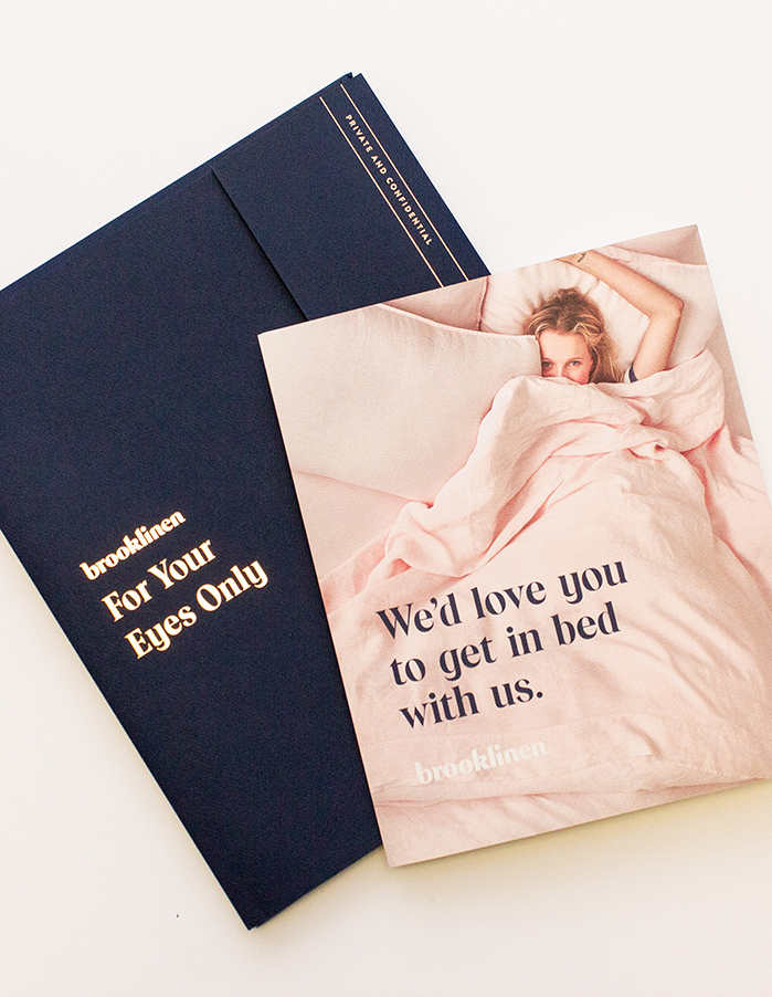
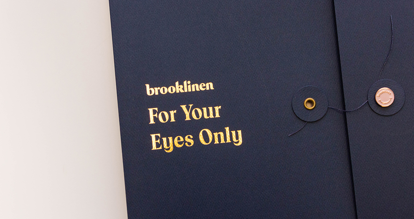
Materials Matter: Brooklinen's "For Your Eyes Only" Collateral
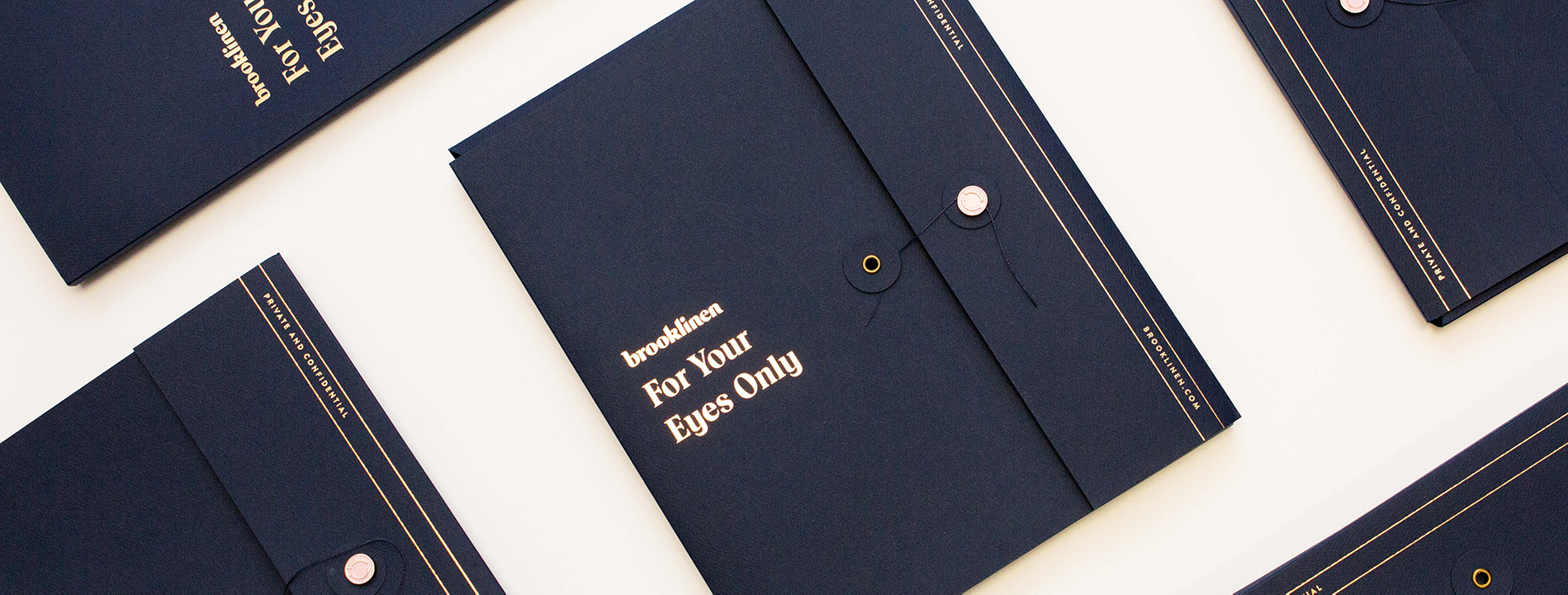
Designer Robson Tan searched for—and found—a critical moment of attention in the increasingly crowded direct-to-consumer space.
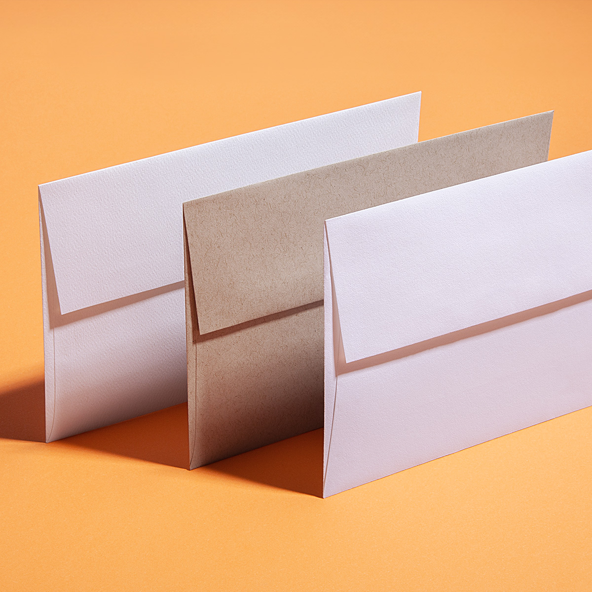
Tips for matching texture to content to enhance your messaging:
- Look for the physical characteristics of your product. Consider weight and texture. Also take into account the environment where your product is at home.
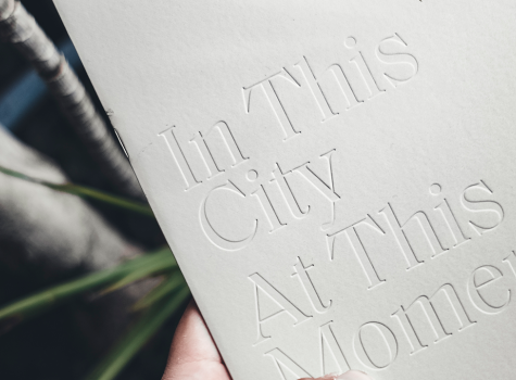
- Match texture to character. Even a brand without physical texture has a character or emotion to convey. Find the texture that best represents the essence of your brand.
- Be open to an array of options. You don’t need a 100% texture match to achieve a striking effect—something in the right ballpark can have similar results.
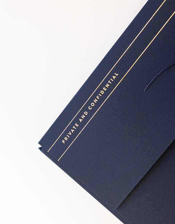
Production Notes
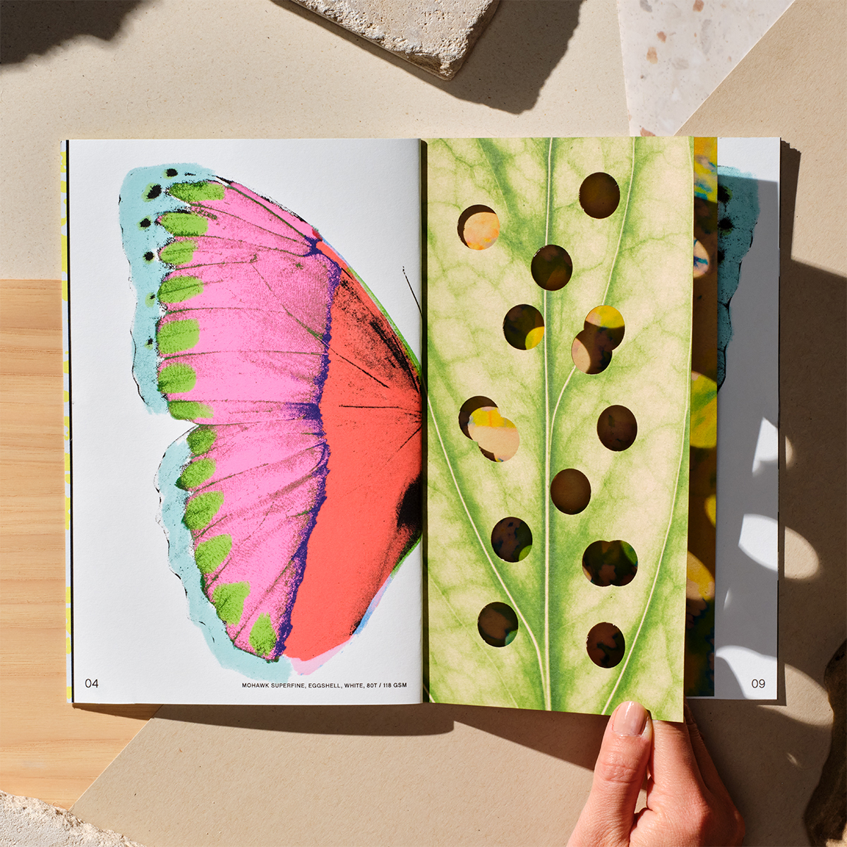
Offset Printing
A commonly used printing technique in which the inked image is transferred from a plate to a rubber blanket, then to the printing surface. When used in combination with the lithographic process, which is based on the repulsion of oil and water, the offset technique employs a flat (planographic) image carrier on which the image to be printed obtains ink from ink rollers, while the non-printing area attracts a water-based film (called "fountain solution"), keeping the non-printing areas ink-free.
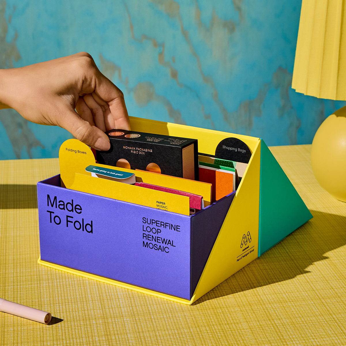
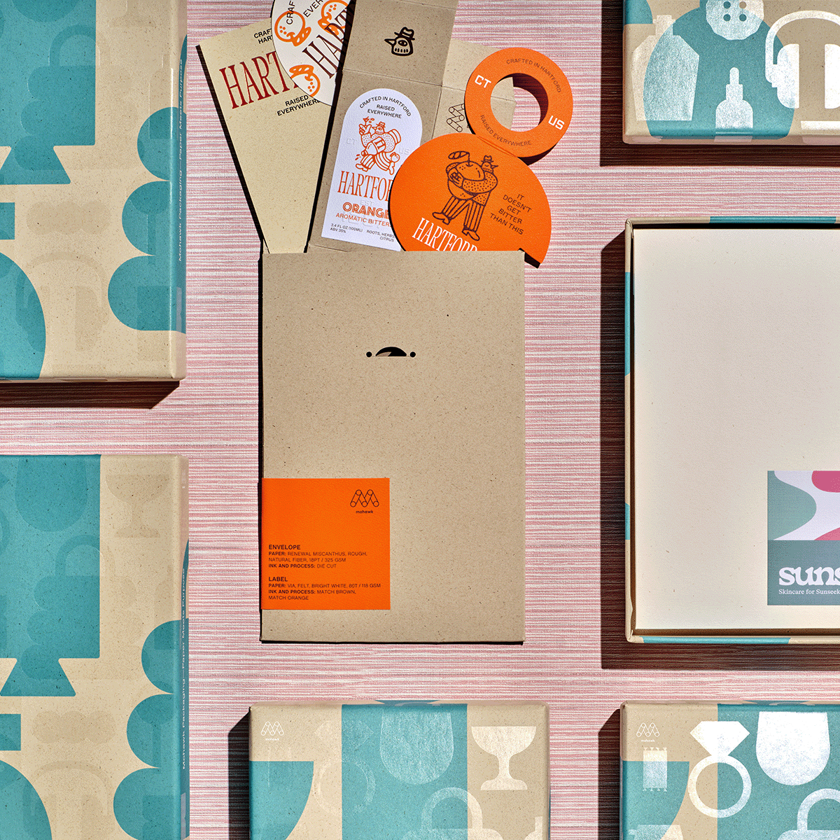
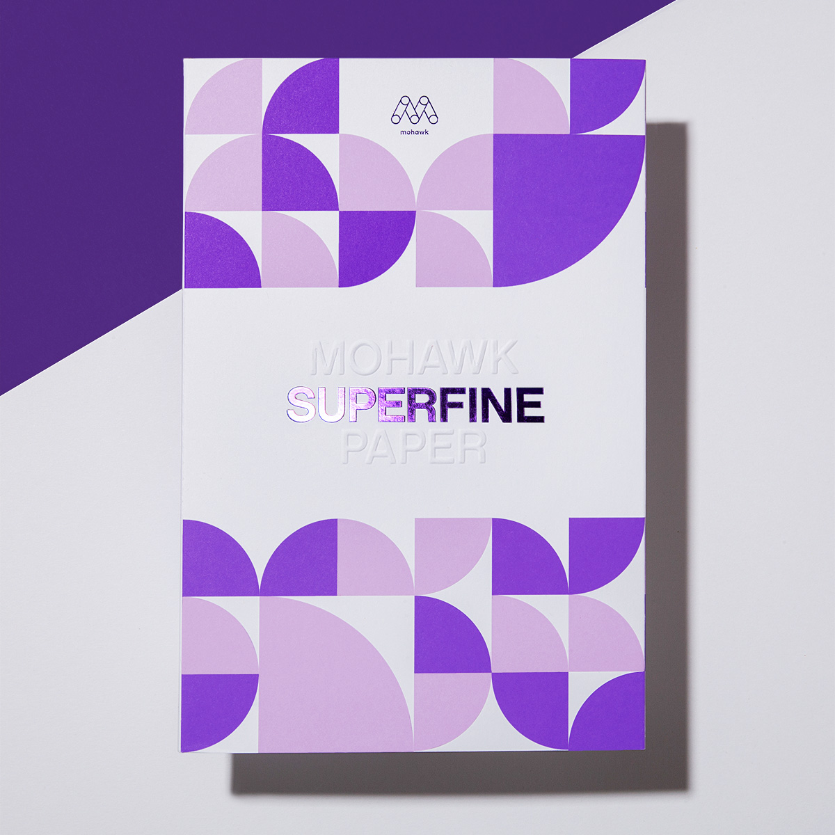
Materials Used

Suggested Articles
Evoking the beach through lush, tactile paper for a luxury oceanfront residence.
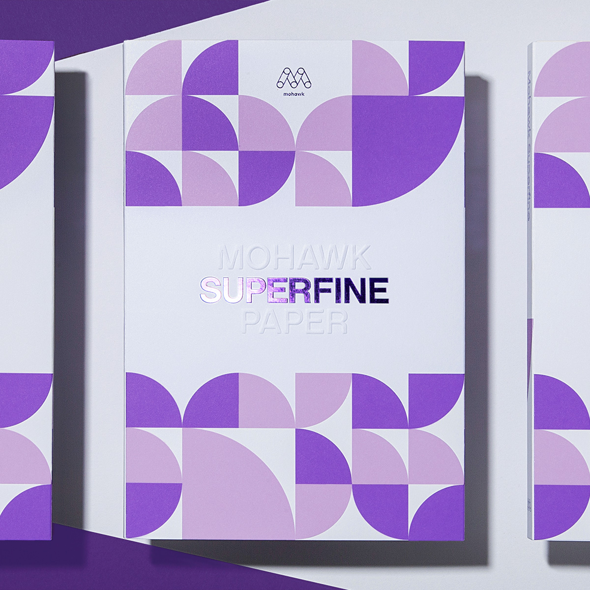
Superfine brings richness and depth to product photography.
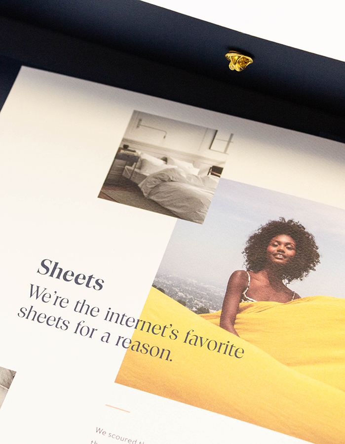
We’ve seen that the way paper feels is powerful and how we use it can make a difference. Every project is about something, be it adventure travel or single origin chocolate. Have you ever thought about finding textures in the content, product or stories that you can emulate through paper?