


Key Considerations When Designing for Digital Print
Whether you're new to the world of digital print or are looking to brush up on your knowledge, having a basic understanding of how to design for digital is critical.

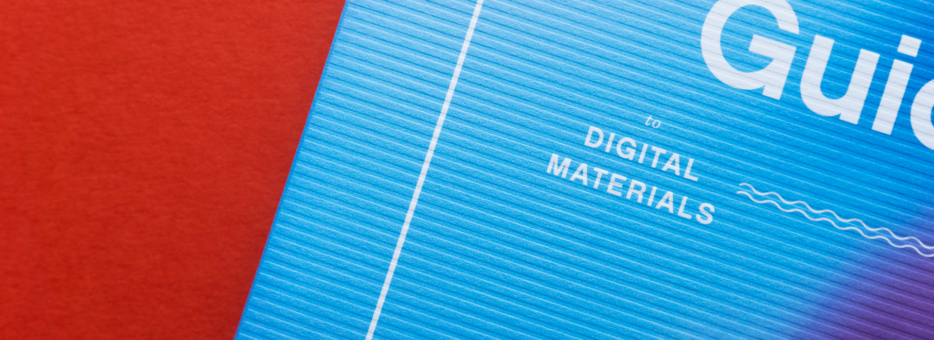
Digital used to feel like a compromise, not anymore. Whether you are a creative designer heavily immersed in the world of print, or a print provider looking to equip your customers with basic knowledge, this discussion is incredibly relevant. Reacquaint yourself with the basics of digital papers, including sheet formation, surface treatments, grain direction and moisture content for maximum impact on and off press.
Production Notes
Suggested Articles
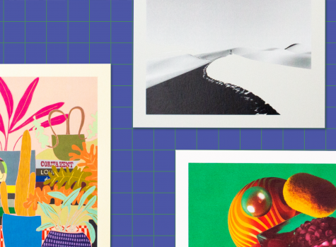
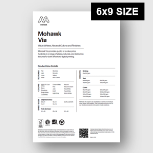
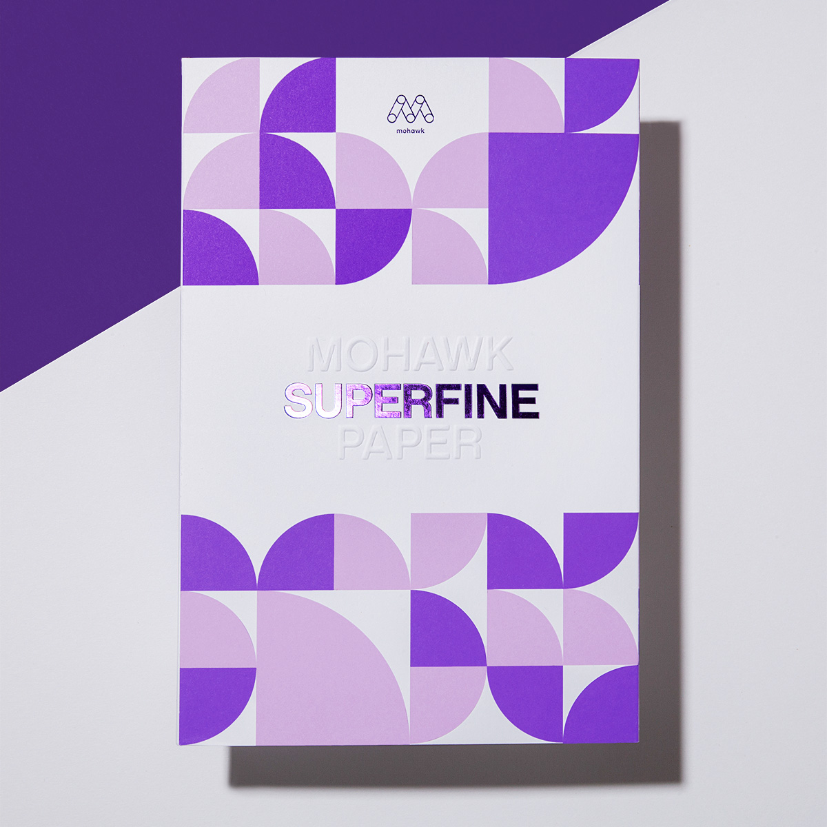
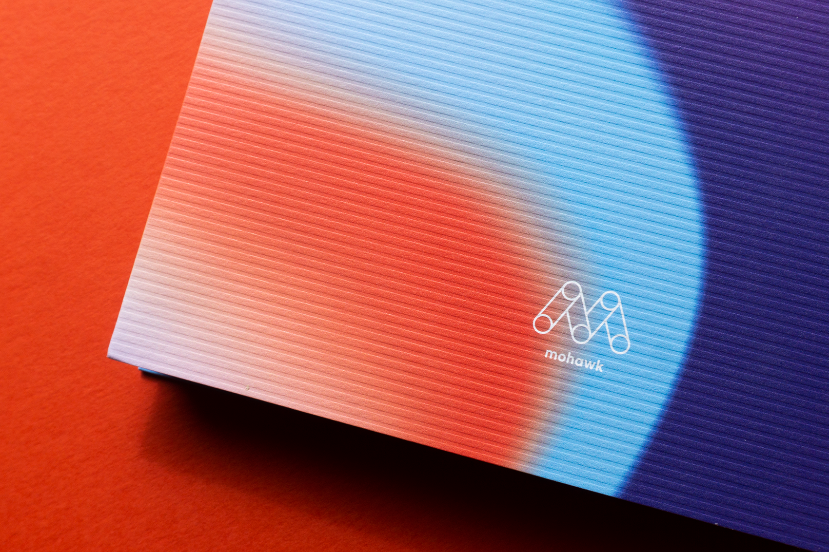
Via + Digital might be the perfect expression of beauty and function in balance.
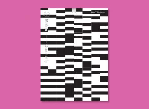
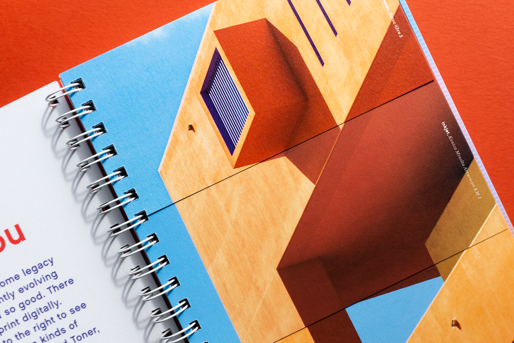
Each issue of the Mohawk Maker Quarterly relies on a single word for its creative framework. In issue thirteen, that word is “disruption.”
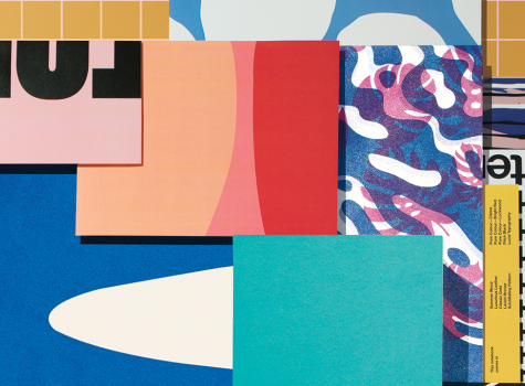
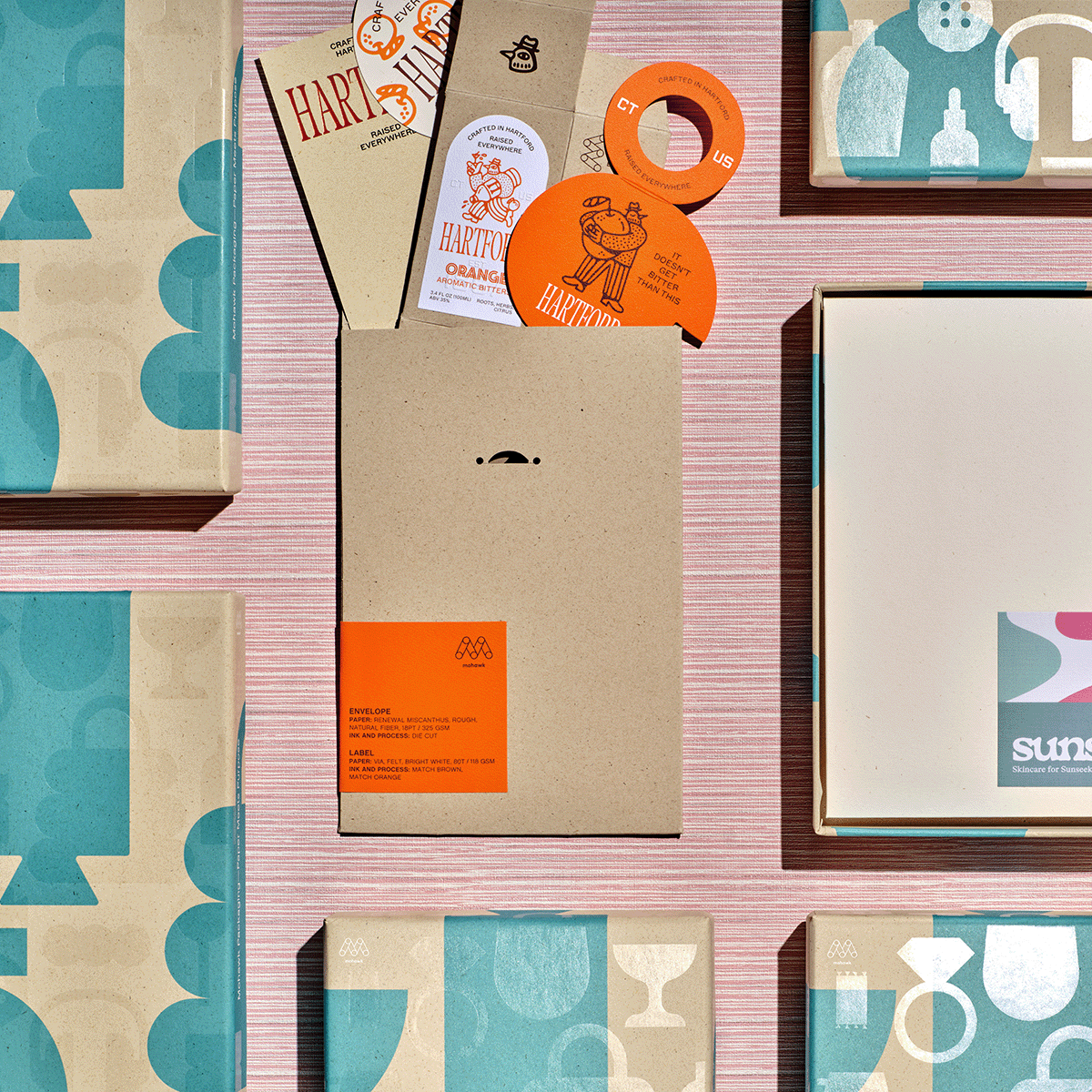
Materials speak, materials communicate – are your materials on-message? The paper and process(es) you choose says a lot.