


Materials Matter: Unread Vol. 1 — The Curiosity Issue
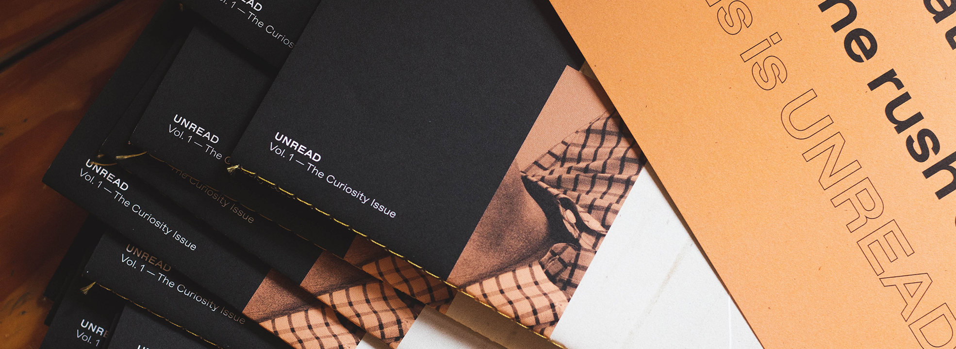
Unread by One Design is curious, creative and definitely worth the read.
Production Notes
Offset Printing
A commonly used printing technique in which the inked image is transferred from a plate to a rubber blanket, then to the printing surface. When used in combination with the lithographic process, which is based on the repulsion of oil and water, the offset technique employs a flat (planographic) image carrier on which the image to be printed obtains ink from ink rollers, while the non-printing area attracts a water-based film (called "fountain solution"), keeping the non-printing areas ink-free.
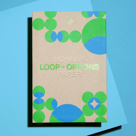
Materials Used
Suggested Articles

Second in a series of “city guides,” Italic Studio created Indoek’s St. Augustine Issue featuring interesting stories, photography and a variety of colored paper.
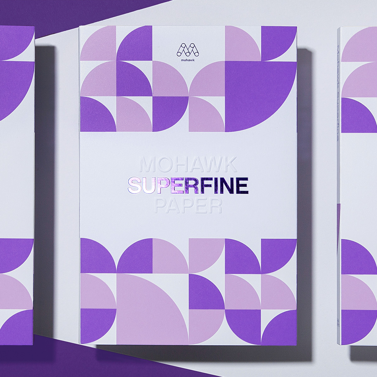
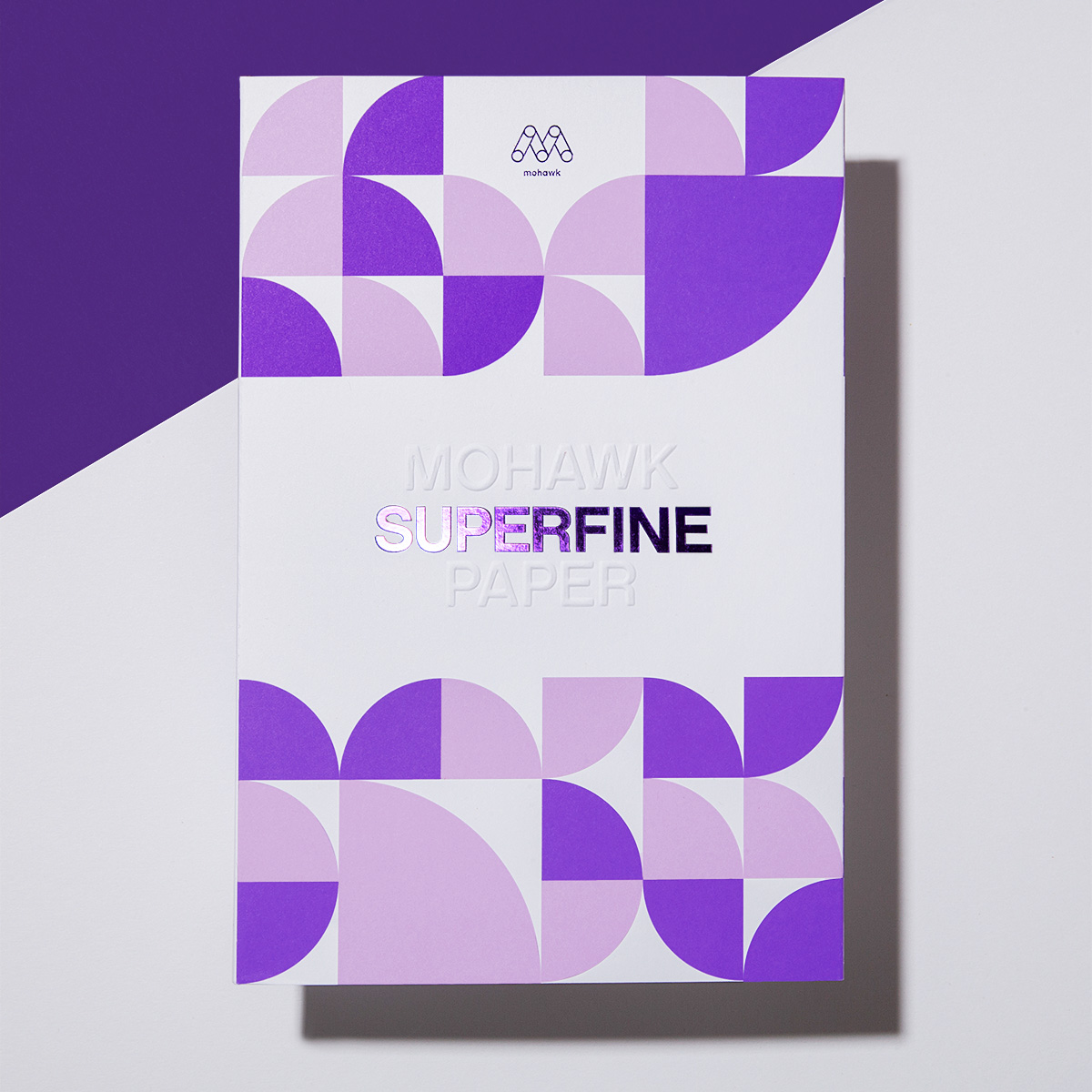
Superfine brings richness and depth to product photography.
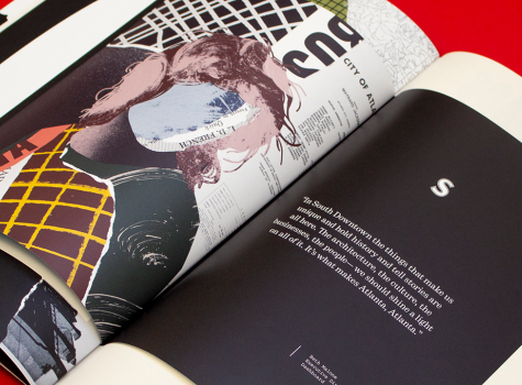
ICON dug deep into South Downtown Atlanta's history to tell a story about its future through texture and typography.