


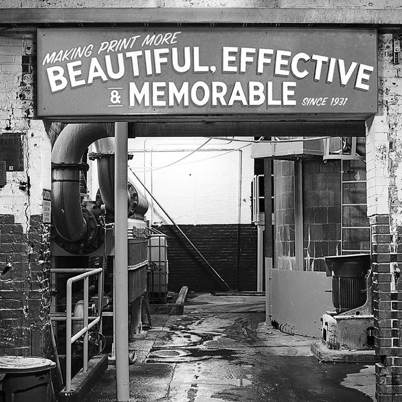
Mohawk Blog
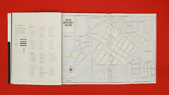
Materials Matter: ICON's South Downtown Atlanta Book
Words
Casey Fisk
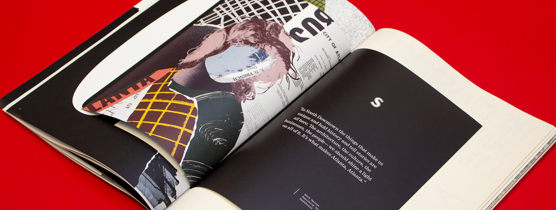
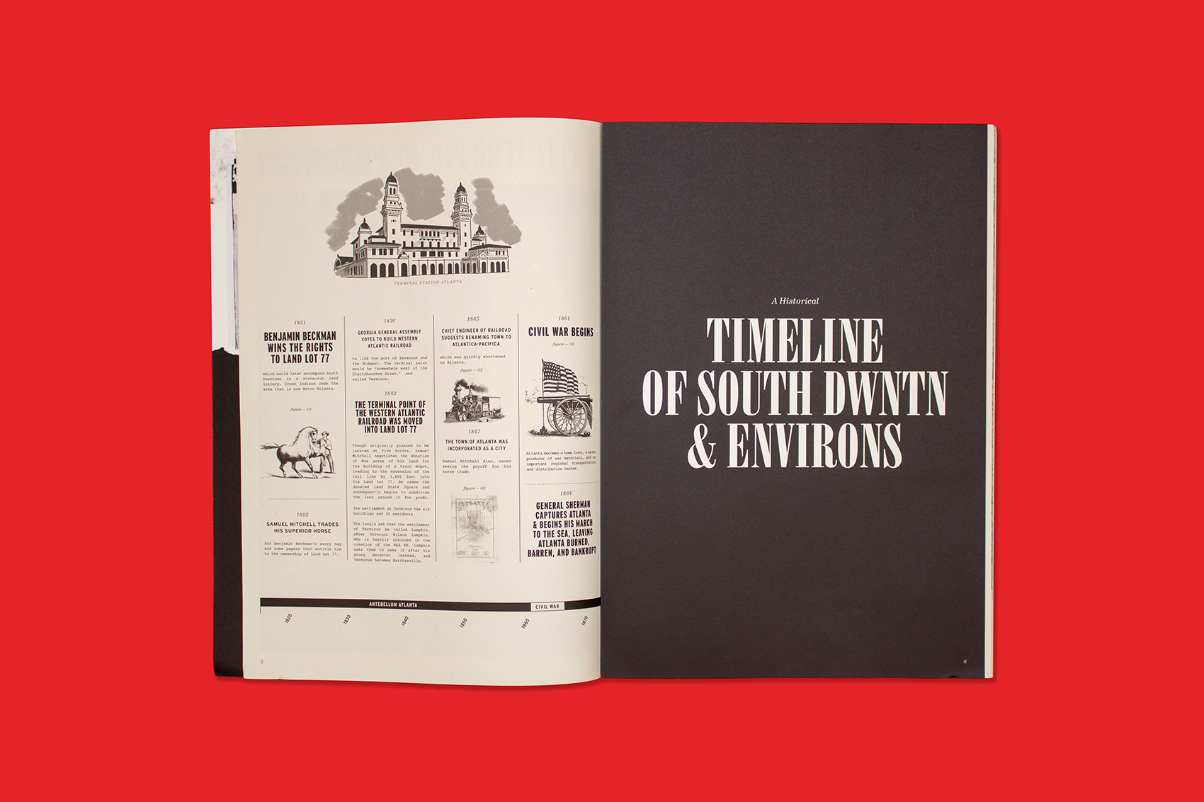
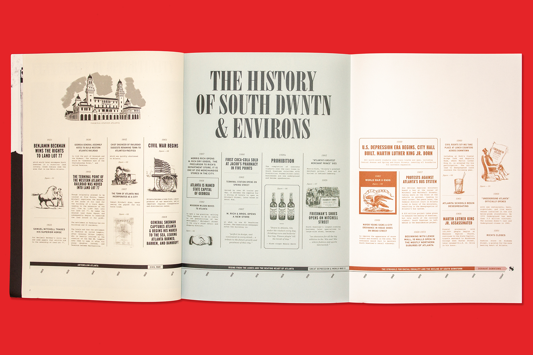
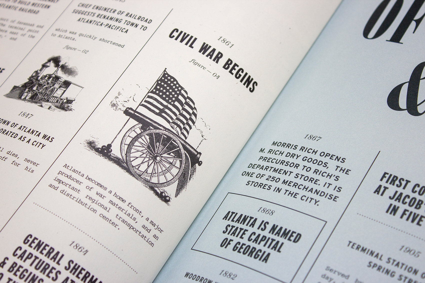
ICON dug deep into South Downtown Atlanta's history to tell a story about its future through texture and typography.
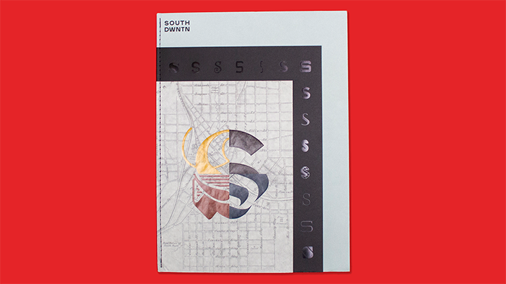
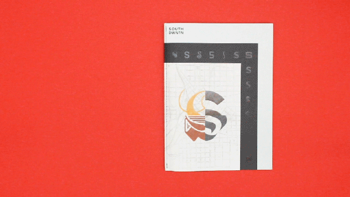
“We wanted to create a piece that somehow captured the idea of many layers — of history, of the diversity of industry, of culture — and decided that paper could play a leading role in delivering this concept.”
ICON
Atlanta, GA
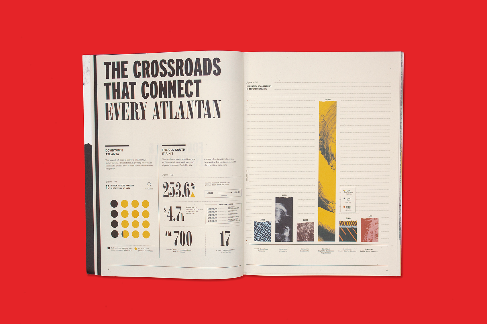
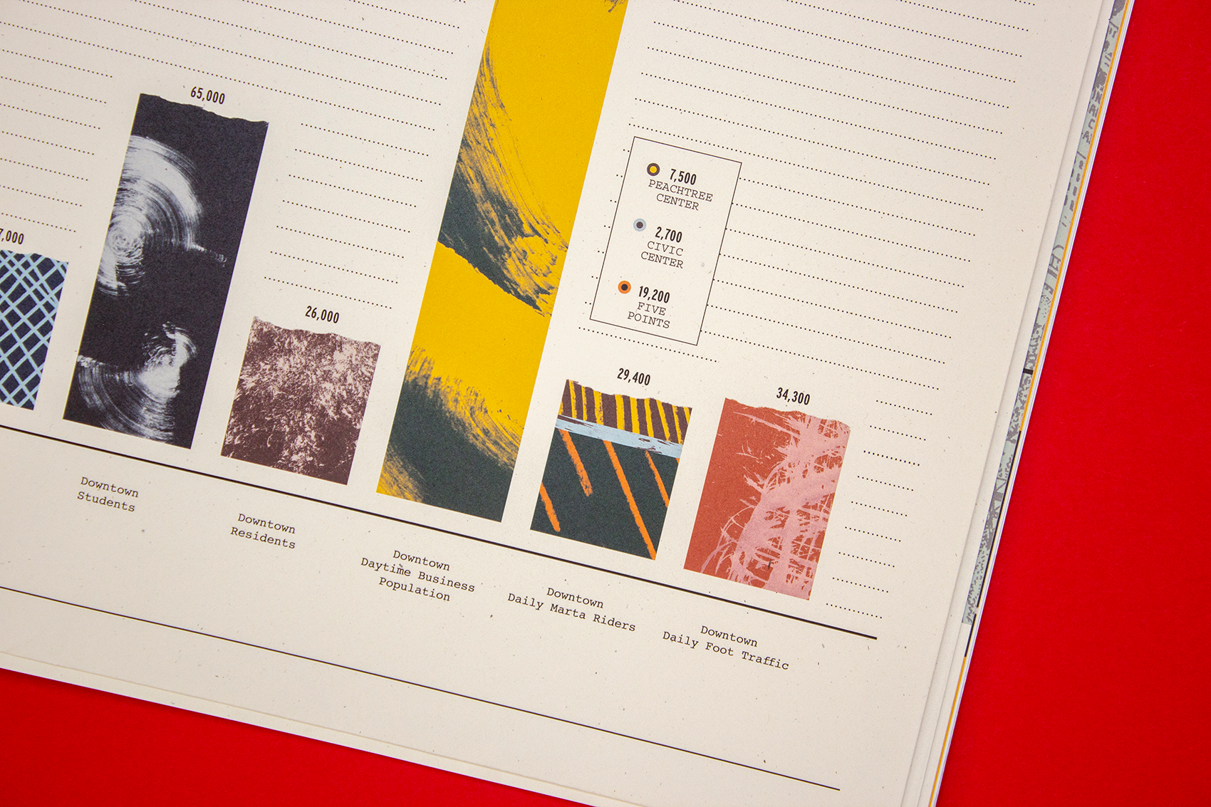
The Crossroads That Connect Every Atlantan
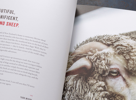
Printed on Mohawk Loop Smooth Birch
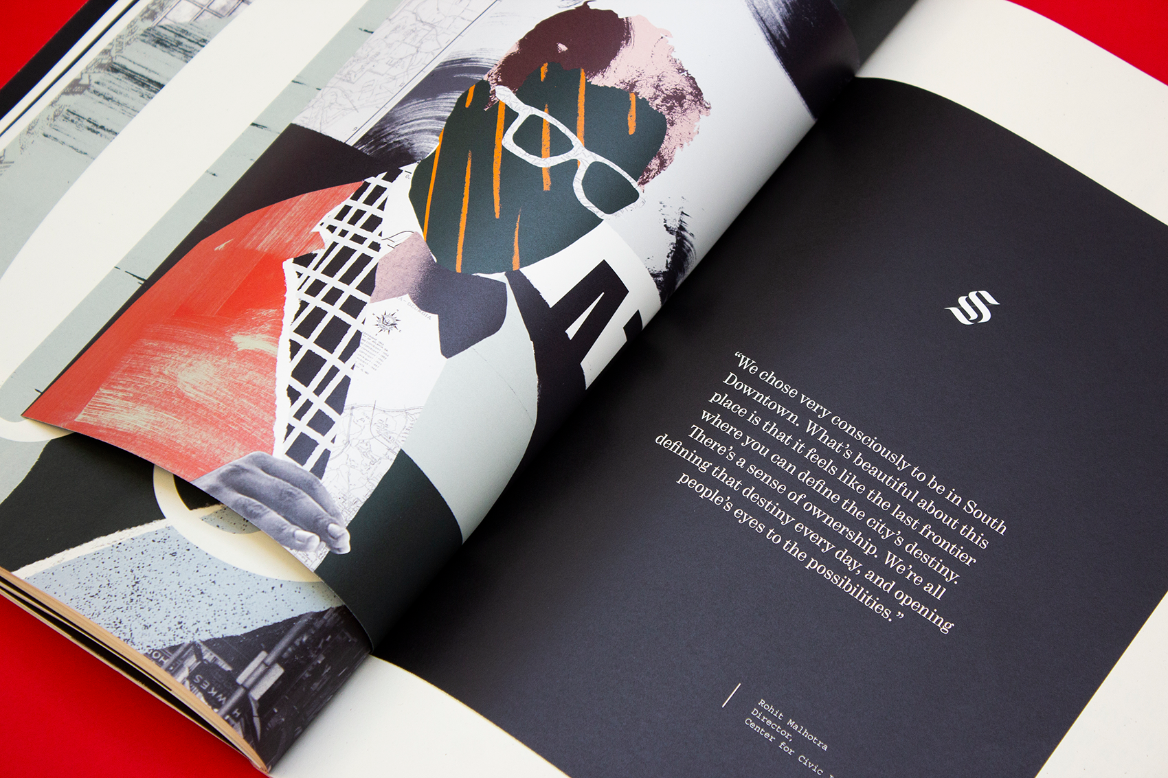
“Sometimes the best role we can play as designers isn’t to create a new story, but to lean into the roots of the story that exists.”
ICON
Atlanta, GA
Production Notes
Bindery
Printer
Designer
ICON
Materials Used

Suggested Articles
Mohawk Blog
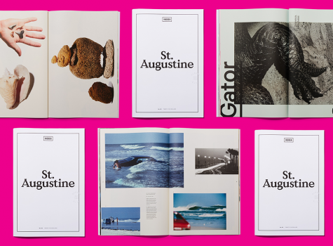
Second in a series of “city guides,” Italic Studio created Indoek’s St. Augustine Issue featuring interesting stories, photography and a variety of colored paper.
Mohawk Blog
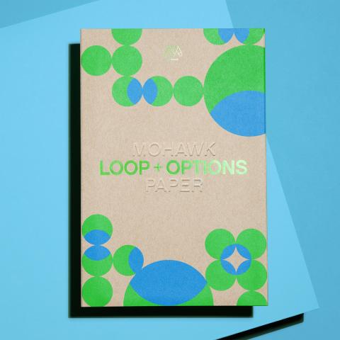
Given the Options, you'll never look at your winter socks the same way again.
Mohawk Blog
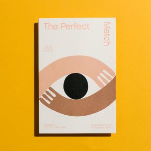
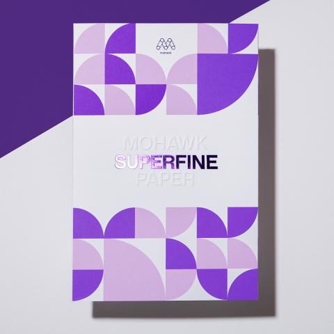
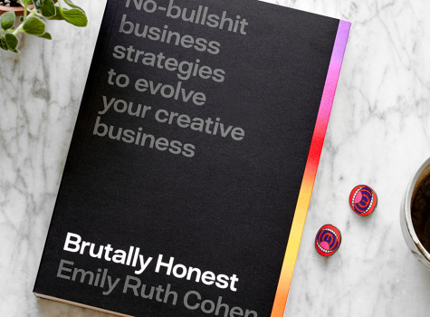
Emily Cohen’s self-published book may be ‘brutally honest’ but this Superfine manual is seriously easy on the eyes.