


[COHOES, NY, November 4, 2019] — Mohawk Fine Papers, Inc., North America's largest privately-owned manufacturer of fine papers, envelopes and specialty printing materials, released the sixteenth issue of its award-winning Mohawk Maker Quarterly at the Adobe Max conference in Los Angeles, CA. For more than six years, each issue of the Mohawk Maker Quarterly has explored a single topic through the lens of diverse creative disciplines and the work of a broad range of groundbreaking creatives. Mohawk Maker Quarterly Issue No. 16 is dedicated to the concept of Community through the lenses of Place, Time, and Voice.
The Community Issue of the Mohawk Maker Quarterly is presented in three volumes: Place, Voice, and time, each occupying an individual, diecut book. The three volumes are held together with a printed belly band featuring the opening editor’s letter. Among the trailblazing minds reflecting on the topic of community are renowned artist Nick Cave, Pinterest Design Director Tim Belonax, designer and paper engineer Kelli Anderson, and Dieline founder Andrew Gibbs.
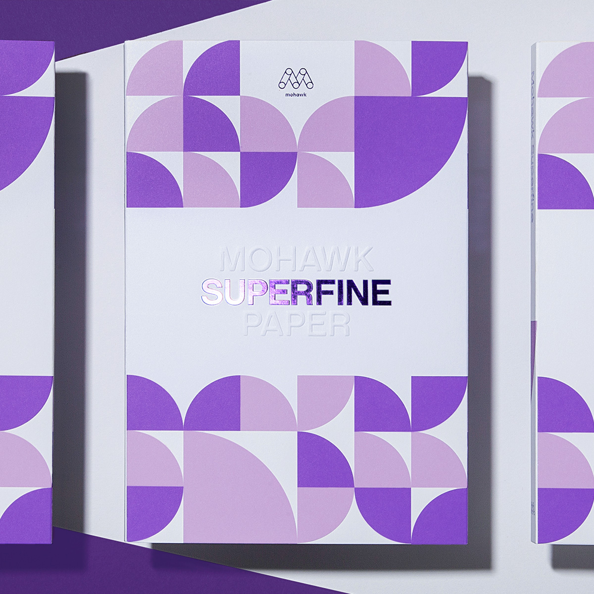
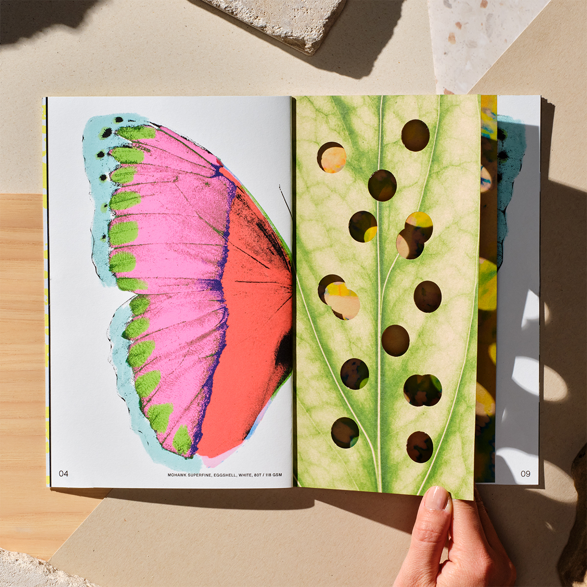
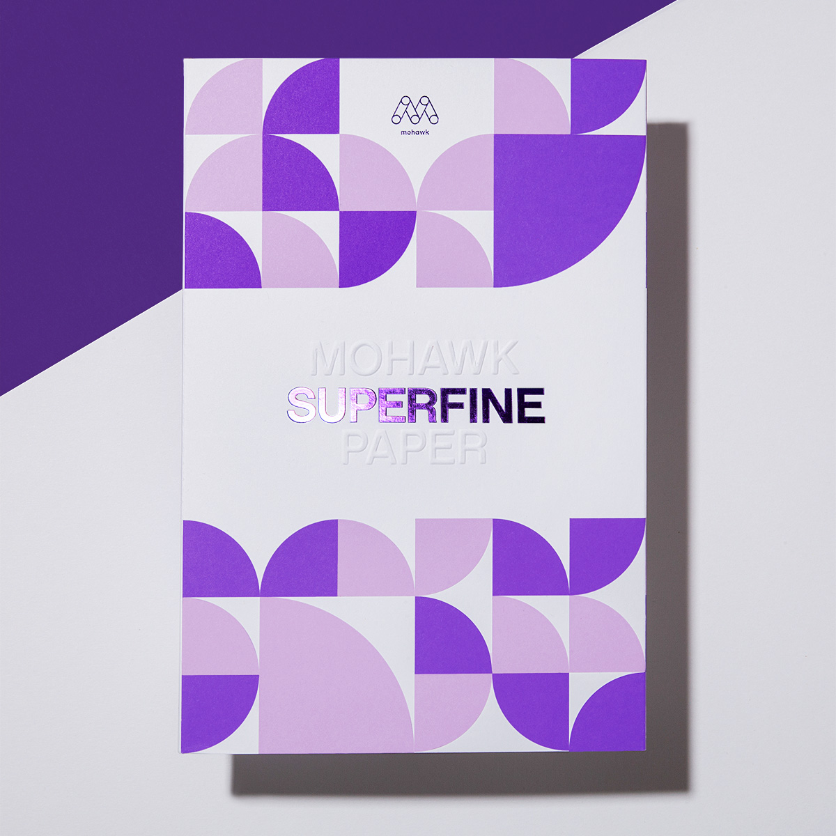
Designed by Hybrid Design in San Francisco, CA, the issue uses all three shades of the iconic Mohawk Superfine grade to unify the three chapters into a set. Mohawk Superfine has become a staple of the design community, known for its superior formation and benchmark ink holdout. The book also features a Strathmore Wove belly band and Via Vellum on the cover of Book One.
"Makers know that nothing is created in a vacuum. The context established by our location in space and time, plus the people around us, changes minute to minute. But the ingredients are constant," said Caleb Kozlowski, Creative Director at Hybrid Design. "We created Mohawk Maker Quarterly Issue No. 16 as a way to interrogate the components of community and encourage people to think about the things that shape their worldview."
Chris Harrold, Mohawk's Senior Vice President of Marketing, said, "We've gone back to basics with the form of Mohawk Maker Quarterly Issue No. 16. Three belly-banded books—each simultaneously distinct and integral to the whole—amplify our message in a way that's deliciously simple. It's a reminder that when we have something to say and a little room to experiment, materials can be more than a vehicle for words and images. They can be part of the message."
Through content and form factor, Mohawk Maker Quarterly Issue No. 16 was created to remind its readers that what makes us unique can also unify us.
Featured articles include:
Chapter One: Place – Book One explores the idea that communities need literal spaces to gather, metaphorical room to experiment, and an open mind to all possibilities.
- Making Community: How cycling brand Rapha has created clubhouses as a hub for people who love to pedal on two wheels. Written by Ed Pollicott.
- Getting Physical: How Facebook's Scott Boms has helped Facebook employees make a mess with purpose in the Facebook Analog Lab.
- Focal Points: Why creative thinkers across disciplines are gathering in the small town of North Adams, Massachusetts. Written by Tim McKeough.
Chapter Two: Voice – Within Book Two, a slate of talented creatives explain why the things that make us unique can also bring us together, as long as we find the courage to speak up and become vulnerable.
- Skate Like a Girl: Kristin Ebeling, founder of girls' organization Skate Like a Girl, reflects on the challenges of growing up feeling left out of the boys' club of skating—and the healing power of connecting with others like her. Written by Kristin Ebeling.
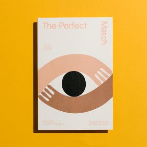
- Interviews: Artists and fearless experimenters Kelli Anderson and Leta Sobierajski interview one another about collaboration, innovation, and "disruptive wonder."
- Designing a Plastic-Free Future: Dieline founder Andrew Gibbs describes how an unexpected and life-changing illness helped him uncover new purpose. Written by Andrew Gibbs.
- Series of Typography Posters: Illustrations by Olivia Ward, David Weber, Carl-Hampus Vaiin, and Patchara Chardensiri based on the essays and interviews in Book Two.
Chapter Three: Time - The final of three books seeks to understand how our experience and understanding of community changes as minutes, years, and decades march on.
- Suits for All Sizes: An interview with Chicago-based visual-performance artist Nick Cave digs into the ways identity, society, and politics collide—and the results are almost impossibly beautiful.
- Typografika: A designer crafts a community narrative of experimental typography in a most unexpected place: a DIY billboard on the side of his suburban garage. Written by Patrick Sisson.
- Sea Change: In the mid-twentieth century in Northern California, a group of like-minded people with revolutionary aspirations for what community could be set out to build a new way to live. Could the utopia last? And what does it mean today? Written by Hadley Meares.
Featured materials include:
Belly Band
- Paper: Strathmore Wove Smoke Gray 100 Cover (270 gsm)
- Process: Blue foil
- Inks: Match black
Chapter One: Place
- Cover: Mohawk Carnival Vellum New Black 80 Cover (216 gsm)
- Process: Silver foil, saddle stitch, diecut, offset printing
- Text: Paper: Mohawk Superfine Eggshell Softwhite 70 text (104 gsm)
- Inks: 4 color process
Chapter Two: Voice
- Cover: Mohawk Superfine Eggshell Digital with i-Tone White 80 Cover (216 gsm)
- Cover process: Saddle stitch, diecut, offset printing
- Text: Mohawk Superfine Eggshell Digital with i-Tone White 70 Text (104 gsm)
- Inks: Match neon orange, match purple
Chapter Three: Time
- Cover paper: Mohawk Superfine Eggshell Ultrawhite 80 Cover (216 gsm)
- Process: Saddle stitch, diecut, digital printing
- Text: Mohawk Superfine Eggshell Ultrawhite 80 Text (118 gsm)
- Ink: 4 color process
Established in 2013, the Mohawk Maker Quarterly has been enthusiastically embraced by makers and creatives worldwide. What began as a celebration of makers, making and the beauty and tactility of fine paper, the Mohawk Maker Quarterly has evolved into an award-winning publication showcasing thoughtful editorial features, compelling design and benchmark printing techniques on a variety of distinctive colored and textured papers which demonstrate the range of Mohawk's expansive Fine Paper portfolio.
Mohawk Maker Quarterly Issue No. 16 was skillfully printed and finished by Sandy Alexander, Inc. in Clifton, NJ, using foil stamping, four-color process, UV printing, and offset printing with match inks. Book Three was printed at Crane Stationery in North Adams, MA using silver foil stamping, four-color process, and digital printing.
To learn more about the publication or to request a copy of Mohawk Maker Quarterly Issue No. 16, visit mohawkconnects.com/inspiration/maker-quarterly.
Press images are available to download at https://www.dropbox.com/sh/5w4f2ilgy324sox/AAAco6rkvw1Uodhqu5iI59eba?dl=0.
ABOUT MOHAWK
At its core, Mohawk is a company of makers. A family-owned business since 1931, it serves the creative needs of designers, brand-owners, and printers in more than 60 countries with carefully crafted papers designed to make print more beautiful, effective, and memorable. It sources pulp responsibly, conserves the water its craft relies on, and harnesses wind power for its mills. Mohawk papers help print go from simply good to truly great.