


Mohawk Blog
In a world saturated with digital impressions, the brands that endure are the ones you can feel.
If you are having trouble logging in please clear your browser cookies.
Don't have an account?
Register
In a world saturated with digital impressions, the brands that endure are the ones you can feel.

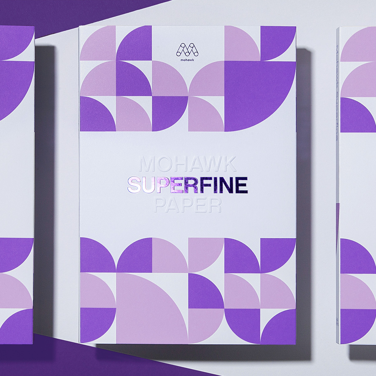
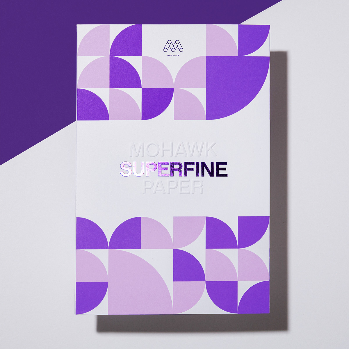
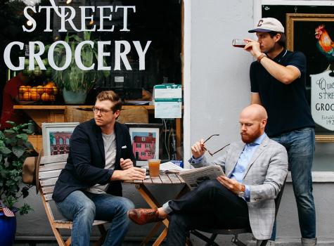
“It feels luxe.” That’s how Bruce Watermann, Blurb’s SVP of Operations, describes the tactile nature of Mohawk Superfine.
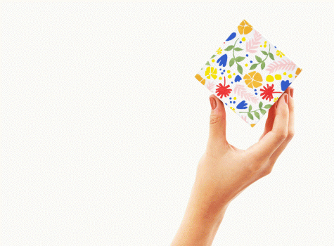
Today, guest blogger, Sarah Schwartz, editor of Stationery Trends and The Paper Chronicles, brings us the story of Greetabl.
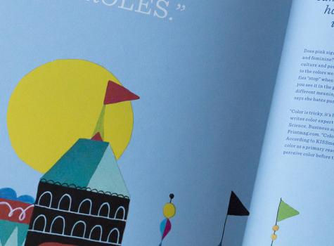
Does pink signify modern and bold? Or does it seem soft and feminine? Perception of color—including context, culture and personal preferences—shapes our response to the colors we see. Perception of color is why red signifies “stop” when you see it on the street, and “love” when you see it in the greeting card aisle. It’s why color has different meanings across the globe. It’s why the client says she hates purple.
Writer, educator and consultant Debbie Millman is at the forefront of understanding how companies develop smart, effective brands for their products and services. Her book “Brand Thinking” features insightful interviews with prominent practitioners. We invited Debbie to discuss what makes successful brands so good at shaping consumer perception.
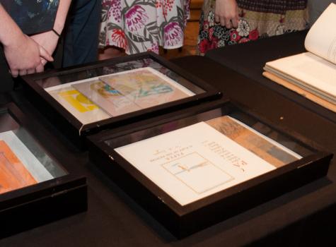
The Strathmore Archive is a treasure trove of over 100 years of rare, historic and beautiful Strathmore paper promotions. Since its discovery, we have been hosting special events and pop-up exhibitions across North America to unveil and share selections from the archive with design enthusiasts and to celebrate Stathmore’s legacy.
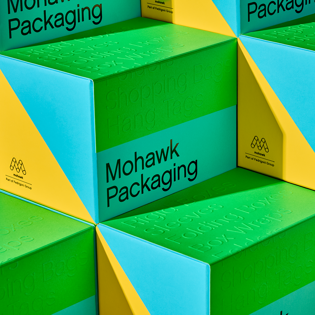
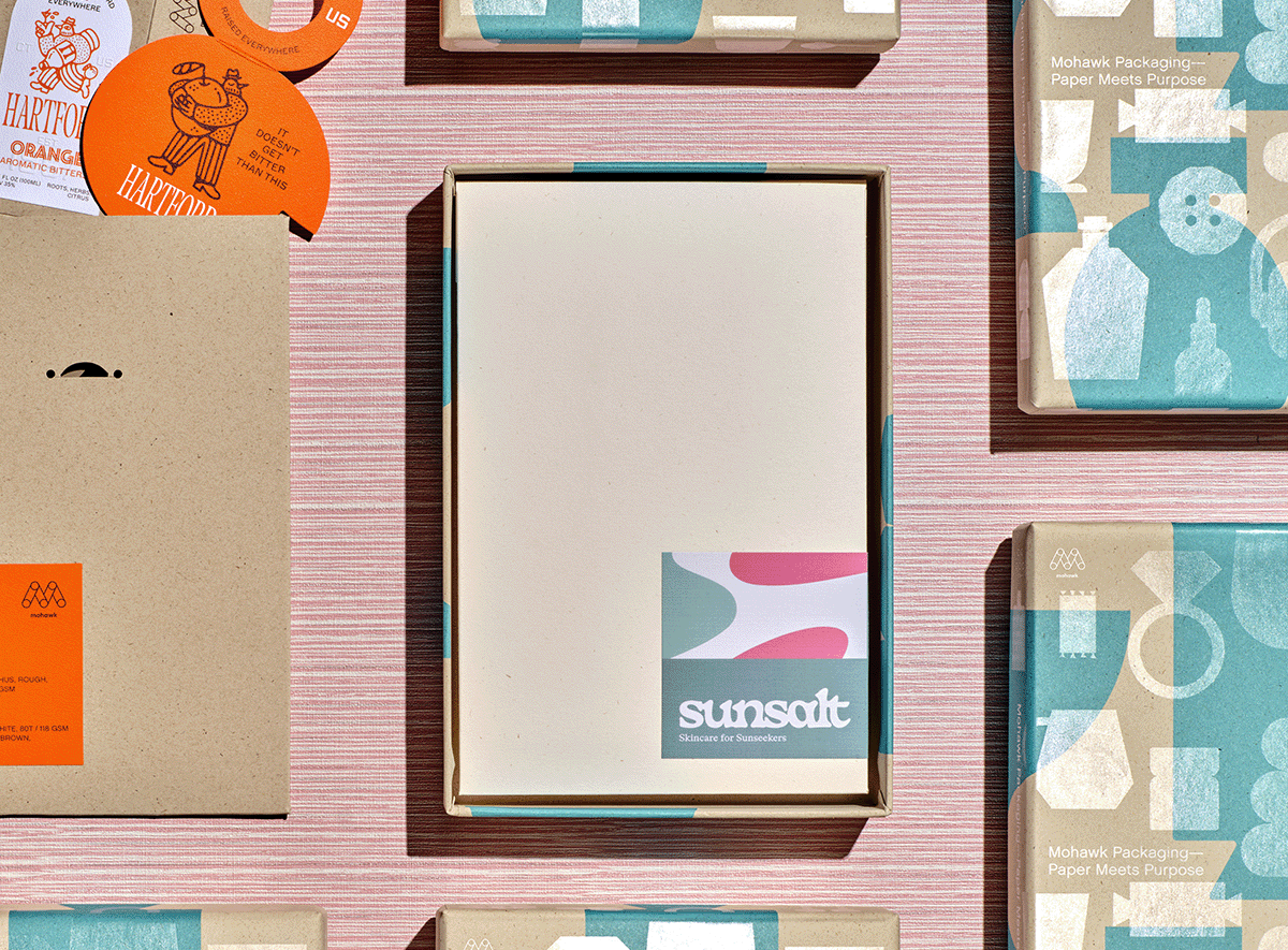
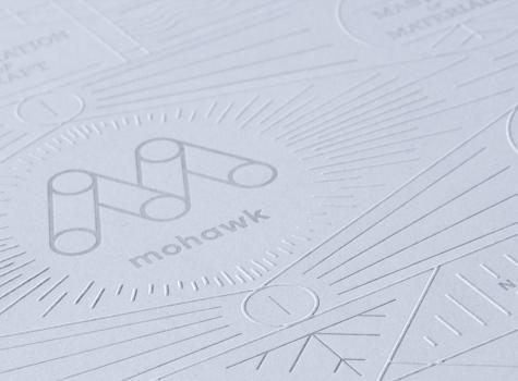
We know that materials matter, and the right materials can take a project from good to great.
The competition for an audiences’ attention has risen to a fever pitch. They are overwhelmed, bombarded with more-more-more, with less and less impact.

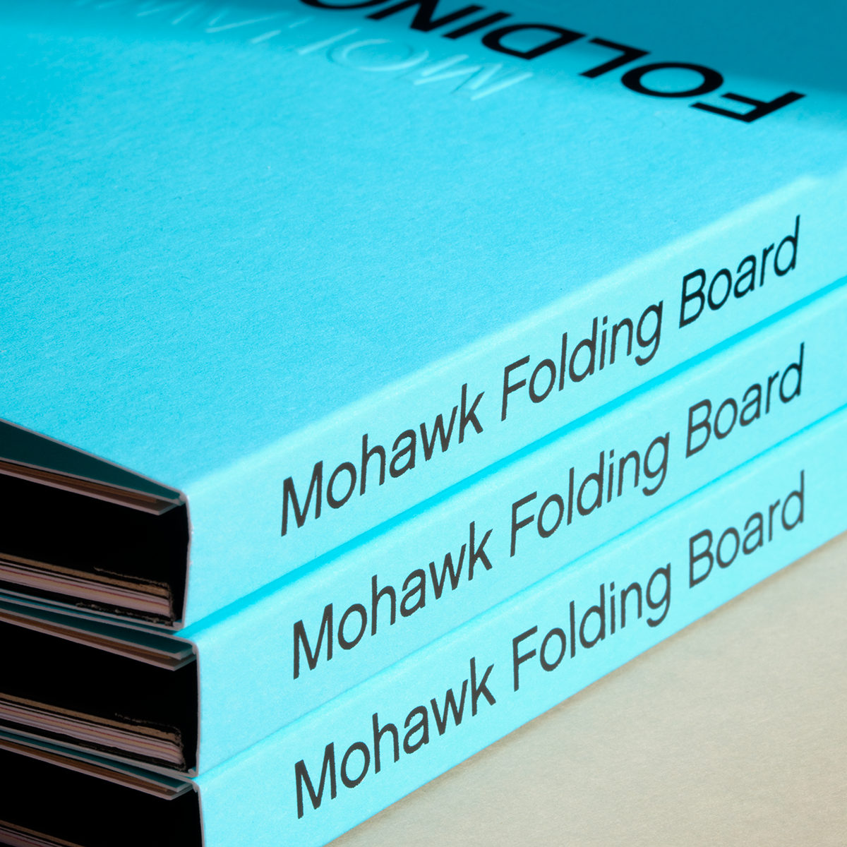
We know that materials matter, and the right materials can take a project from good to great.
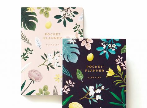
Today, guest blogger, Sarah Schwartz, editor of Stationery Trends and The Paper Chronicles, chats with one of Stationery Trends’ Top Ten 2016 Designers to Watch about her career, inspiration and thoughts about paper. Today, Sarah introduces us to Mimi Kim of Clap Clap.
Mohawkconnects.com will be performing scheduled maintenance on Saturday, January 20th, 2024 between the hours of 9am and 12pm EST.
We apologize for any inconvenience or interruption to stock check, Xpress Check, product pages and the add to cart feature during this time. If any issues persist beyond this window, please contact [email protected] or 800-THE-MILL during normal business hours resuming Monday, January 22nd at 8am EST. Thank you.