


The Recorder: Reimagined, Redesigned + Relaunched
This month typography and design fans globally have heralded the relaunch of The Recorder. Originally published in 1902 as a method to highlight the history of typography and products used within the industry, The Recorder was primarily known as a trade magazine until the early 1970’s. Now, with a brilliant redesign and relaunch, it celebrates the relevancy of type in today’s culture.
Production Notes
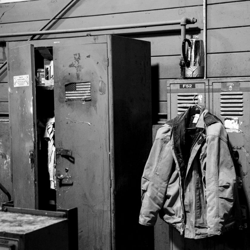
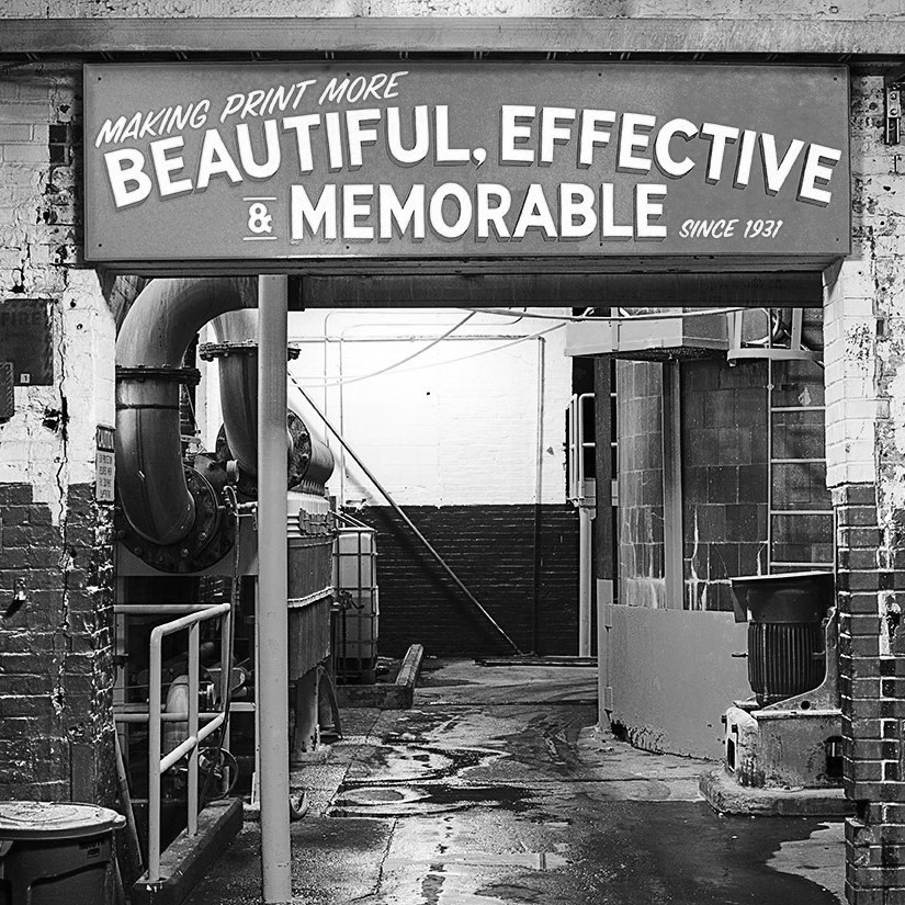
Offset Printing
A commonly used printing technique in which the inked image is transferred from a plate to a rubber blanket, then to the printing surface. When used in combination with the lithographic process, which is based on the repulsion of oil and water, the offset technique employs a flat (planographic) image carrier on which the image to be printed obtains ink from ink rollers, while the non-printing area attracts a water-based film (called "fountain solution"), keeping the non-printing areas ink-free.
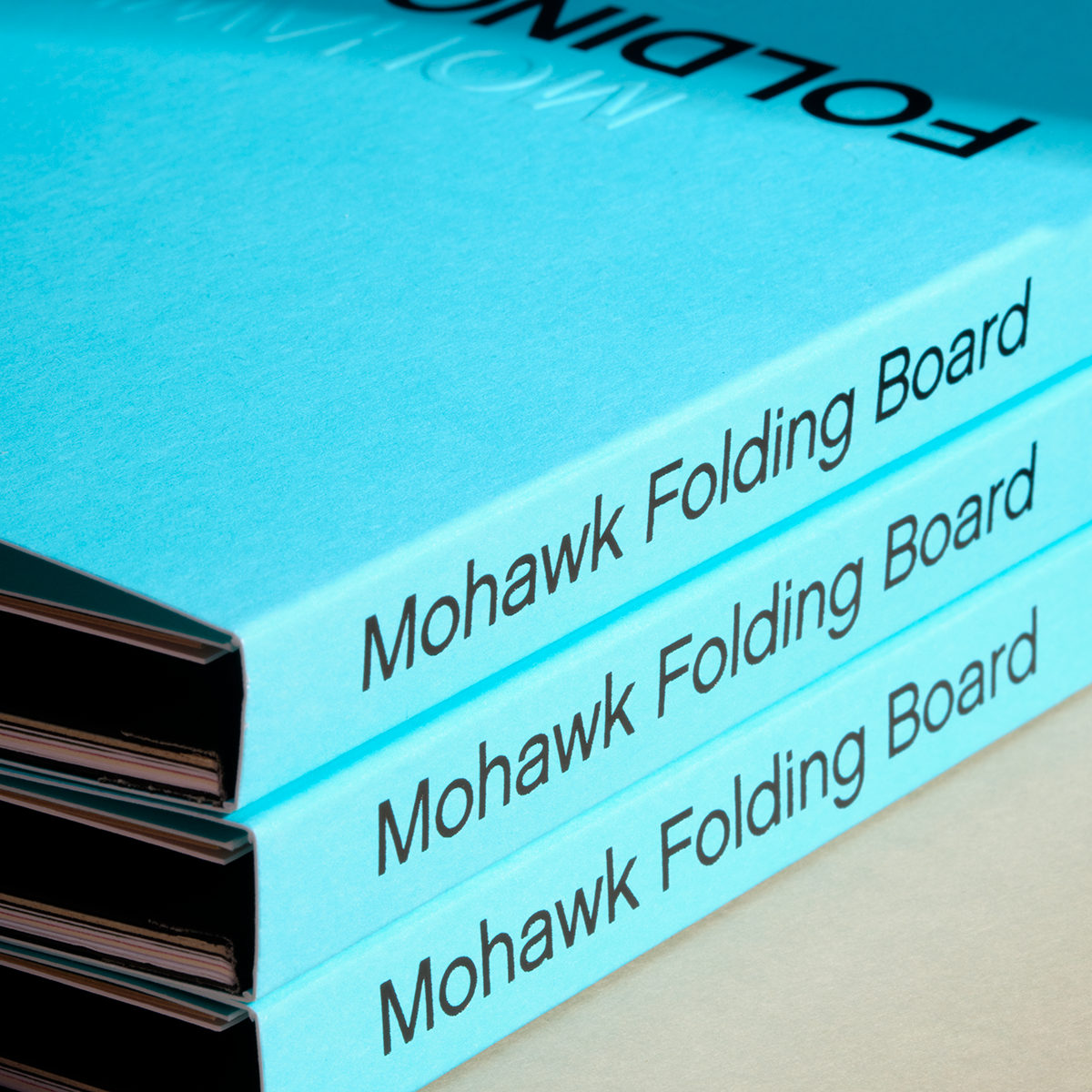
Materials Used
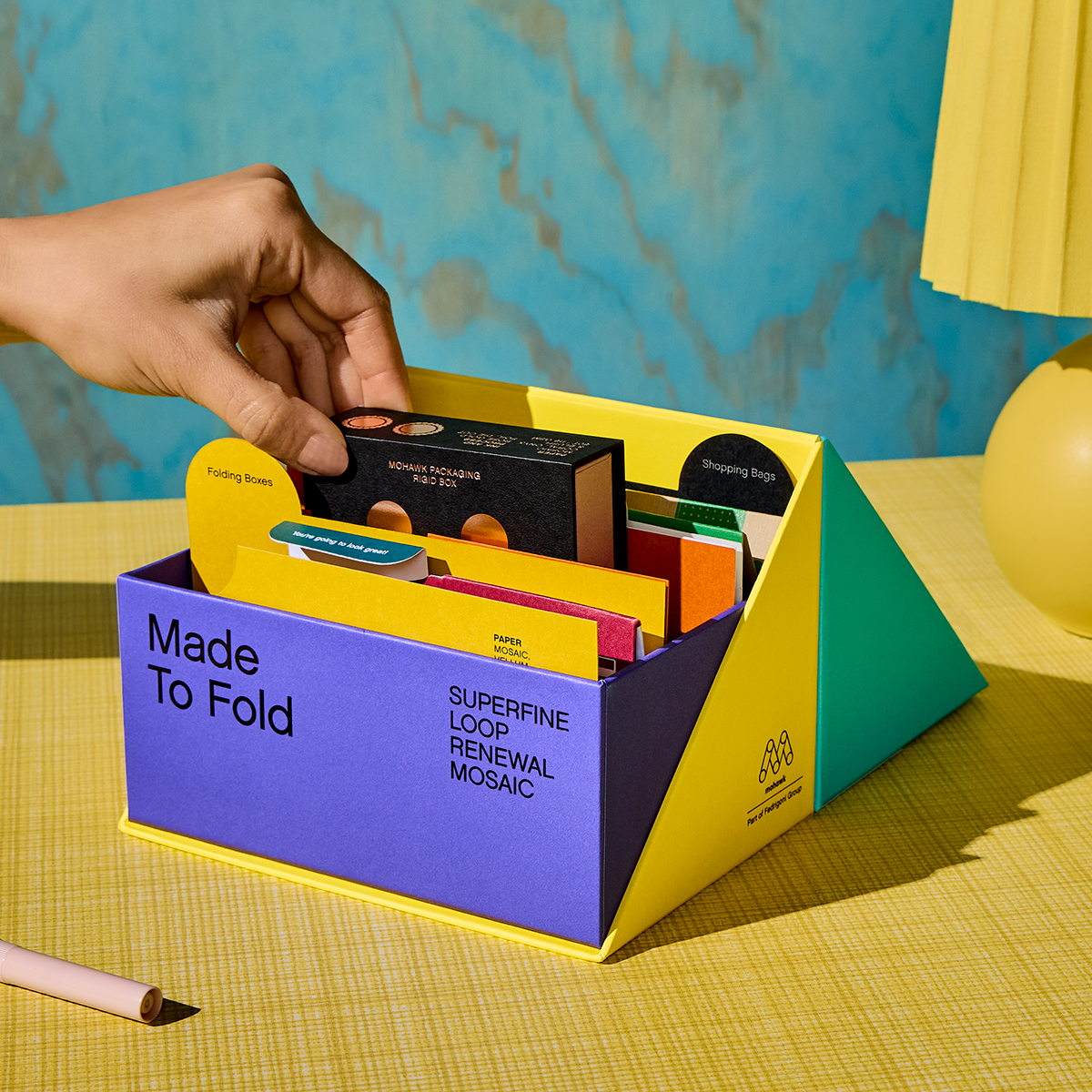
Suggested Articles

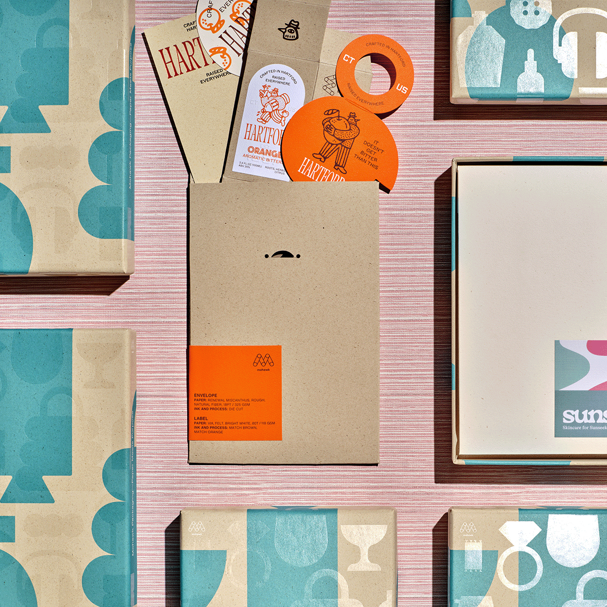
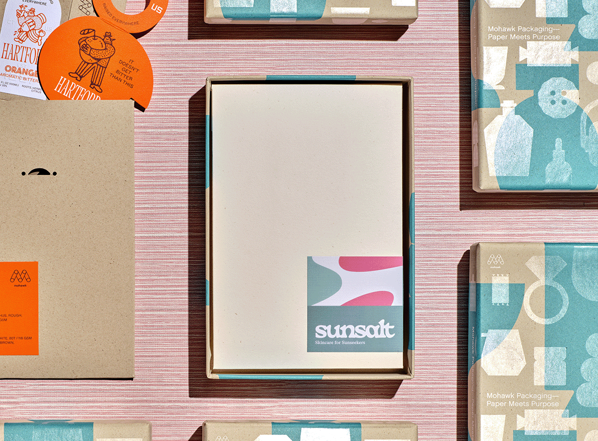
If Sunsalt is a sunlit afternoon, Hartford is the quiet hour that follows — unhurried, intentional, and crafted with care.
In a world saturated with digital impressions, the brands that endure are the ones you can feel.

Sunsalt's identity is built on warmth, ease, and the quiet pleasure of a long summer day — the kind you feel on your skin long after the sun has set.