


Paper is Part of the Picture
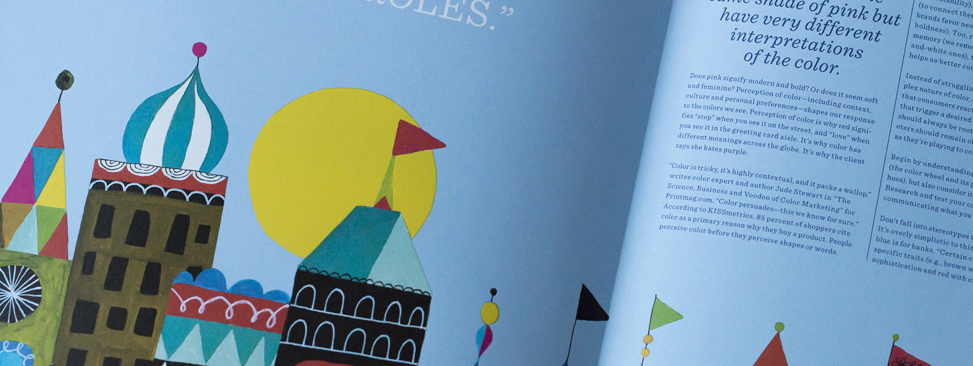
Does pink signify modern and bold? Or does it seem soft and feminine? Perception of color—including context, culture and personal preferences—shapes our response to the colors we see. Perception of color is why red signifies “stop” when you see it on the street, and “love” when you see it in the greeting card aisle. It’s why color has different meanings across the globe. It’s why the client says she hates purple.

This article was originally published in Issue 05 of the Mohawk Maker Quarterly. The Mohawk Maker Quarterly is a vehicle to support a community of like-minded makers. Content focuses on stories of small manufacturers, artisans, printers, designers, and artists who are making their way in the midst of the digital revolution. Learn more about the quarterly here.
-or-
If you’re looking for inspiration, examples, and more tips on how to increase the impact of your next printed project through careful paper selection, click here to learn more and take your work from good to great.
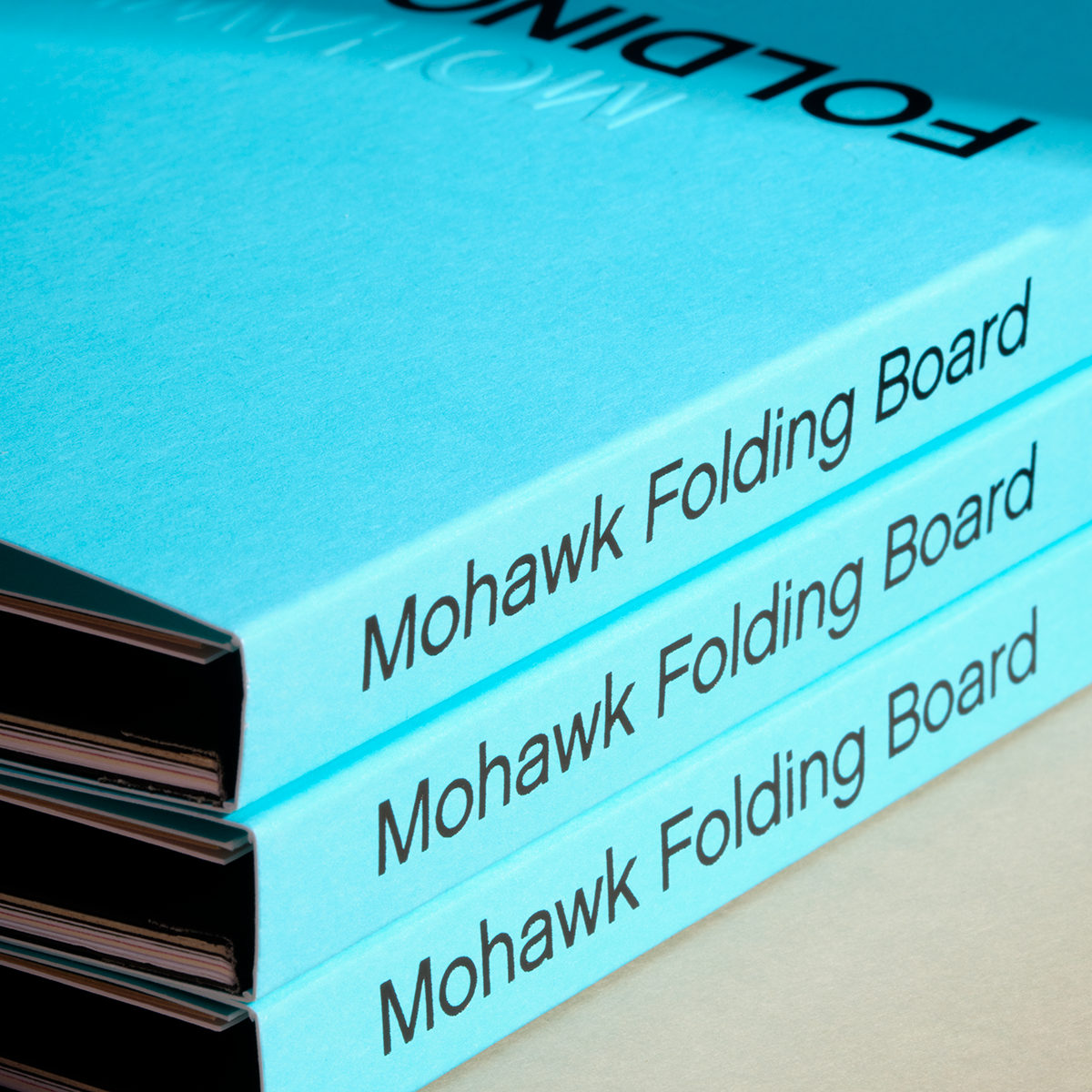
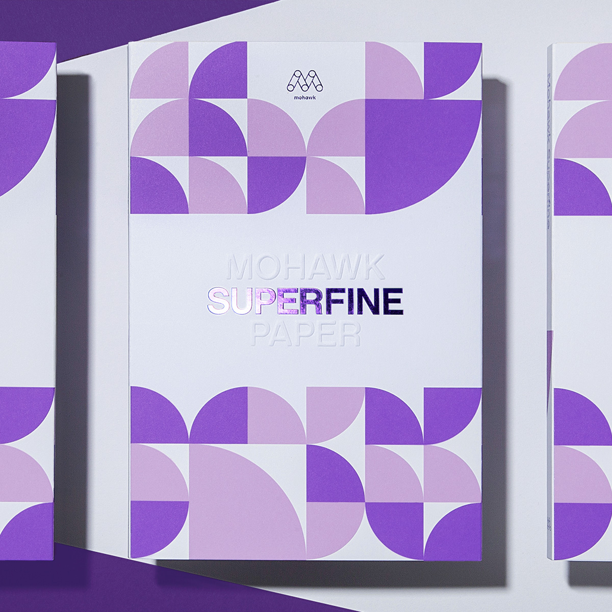
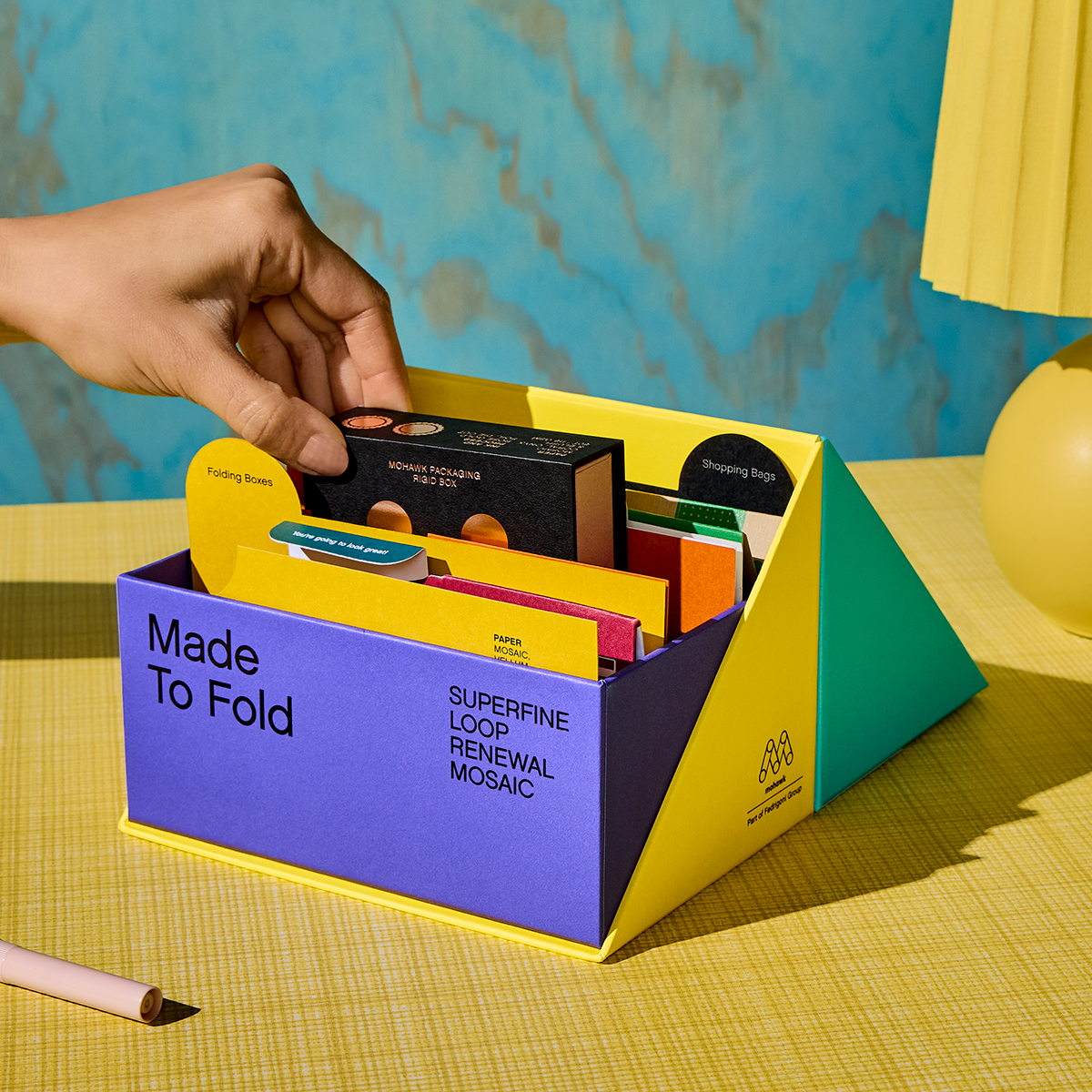
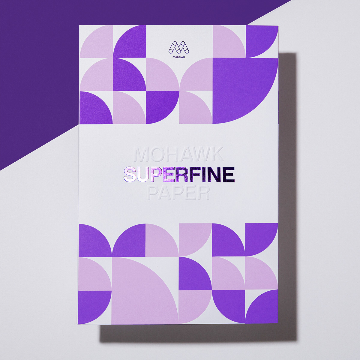
Materials Used

Suggested Articles
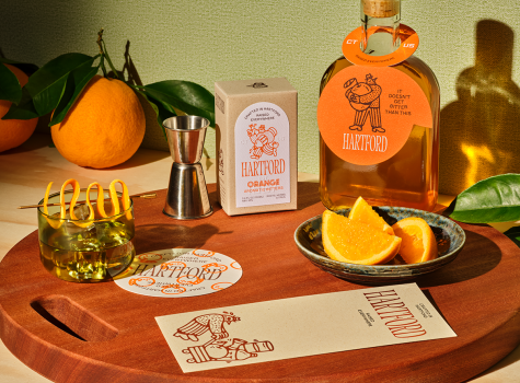
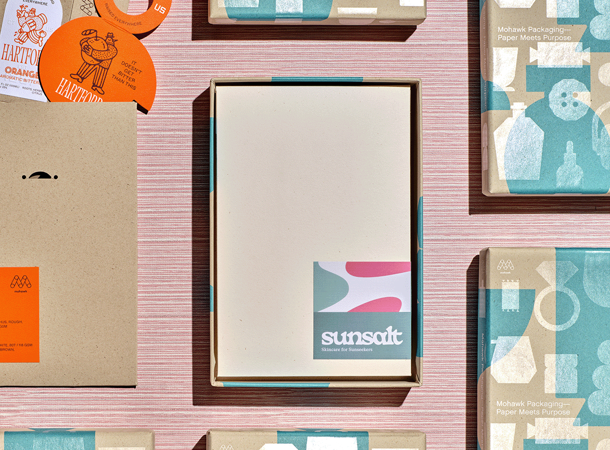
If Sunsalt is a sunlit afternoon, Hartford is the quiet hour that follows — unhurried, intentional, and crafted with care.

Sunsalt's identity is built on warmth, ease, and the quiet pleasure of a long summer day — the kind you feel on your skin long after the sun has set.
In a world saturated with digital impressions, the brands that endure are the ones you can feel.