


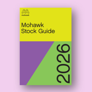


Mohawk Blog
In a world saturated with digital impressions, the brands that endure are the ones you can feel.
If you are having trouble logging in please clear your browser cookies.
Don't have an account?
Register
In a world saturated with digital impressions, the brands that endure are the ones you can feel.
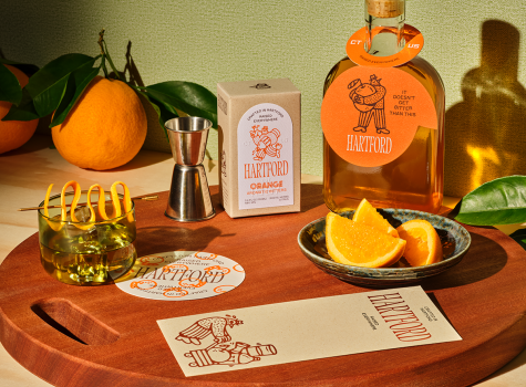
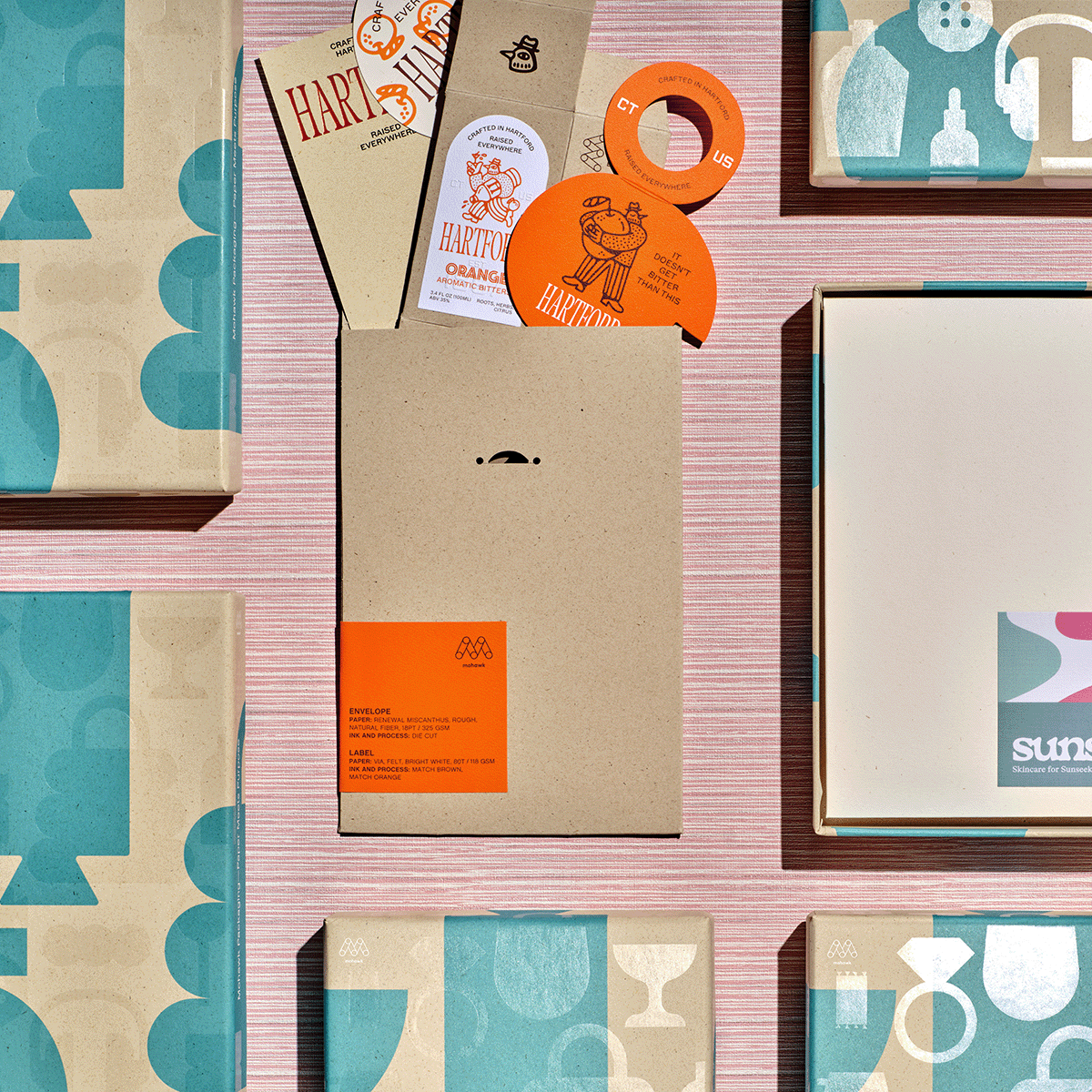
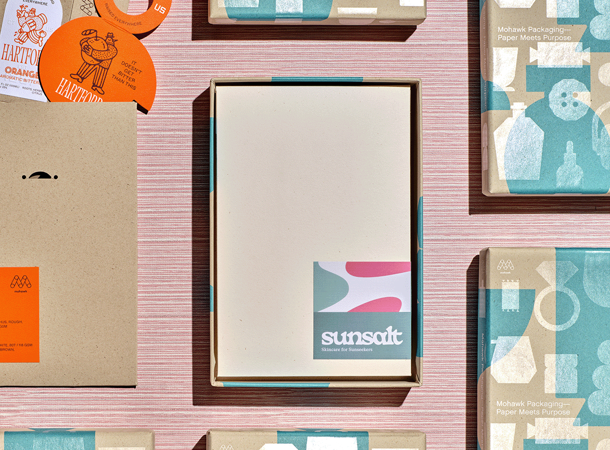
If Sunsalt is a sunlit afternoon, Hartford is the quiet hour that follows — unhurried, intentional, and crafted with care.
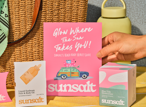
Sunsalt's identity is built on warmth, ease, and the quiet pleasure of a long summer day — the kind you feel on your skin long after the sun has set.
In a world saturated with digital impressions, the brands that endure are the ones you can feel.
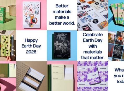
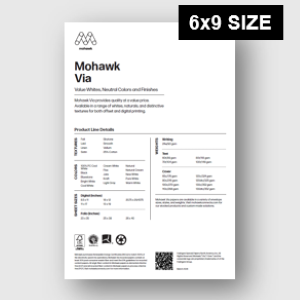
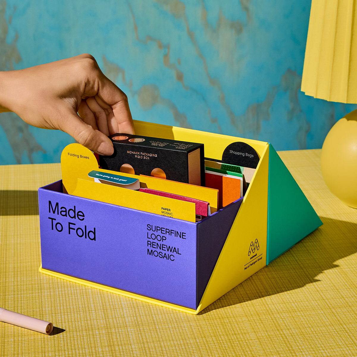
Better materials make a better world. Mohawk is proud to champion sustainable papermaking - creating fiber‑based alternatives that help reduce plastic use and support a healthier planet.
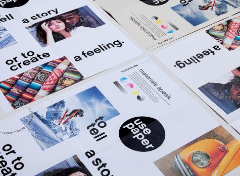
Design isn’t just about what you see—it’s about what you feel.

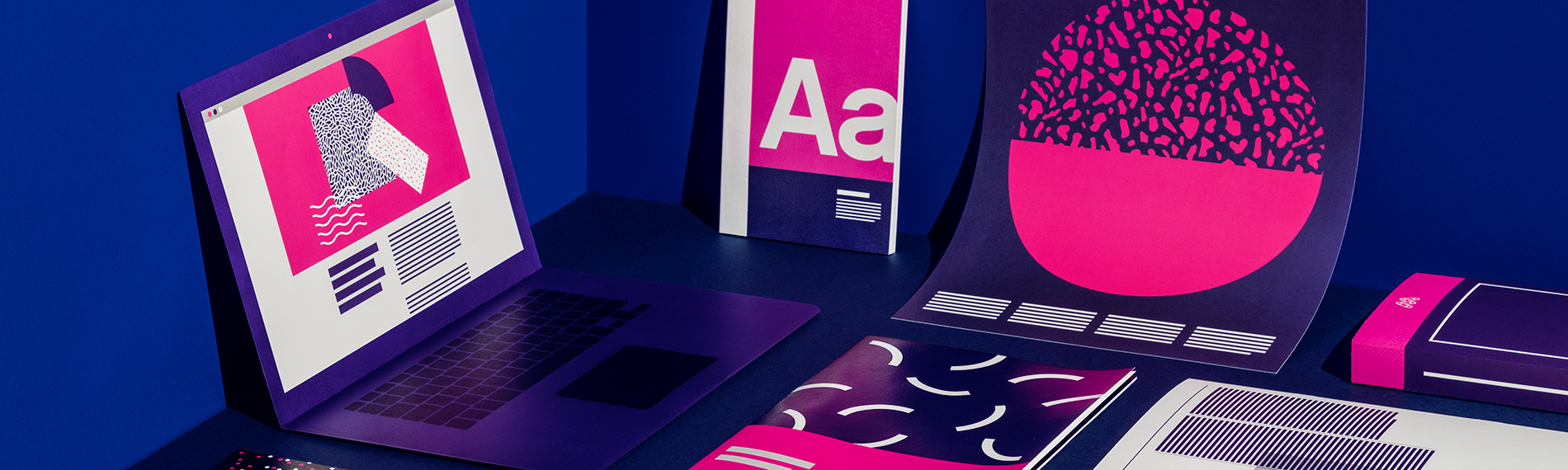
As digital printing evolves from compromise to sophisticated tool—advances in color, texture, and fiber papers push the boundaries of what's possible.

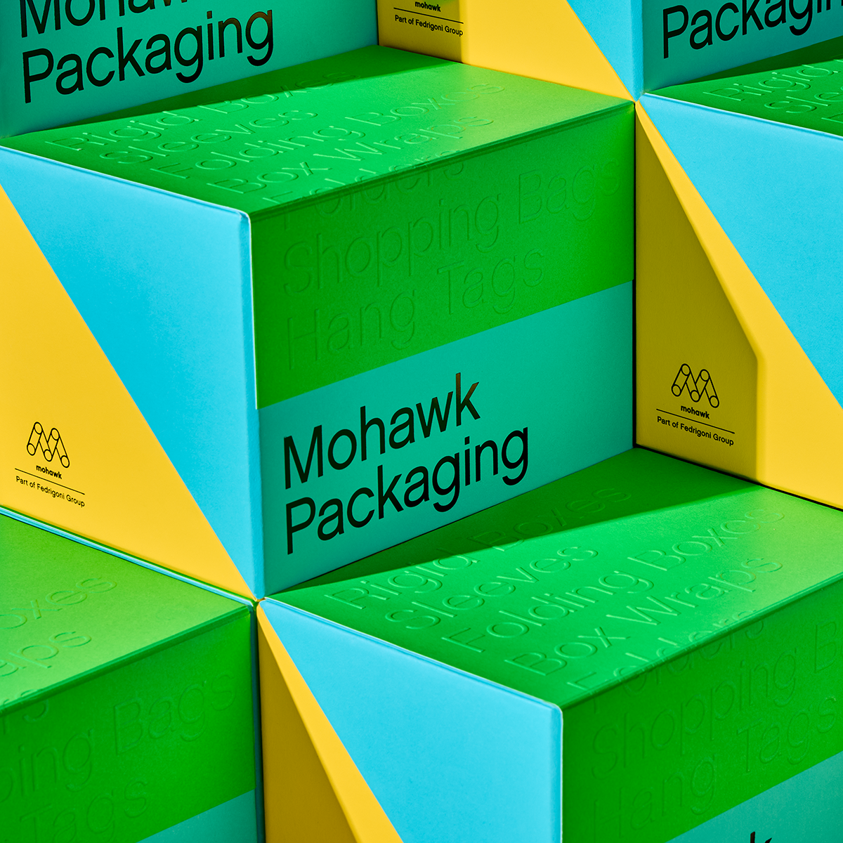
In today's competitive marketplace, packaging plays a crucial role in brand perception and consumer satisfaction.
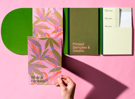
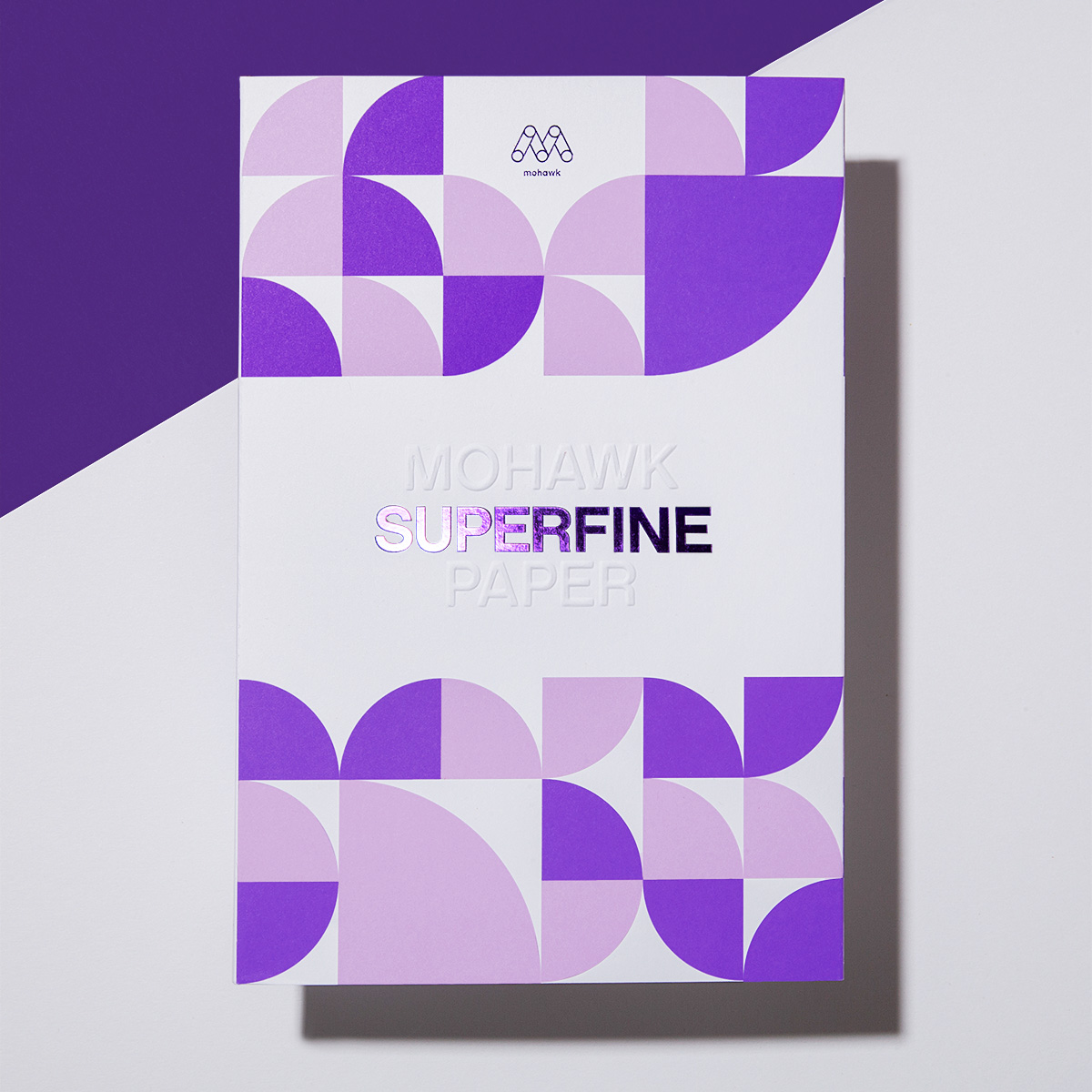
Mohawk Renewal marks a bold new chapter in our ongoing commitment to sustainability and innovation in papermaking.

Beautiful. Effective. Memorable. What will you make today?
Mohawkconnects.com will be performing scheduled maintenance on Saturday, January 20th, 2024 between the hours of 9am and 12pm EST.
We apologize for any inconvenience or interruption to stock check, Xpress Check, product pages and the add to cart feature during this time. If any issues persist beyond this window, please contact [email protected] or 800-THE-MILL during normal business hours resuming Monday, January 22nd at 8am EST. Thank you.