


Mohawk Blog
It's the most wonderful time of the year! What will you give this holiday season?
If you are having trouble logging in please clear your browser cookies.
Don't have an account?
Register
It's the most wonderful time of the year! What will you give this holiday season?
It's the most wonderful time of the year! What will you give this holiday season?
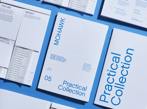
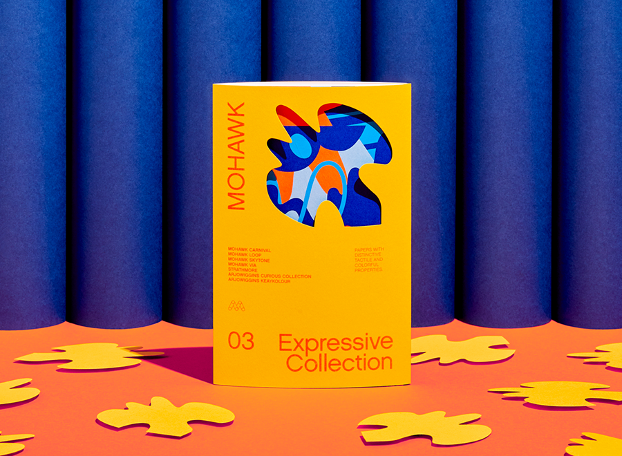
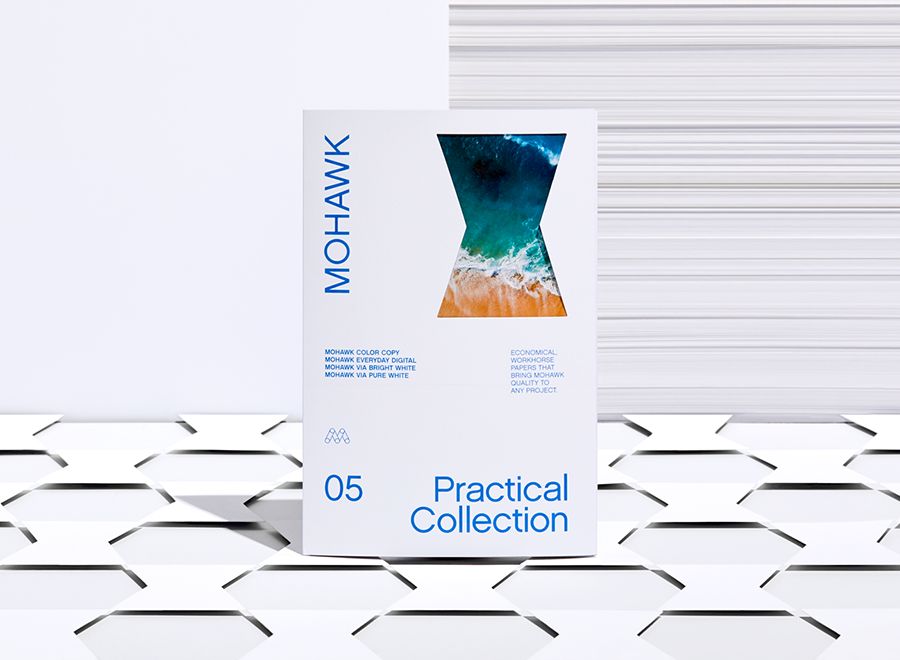
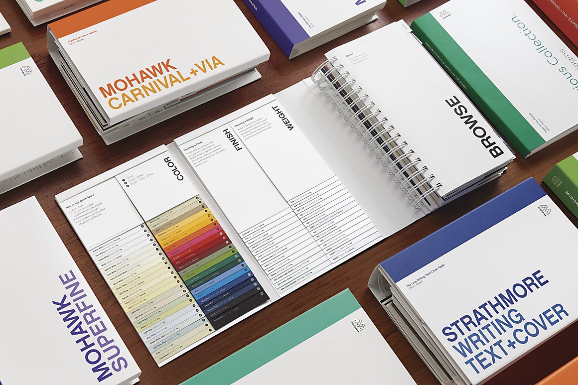
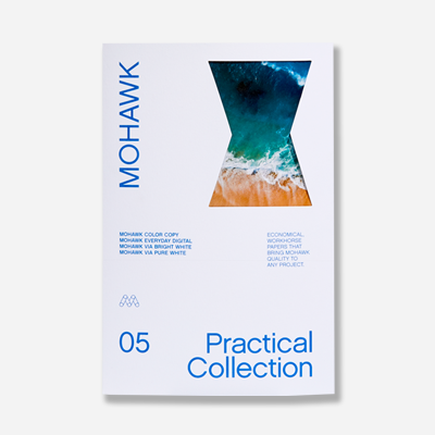
The Practical Collection is comprised of economical, workhorse papers that bring Mohawk quality to any project.
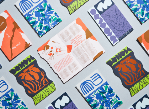
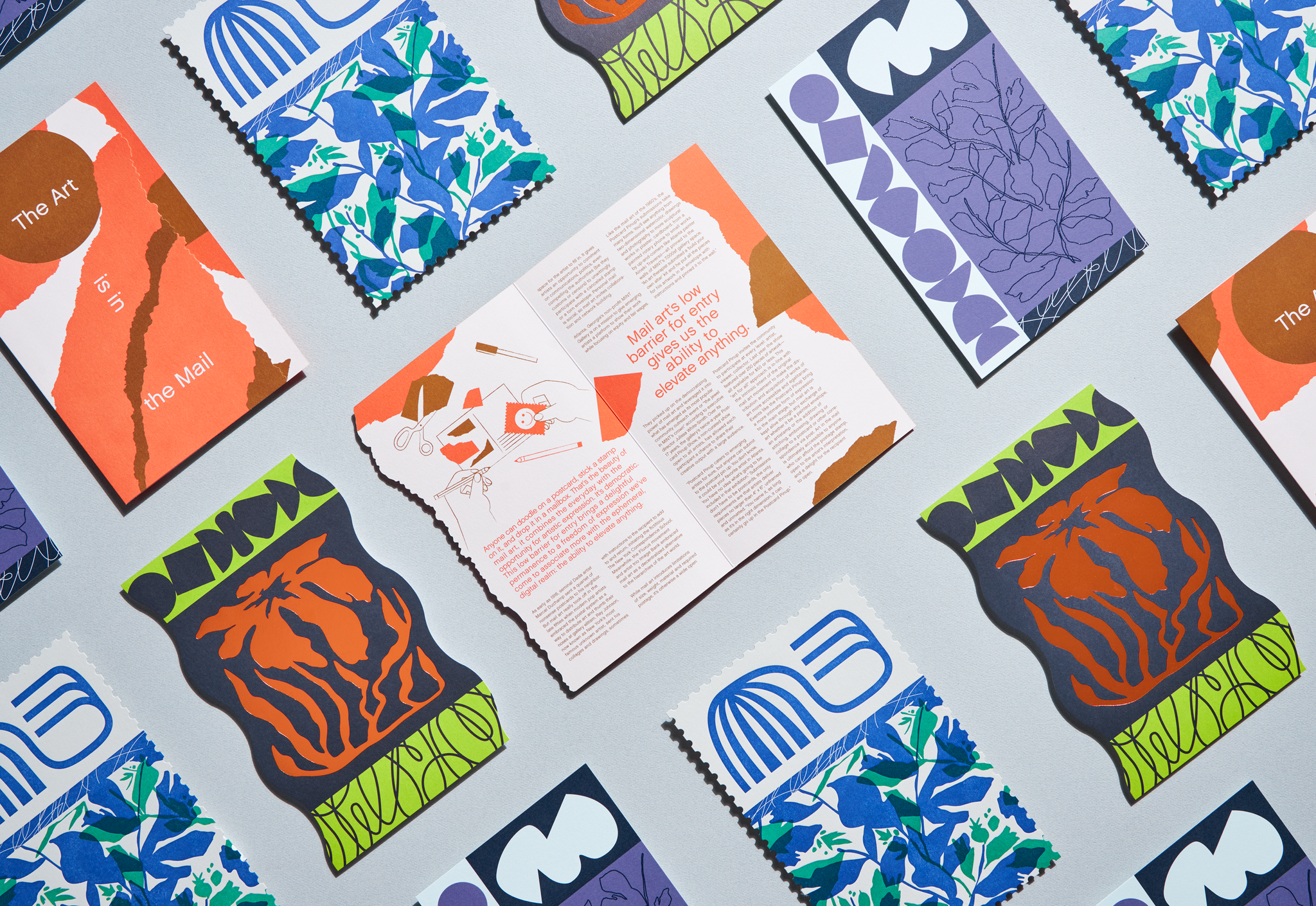
The beauty of mail art is its low barrier to entry which gives anyone the ability to elevate the everyday to the extraordinary.
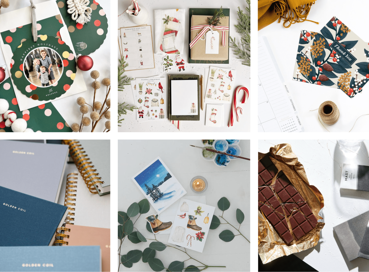
Spread holiday cheer this year with Mohawk-made and fine paper-packaged goods and gifts.
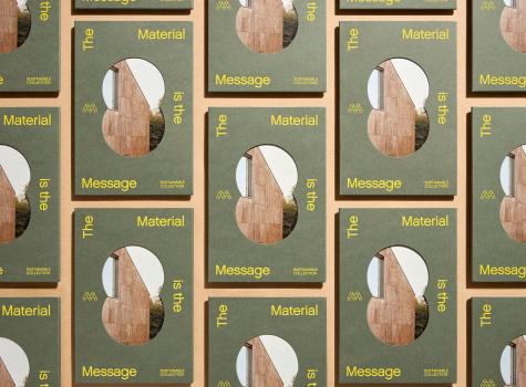
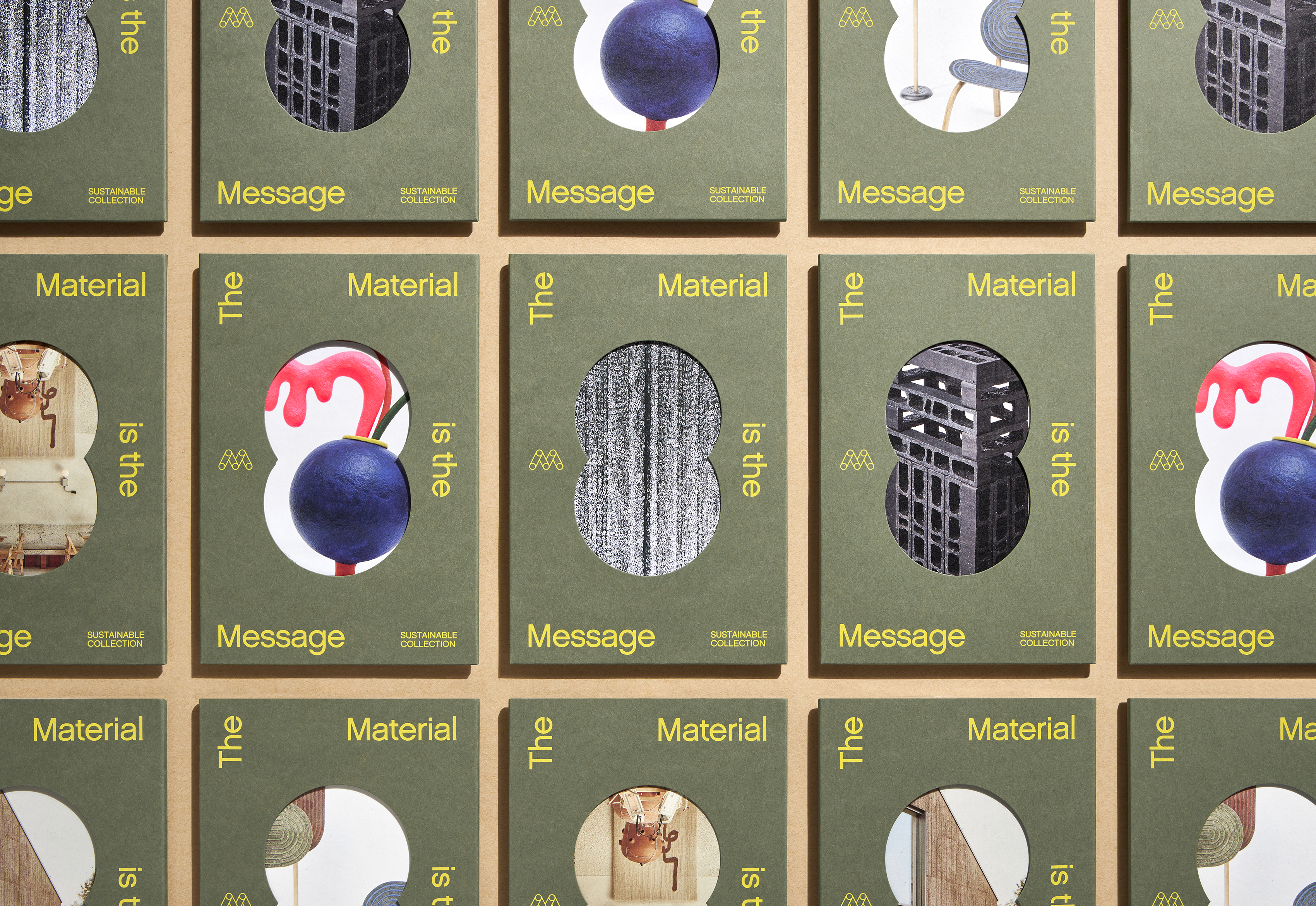
"The Material is the Message," tells the story of 6 different installations, dwellings, sculptures, objects, or other artifacts that are created using alternative materials or methods.
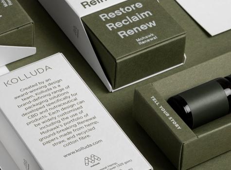
Burgopak partnered with Mohawk to present stunning and sustainable packaging solutions for CBD-infused products and beyond.
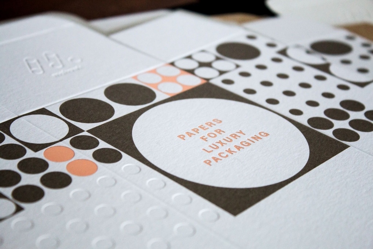
From your morning coffee to your late-night snack, from Amazon to Zappos and everything in between, the stuff we buy has one thing in common: nearly all of it comes in some kind of packaging.
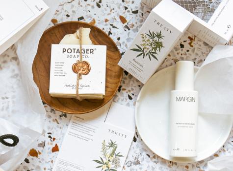
Every single one of Still Novel's products are driven by storytelling and elevated by design.
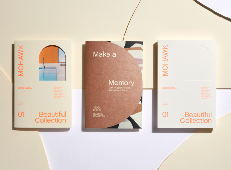
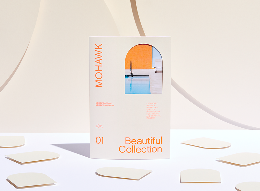
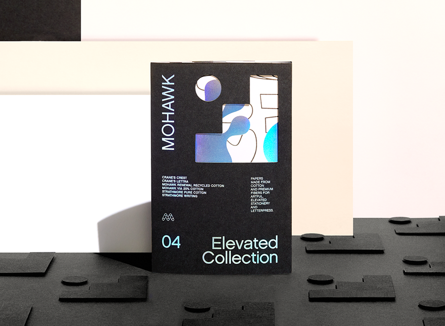
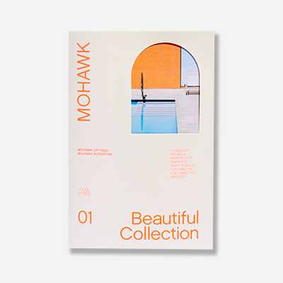
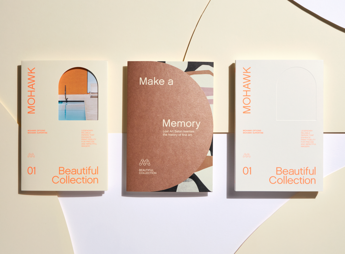
"Make a Memory" with Mohawk's Beautiful Collection — Legendary reliable papers that enhance print fidelity for precise and impactful imagery.
Mohawkconnects.com will be performing scheduled maintenance on Saturday, January 20th, 2024 between the hours of 9am and 12pm EST.
We apologize for any inconvenience or interruption to stock check, Xpress Check, product pages and the add to cart feature during this time. If any issues persist beyond this window, please contact [email protected] or 800-THE-MILL during normal business hours resuming Monday, January 22nd at 8am EST. Thank you.